
Designing a website can be a Herculean task, but the real challenge is how to make it useful and pleasing in the eyes of its visitors. The problem with most of the web designers is that they follow only what is “trending in”. They often forget that it’s the users and their needs which should be their priority. Once you enter into a creative field there are a lot of things that you shouldn’t do. Giving away usability and experience in front of creativity is what that most of the web designers often do. This can have a serious impact on the overall quality of a website and can prove very costly in the long run.
In the mad rush of creating a “trendy” website, designers often sacrifice the basic elements that contribute to the overall design and experience of a website. Users don’t like to get puzzled as they crave for simplicity and design practicality. Therefore, it’s the responsibility of designers to ensure that whatever they design looks not only impressive but also offers value to its user.
In this post, we are focusing on some of the common mistakes that web designers often commit while designing a website. Hopefully, you find the post useful and learn from the tips provided. Happy reading!
1. Try Not to Confuse Your Visitors
There is a tendency among website designers that they very easily get carried away by “over-the-top” designing elements. Design is not only about beauty, but it’s also about arranging various elements in such a way that can capture the clear view of your customers’ experience. While overwhelming them with cumbersome or time-consuming elements can alienate them fast.
There is no harm of using artistic designs unless until you are making sure that they are revolving around the core of your website. Anything that’s not complimenting the objectives of your business can make users confused and thus forcing them to navigate off from your website.
2. Think About Search Box
You just can’t overstate the fact that the web is an archive of information. Irrespective of what kind of website you are designing – be a corporate or a casual one for blogging, giving a neat and clean way of information searching is a perfect way to start. A nicely designed search box helps your visitors to explore your website in the most effective manner. Take Google’s search box as an example; the box looks clean and gives an efficient way for searching anything visitors look for.
3. Too Much Advertisements Suck
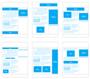 True, advertising is an effective way of expanding your customers reach and take your business ahead. But, overloading your website with a variety of third-party ads can negatively influence the perspective of your customers.
The biggest problem of displaying third-party ads is that in a way you are giving an opportunity to some other brand to make revenue through your website. And the worst part is, the random appearance of these ads generally lead to customer frustration and ultimately force them to navigate off from your website.
4. Font Overload
A clear and well-organized design attracts user’s attraction and therefore it is important to make use of the fonts that give a neat and clean look to your website. You need to ensure that your type appears consistent, so don’t complicate your user’s experience by overburdening your website with loads of different fonts.
As the rule of thumb, make sure you choose one or two readable fonts on your website, which can be used to differentiate and highlight significant areas. This helps your visitors to understand the most important sections of your website and make them grasp the content in the best possible manner.
5. Pages Loading in a Rag-tag Manner
Paying attention to the speed at which your pages are loading in front of the visitors will serve you well. Customers find websites frustrating that take too much time to load or break up while responding. If a website fails to display the key content right to the audience, it can be assumed that the set of code used while developing it are not compatible with all types of browsers, or it can be said that the codes are not organized properly. This type of problems can make a website vulnerable to security attacks and dropping from search engines.
6. Inconsistent Design of Interface
 There is a tendency among web designers to take creative elements to another level by creating different designs for each and every page. This is something that really confuses your visitors, something which is utterly annoying. No matter how attractive and over-the-top website you have designed, if the overall look and feel are not in-tune with each other, users cannot establish any link with the website and feel less committed towards it.
Therefore, it is crucial to make use of a consistent theme in every page provided with the links for the main section of the website. Design should be friendly enough to make your visitors feel controlled and directed towards your website.
7. Outdated or Grammatically Incorrect Content
Websites that include old, outdated content often fail to leave any positive impression in the mind of its users. It is crucial for web owners to ensure that their website uses fresh or updated content for desirable results. Fresh content helps in a good website ranking and also shows your active participation in reaching to your customers.
Not only this, but the content you publish on your website should also be grammatically correct. Make sure you proofread each and every article before publishing it finally.
Conclusion
Your website is your business, therefore it is necessary to show visitors that you are serious about your business by giving them a clean, friendly, and easy to navigate website, thus open up new possibilities for you.