This short write up would be about some interesting technique I stumbled across gradually, about make digital artworks more interesting and less flat. You can apply this to almost all forms of digital artwork (digital painting or digital illustration), where you create the sense of depth and give volume to your subject by putting different shades of same color/hue. It can be applied where you are varying the value and hue too, once you get the underlying principle. To learn more checkout out our Online Digital Painting Course over at LawsOfColor.com on digital drawing and digital painting courses.
Let us take as simple example.
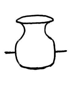
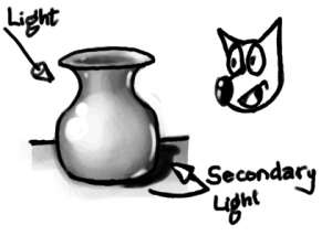
Line Art of a Vase
This is a simple line art of a vase or pot like object. Once you get the shape right, depending on the style or medium, you would start rendering its volume. First a light source is assumed, and color (or gray) is applied with varying value (intensity/shade). In this example let us assume the light source is on the left-top and behind the viewer.
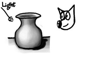
Vase shaded for simple light setup
It is pretty decent depiction of the shape of the vase, due to the varying intensity of light falling on different parts and surfaces. But it still seems to not have that character, and even with proper shading, looks a bit with out depth. The reason for this is, the above shading is not proper. It would have been proper if the vase was floating in empty space with the light source where we have assumed. Even with the shadow draw, it may not look convincing enough as we see in real life. So what are we missing?
The missing render is of, what may be called secondary light. It is the ambient light of the room, or some of the reflected light from the surface the vase is kept on. The moment you depict this secondary light, the artwork gains more character.
Vase shaded for light setup with secondary light
Here, I did exaggerate the light from the secondary source a bit more than I usually would so that it become clear. Observe the rim of reflected light drawn on the right hand surfaces of the vase, which are facing the ground/table.
When doing actual artwork, render the reflected light much lighter than the primary light source. Some times, the scene may have an actual secondary light source. The secondary light source may be almost as intense as the primary, but to get a dramatic artwork, always try to compose a scene having one strong primary light source.
In this example, to make it simple, I showed it in gray scale image. But when color/hue comes into play, the technique becomes even more interesting. Studying other established artists’ works, you can notice that most of them have a secondary light source color to be complementary of the primary light source. This, I think, is done to make an interesting composition by having color contrast in the artwork.
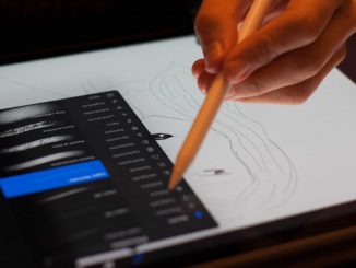
Hey! What’s up! I’d like to talk to you about ways to improve your digital portrait painting skills. Here are the 5 tips or exercises to improve your portrait painting skills in Photoshop digital arts. Let’s get started!
Number 1: Study facial features.
My first tip to improve your portrait painting skills is to do studies of facial features. If you struggle painting lips for example, make a series of lip studies. Even quick and rough studies can help a lot. These quick studies of facial features usually don’t take up too much time so the chance of getting frustrated is smaller.
Number 2: Make a quick sketch.
My next tip is to make quick sketches and set yourself a time limit. Improving your skills is all about practicing, a LOT. Making quick sketches and limiting the time to 10 minutes for example enables you to get a lot of practice in a short amount of time. Also, don’t worry about the end result too much but think about the exercise itself and you are working on improving your skills with every sketch you make.
Number 3: Use the right hues of color.
Of course it is a lot of fun to make colorful portrait work but working in color is a lot harder than working in black and white. Values are extremely important when you want to make realistic portrait paintings. You can use all the right hues of color, but when the value is off the portrait won’t look very realistic. Specially when working with for example a skin palette colors. So working in gray scale is a great practice. When you make value paintings, you can focus more on shapes, edges, details in the facial features, etc. Once you are more confident painting portraits, you can switch to full color paintings or you can use coloring techniques to color your black and white portrait paintings.
Number 4: Learn construction.
My next tip is to learn construction, study the Loomis technique for example. Learning construction like this, helps you to decide where the facial features should be placed in your portrait painting. The head can be divided into three equal parts for example giving you markers for the hairline, the eyebrows and the underside of the nose. Learning techniques like this is a great way to practice measuring in your portraits and doing exercises with these techniques will improve your portrait paintings.
Number 5: Draw over your reference photos.
My final tip is to draw over your reference photos. This is a way to study construction by drawing over a photo and thinking about the basic shapes of the face. There are different ways to use this technique. You can make a rough lay over on your reference photo and copy these lines. You can then use this ‘line art’ to build up your painting, giving yourself a head start. You could also make an even more abstract layover of your reference, using mostly angular shapes. This makes the shapes very simple and easy to duplicate. This time, don’t just copy the line art, but draw it yourself. It is a wonderful exercise to improve your hand eye coordination. Next, you can use this abstract line work to build up your portrait painting. But perhaps you are not too confident about your drawing skills yet. What you can do is make a more detailed line drawing on top of your reference. People might say this is cheating, but I think it’s still a great practice since it will help you understand the structure of the face.
In time you will become more confident and continuously make your steps more challenging. So just go ahead and make the line work as detailed as you feel is needed for your skill level and use that line drawing as a base for your painting.
And remember, you’re not a cheat as long as you don’t claim you drew it by hand. Just enjoy the practice! These were my 5 tips to improve your portrait painting skills. I hope you liked these tips and you have learned from it.
Other great websites and resources: https://medium.com/@jaejohns/10-best-digital-painting-tutorials-to-help-you-paint-like-a-master-30b6b75a34d5
As the technological boundaries shift and bandwidth increases, sites all over the Internet are showcasing Web 2.0 web site design and technologies. The developers in our web design company have years of experience working with a wide variety of programming languages, database technologies, and computer hardware. Whether you’re interested in adding a blog, building a contact form, or redesigning your entire web presence, we can work with you and your technical team to provide a web page design and solution that will seamlessly be integrated into your current site architecture and website design technology.
Custom WordPress Content Management System
While managing your online presence the need may arise to periodically make changes to your site. This is where the need for a content management system comes into play. Also known as a CMS. A web design company can provide you with a full content management system that gives you complete control over your online presence and web page design. We can also work within your existing content management system allowing you to refresh your site’s web page design while maintaining the familiarity of your existing website design and workflow. Find Out More
E-Commerce Web Site Development
The team of experts at San Diego Web Design company will help you get your online store off the ground. By utilizing W3C standards and leading search engine optimization web site design techniques, DesigNirvana ensures that your new eCommerce web site design will not only look and function great, but gives you the ability to gain maximum ROI on your SEO campaigns. We work with all of the popular eCommerce website design platforms including Magento™, Ubercart, Joomla!® and Yahoo!® Merchant Services to name a few. Embark upon your next eCommerce web site design or development project with DesigNirvana.
It would truly be a feat to create a website that is entirely self optimizing, however many companies embark upon website development projects and find out their site’s architecture prevents them from taking full advantage of their search engine optimization campaigns. We pride ourselves in offering search engine friendly web development services that not only engages the user but meets your company’s SEO goals.
At DesigNirvana web development company, our website development services ensure high visibility and traffic to your site first, and then build an engaging user experience on top of that strong, SEO foundation.
If you are in the initial stages of building your website, you are in the perfect position for SEO friendly web development services. Building on a structure of search engine optimization is ideal, and will make any kind of updates easier in the future.
If you have a functioning website that’s been up for several years, it’s not too late – we can help you too! We can restructure your site design for search engine optimization to attract customers, give them a great experience and turn their interest into ROI for your business or company.
Our website development company takes a two-sided approach to our SEO friendly website development services with both web design and web development with an SEO mentality. Our designers create the layout of your site with SEO guidelines in mind, then our web development technicians implement proven SEO techniques that can help put your site at the top of the search engine rankings.
The SEO experts at our web site development company have years of experience working with a wide variety of programming languages, database technologies, and computer hardware. Whether you’re interested in adding a blog, building a contact form, or redesigning your entire web presence, we can work with you and your technical team to provide SEO web development services that will seamlessly be integrated into your current site architecture and technology.
Here we stand at the dawn of yet another year. 2021 saw the birth of some new trends, while some trends disappeared altogether. Although this holds true for every industry, here we are concerned with the ever-evolving world of the Internet where things change constantly. Even as we talk about it right now, new innovations are happening in the online industry. Chula Vista Web design, which is a natural extension of the Internet marketing, or also known as digital marketing is experiencing a revolution of sorts and the coming year will see the culmination of some cool web design trends.
Web design is the most important aspect of a website. Just like everyone having a business, however small or big, needs a website, similarly every website needs good web design. But what exactly makes web design important?
Why do you want to care about web design?
A good web design is as important as having a website itself. Think about it. What is the purpose of your website?
It might be conversion or brand awareness or maybe it is just pure information that you want to provide through the website.
Whatever might be the intention, your efforts should be on providing the visitors with quick and easy access to what they came looking for. And this is why good web design matters. Whenever a visitor comes to your website he already knows what he is there for and the landing page should be able to present him with all that without him even requiring scrolling. A good design facilitates a similar end result creating a loyal fan following or customer base.
Things that you might consider including in your web design in 2021
With the evolution of technology, there are certain necessary amendments required to keep websites relevant and consumer friendly. The emergence of mobile is the biggest game changer that has transformed the web design industry in the last few years. As more people use smartphones and other mobile devices like tablets for accessing the web, designers are adopting new techniques and trends for meeting the new challenges. If you are a website owner, here are some of the changes that you also might consider including in the coming year:
Infinite scrolling:
Infinite scrolling is one of the most acclaimed techniques in the world of web design, and yet we are still far away from witnessing widespread adoption of it in websites. Also known as endless scrolling or continuous scrolling, the technique auto loads the content of second page when the user reaches at the bottom of the page so that it is not necessary to look for pagination buttons to go to the next part. From the current notable examples, Facebook Newsfeed uses it. This scrolling was also a feature of Apple’s iBook 3.0 where the reader could easily go through a bestseller using vertical scrolling.
Handwritten fonts & Flat design:
In the age of social media, adding a personal touch to every communication is the latest fad. Its obvious advantage is the feeling that it comes directly from a person and not a computer or robotic device. Such personalization has always been welcomed in the world of signage and sign companies.
It wouldn’t be wrong to say that 2019 was the year of flat design. When a whole operating system (Windows 8) is modeled on the principles of flat design, you can easily predict the importance and the bright future associated with it. Apple went flat with its iOS7 which featured a complete flat design overhaul and it has quickly crept into website design. The benefits are more than just visual appeal. It also boosts the existing performance level.
Responsive mobile design:
Much has already been said about the importance of responsive design. Mobile traffic now accounts for more than one-third of the total website traffic and it’s only going to increase in 2019. Earlier mobile-specific websites were created to address these consumers, which needed a separate design team, server space and maintenance costs. However, with responsive design, it all boiled down to sticking to specific CSS and HTML5 codes so as to make a site react as per the screen size on which it is being viewed. Not only does it reduce the expenses of maintaining a separate website, it also lends it a professional aura. 2019 will make RWD the de facto standard rather than an anomaly in website designing.
Drupal is a free and open-source content management system (CMS) coded purely in PHP and distributed under the GNU General Public License. More than 2.1% of all websites worldwide are running on Drupal ranging from personal blogs to corporate, political, and government sites including whitehouse.gov and data.gov.uk. It is also used for knowledge management and business collaboration. Drupal is highly customizable and easy to use even for people with very limited knowledge in web design. The user interface is really simple and comprehensible to common people.
The strength of Drupal as a CMS is mainly the community support, it is supported across globally by a large community of developers and designers who are specializing in Drupal framework.
With Drupal themes, we can easily and very quickly change the look and feel of the site with just a button click. There are a large number of free quality Drupal themes available online for download from various sources including the official Drupal theme directory. Finding uniquely beautiful and professional looking themes from the chunk of themes is really tough at times. So, here we have collected more than 15 beautiful and quality free Drupal themes which you can use in your next Drupal project.
1. Creative Theme
Creative Theme is a very clean and modern business and portfolio Drupal 7 theme that is perfect for any small or large business website, corporate or portfolio. I have created this theme with a focus on simplicity. If you want a very clean yet powerful website, Creative Theme might be the theme you seek.
2. Magazeen Lite
Magazeen Lite by More than (just) Themes is based on the WordPress’ Magazeen theme plus the addition of a slideshow, which was created by the talented WeFunction Design Agency for Smashing Magazine and its readers.
Magazeen Lite theme has been ported to Drupal and is supported by More than (just) Themes, as part of our ongoing effort to bring top quality themes to Drupal community.
3. Journal Crunch
JournalCruch for Drupal by More than (just) Themes is based on the WordPress’ JournalCruch theme, which was designed by Site5 for Smashing Magazine and its readers.
JournalCruch has been ported to Drupal and is supported by More than (just) Themes, as part of our ongoing effort to bring quality themes to Drupal community.
4. TB Methys
Looking for refreshment in Drupal theme? This may be your choice.
TB Methys is designed in simple and bold style: bold font set and wide slideshow. Furthermore, it supports multi-color skin tone, which gives more choices to customize the theme.
TB Methys comes with a set of features as you know from our Drupal themes. TB Methys is the first theme supporting multi-color serving for fashion and live style content.
5. Fold
Fold is a fixed width (980px) theme. The theme is not dependent on any core theme or module. Its very lightweight with a modern look.
6. Corporate Clean
Corporate Clean for Drupal by More than (just) Themes is based on the homonymous PSD template, which was designed and published by Zsolt Kacso.
Corporate Clean theme has been ported to Drupal and is supported by More than (just) Themes, as part of our ongoing effort to bring top quality themes to Drupal community. Corporate Clean theme 7.x-2.x releases come with a responsive grid layout.
7. Acquia Prosper
Acquia Prosper is an advanced Drupal theme by TopNotchThemes, with a monochromatic look and clean lines. It is designed as an Ubercart e-commerce theme that is easy to customize but is extremely flexible for any type of site.
8. TB Sirate
Impress your business partners with a well-organized, an informative online profile and a professional look. Clean layout and lightweight code make TB Sirate becomes a great theme for small, medium-sized businesses or big corporations to get up and run quickly. TB Sirate features as a sub-theme of Drupal Nucleus.
9. TB Blog
TB Blog is the easiest way to get your Drupal Journal started. It is kept very airy and simple with the subtle body background texture. You can post blog entries with preformatted image styles, auto-resizing thumbnails.
Are you interested in starting a forum as well? This theme gives Drupal’s default forum the look people feel more familiar interacting with, try it out.
10. Plasma
Plasma is a Drupal 7 theme by DrupalYag.
Plasma is a fixed width (980px) theme. The theme is not dependent on any core theme. Its very lightweight for fast loading with a modern look.
11. TB Neris
Neris is a clean business portfolio theme with a modern and simple touch. A highlight for your products and services on the web.
12. Rave
Looking for a site to publish news or built your magazine site, this Drupal theme TB Rave will be a perfect suit.
TB Rave supports great articles posting, pop-up photos viewing, forum, twitter buzz and many more. Along with the clean and simple design, all in one site to give you the best experience of a magazine, news site could do.
With Multi-color feature, TB Rave gives you the best choices to quickly change colors of theme as well as customize it.
13. ImpreZZ
ImpreZZ for Drupal is based on the WordPress theme ImpreZZ, which was created by ProductiveDreams for Smashing Magazine.
ImpreZZ has been ported to Drupal and is supported by More than Themes, as part of our ongoing effort to bring quality WP themes to Drupal.
14. Touch
Touch is a great looking Drupal 7 theme. The theme is not dependent on any core theme.
Its very lightweight with a modern look and feel.
15. Skeleton
Skeleton theme for Drupal by More than (just) Themes is a responsive theme, built upon the Skeleton Boilerplate. It has been inspired by the excellent Skeleton WordPress theme, which was designed by Simple themes.
16. BlueMasters
BlueMasters for Drupal by More than (just) Themes is based on the homonymous PSD template, which was designed by Wendell Fernandes and released for Smashing Magazine and its readers.
Web design is the paramount that helps attain the viewer’s attention and keep them engaged with a website. An outdated web design will eventually push your website down in ranking and thus, will affect your site’s potential traffic.
Though, it is quite hard to keep pace with the ever-fluctuating web design trends but, it’s extremely essential to make your website boast a visually appealing and trendy design in order to maintain a successful online presence.
With the advancement in the Internet and mobile technology, today, we have truckloads of devices in the market that possesses different platforms, screen size, hardware, and software. The current designing trends including Responsive and Adaptive designs allow websites to easily target a huge user base who access them through diverse devices. However since no UX (user experience) is the same as the other, there has to be some other way out to ensure ultimate UX.
How about stopping the guesswork and letting users decide the course of a website design?
You can keep the creative control to yourself, but allow your users to tinker around the display specs of your website. But, more on that later. Let us first go back to the more popular approaches and take it off from there.
Responsive Designs
It is true that, with the evolution of Smartphones and other Internet-enabled devices, the number of access made to websites from mobile devices has increased exponentially, and this is only expected to continue. Hence, optimizing the web content for mobile devices would be a great idea. This is where the idea of responsive designs came into, according to this web design, a website must adapt itself to the screen sizes of the targeted devices. The primary aim is to make a website automatically adapt to the layout changes from a device to another (which exhibits different display sizes and device-specific capabilities).
The responsive web design concept allows auto-simplification of multiple column layouts into a few column layouts depending upon the available screen size. Unlike traditional graphic designs, this approach separates the web content and its presentation. For responding to any display size, developers can implement standard CSS3 media queries. It includes a flexible grid layout, instead of fixed grids.
This approach is quite popular and has been adopted by several global companies including Boston Globe, American Express, and more.
Adaptive Designs
Defining another essential User Experience (UX) element, the Adaptive Designs refers to the progressive enhancement of a website. It aims at delivering responsive design at the client side by following several resourceful tactics. This design is ideal for creating an adaptive web content that can be easily shared or distributed across any platform.
This approach includes content re-usability, assiduous content structure, integration of resourceful metadata, implementation of an absolute Content Management System (CMS), etc.
If you consider the emerging designs of the latest mobile devices, it can be observed that there are two trends that are being followed by mobile devices. It is that the Smartphone and tablets like mobile devices say that “bigger is better”, on the contrary, the devices like wearable follow “smaller is simpler” approach.
Adjustive Designs
In order to stand up to the expectations of all the different types of mobile devices and to make strive for an absolute UX, here we are pondering into a better approach, which is known as Adjustive design.
Adjustive Web Designs are ideal for designing a website with a feature that enables the user to adjust certain aspects layout in a desirable fashion in order to access the site with greater convenience. It basically includes the key aspects of Adaptive content and follows the responsive approach to represent the web content while auto adjusting to the targeted screen sizes.
For instance, accessing some UI elements on the large-screen mobile devices (including tablets, “phablets”, etc.) could be a daunting task for hands. The fix-positioned hamburger-style site header (or any other responsively adjusted UI control) won’t ensure easy accessibility to a user.
However, with the Adjustive web design approach, you can allow your website users to adjust (relocate) the crucial UI elements at an easily accessible location on their mobile screen. Thus, they can have a more intuitive and interesting UI.
With the rapid improvements in the mobile realm, especially considering the User Experience, it is essential to make strives to enhance the online content to successfully reach a huge audience base of mobile users. To target the gigantic mobile market that features numerous screen sizes, platform capabilities, etc., you must deploy a web design that is simple, intuitive, adjustive and updated with the latest trend.
The fluctuating user behavior and web trends, one ensure that their site possesses an optimized designing approach and frameworks. Adapting the pace with which the technology is advancing will help you ensure a powerful and successful presence in the market.
It freaks you out when you get interrupted by your senior designer just when you are about to do some awesome things with Photoshop. Yeah, this is a part of a website designer’s life. Every day we have to deal with extreme pressure, not to mention chasing insane target, and yet, people expect us to be creative 24×7 as if we are some sort of Martians. Well, we are not whining all the time. Work pressure is something normal with any creative work and definitely, we are not against this; rather what makes our job all the more difficult is the designing constraints. There are so many creative constraints in web design that make it tough for a designer to come up with something truly inspiring.
But constraints are not necessarily bad. They may look liked barbed wires restraining your movements and your creative freedom but in reality, they are not. They are the best tools for creativity. They challenge you and get the best out of you by pitting you in a position where you can let your creative part go wild. And because of these constraints, you will be trying to do new things and continue making experiments with the design part unless and until you come up with something aesthetically pleasing.
What these restrictions are?
Restrictions vary project wise. But there are certain restrictions that we have to encounter in almost all projects irrespective of their nature and clients’ specifications. Following are some basic constraints that trouble almost all web designers irrespective of the project scope –
* Timeline
* Preferences of the client
* Expectation of the Customer
* Browser restrictions
* Screen Size restrictions
* Our own personal preference
* Our inability to work on certain platforms
* Software restrictions
However, no matter how long this list of these restrictions may appear, these restrictions are not necessarily a bad thing. These restrictions will put you in a challenging position and thereby instigating you to rise above adversaries and deliver your best.
Too Much Freedom is certainly not A Great Thing
Freedom is all we desire. But in some cases, too much freedom can lead to trouble especially when you are in a creative domain. Chances are that when you are given unbridled freedom; you might get yourself lost in its vastness or vagueness. For say, if the client only says that he needs a great design and nothing else, will you be able to come up with anything? Definitely not, because the client has failed to specify in clear English, what he actually wants. So, if he has given some sort of specification like what he wants in the design and what he does not want, it will be easier for you to come up with something creative.
In short, restrictions help you stay focused and do our job the best way possible; without these restrictions, you will not be able to concentrate and waste your precise time on things that may not be related to the project. Here are the following benefits of restrictions that even the strongest supporters of freedom and democracy cannot rule out:
* Making it easier to take quick decision
* It helps us focus on things we are assigned with
* Increases precision
* It draws out our best
Take you out of our comfort Zone
Designing a website with a subtle touch of creativity is certainly not an easy feat. Now, staying creative 24×7 is super tough and definitely not something for the faint-hearted. So, the easiest way to stay creative is to eliminate the unwanted distractions that come thick and fast whenever you hit the work desk. The best way you can eliminate these distractions is by imposing self restrictions. These restrictions will not let you go wild while designing templates and speed up the process. And you may never know these restrictions may help you rise above everything and excel in your field.
You can even try new things like. You can impose a few more restrictions in a designing project apart from all those already set by the client just to challenge yourself a bit. You may never know you might be able to come up with something more interesting and awesome that you might have imaged ever. You can try any of these followings and I hope, it will get you out of your comfort zone:
* Using only standard web fonts
* Using only illustrator and no Photoshop
* No images above the fold
When you will be imposing restrictions like these, you will be entrusted with the responsibility of doing something great with the available resources. And because of the limitation of resources, you will have to do something extraordinary with the available options and probably, this will lead to the birth of something awesome.
So, hopefully, you have come to realize the importance of restrictions in a creative process.
It can be very much stated that the bygone years have been the years of flat design. All have been busy trying different levels of flat design and trust us, flat design is ever trending and seems to continue doing so. If you are also one of them who is ready to get started but are unsure about how you would go about it, we are there to help you explore them out right away.
If you are interested in swimming out a bit deeper and test out the flat design waters, here we go.
Flat design
So what is flat design? It is actually something that has the ability to trick and help the designers create a three-dimensional or even a realistic effect. This is one style that is often characterized by the minimalistic look and the muted and bold colors. Flat designs use typography that is simple along with simple icons and buttons. These often include drop shadows, artificial textures, and gradients.
Flat design can be held responsible for bringing back the emphasis on the minimalist design and have contributed in changing the attitude of the designers who have not been using the flat style techniques. They have returned back to the simple and the most basic typography. The emphasis is more on the sharp shapes and lines.
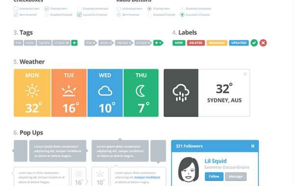
User interface kits
They are simply one of the best and greatest ways to get started on the flat design projects. When you are looking for trends, these kits can help you save time. A lot of user interface kits are available in PSD file formats and can be edited, provided you feel comfortable with the software. The options are growing with time and in the time to come, you will get plenty of them.
Don’t focus too much on the color while you choose one among the kits. A lot of kits are known to use colors that can be termed as ‘usable’ but the color scheme can be changed with just a few clicks. Pay attention to the saturation and contrast.
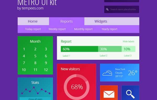
Metro UI kit
It is one of the brighter, beautiful and colorful kits that one can put into use. These have simple typography, attractive and colorful blocks and lot more interesting elements. It rules the usability factor when it comes to colors and style. This is also one kit that includes the chart, menus, icons, calendar, stats, and the search elements.
Polaris UI
These have a good range of panels and buttons and contain some of the exclusive features in the flat design. These kits include plenty of elements so enjoy and have fun.
LIL UI kit
These have so many interesting elements and matched pieces and are definitely a treat for all who are willing to put them into use. These do include almost 18 categories of elements. Vector kit in this is known to be customizable and it was specifically designed keeping the visual consistency and simplicity in mind.
Erste UI
These contain a good number of basic elements such as the menus, media player and the social login buttons. Colors are one of the important and crucial characteristics of the flat design and are known to put primary hues palettes into use.
Flat UI kit
These kits contain a huge number of elements right from the interesting navigation to the drop-down menus and ecommerce modules to the social sharing tools and a lot more. With this kit at service, you are up for getting spoiled.
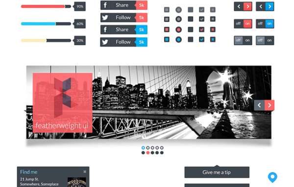
Featherweight UI
It is a simple UI kit that includes simple icons, photo scroll, menus, and scroll widgets. It has the capability of playing more retro color allowing people to choose from one of their favorite themes out there. Even though the kit is not that large, you can still expect it to be elegant in terms of style and substance.
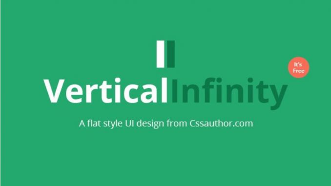
Vertical infinity
It is by the CSS author and also retina-ready. It should also be added that it is one of the biggest free kits that are available in the current time. It is highly manageable and actually includes plenty of other features such as the drop-down menus, widget formation and social icons and a lot more. It has a style that can actually be called “basic” without actually incorporating loads of extras. The good thing with these is that these can be easily used in almost any kind of application.
You can also grab the easily available free icons and most of the kits are available for almost free. A lot of those icons are specifically designed keeping the mobile device applications in mind. On the other hand, these icons can also serve plenty of other purposes and can go on to making some of the great and really amazing website buttons. While you are choosing them, make sure that you look for kits that do contain icons in different size options good enough to meet your requirements. However, when used too large, they can also lead to loss of quality.
Mind mapping is a visual rendition of information via a diagram. Mind mapping is usually used for sketching out a plan, brainstorm ideas or to create concentrate guidelines as to how to materialize a plan. Generally, a single word or idea is placed at the center of a mind map and other texts and ideas are then interwoven and added to that mind map. This gives a vivid visual presentation of how an idea can be materialized. This is much more effective than presenting raw data in some boring format that has some kind of sleep-inducing effects on the targeted audience.
Everyone needs to organize ideas and find connections and associations at some point in time. And nothing’s better at organizing ideas than a visual format. But doing it on paper is too cumbersome to make it of any real use.
Mind mapping is especially important for web designers, whether the task at hand is a simple logo design or a complex app development. The good news is that a host of mind mapping tools makes it easier to do it without a hitch.
Let’s take a look at the popular and preferred tools you can use for mind mapping.
Bubbl.us
Bubbl.us is a free, web app that helps you create a mind-map the simple and easy way. All you need is Flash-player. The practical functionality of the tool makes it apt for mapping out ideas in a linear branching manner.
Coggle
Coggle is another free online app that lets you create a visual mind-map you can view on the website while you collaborate with others. The custom color schemes, image support and detailed history of additions and alterations make it one ideal tool.
FreeMind
FreeMind is a free tool for cross-platform usage as long as Java is available. The effective set of features and varied export choices make it ideal whether you work alone or collaborate with colleagues.
i2Brain
i2Brain lets you divide every mind-map you create into separate phases. This makes it possible to work on a single phase at one time or view it as an entire map complete with all the phases.
iMindMap
iMindMap is another tool of the same category as FreeMind. The best feature of this tool is that it mimics the non-linear thought process of the brain. This makes it quite an appropriate option for web designers.
Mapul
Mapul is a web-based service that lets you generate original, hand-drawn mind map renderings. It is a subscription-based option. But you can test-drive it from mapmyself.com. Once you are satisfied, get the Silverlight plug-in to use it.
MindMeister
MindMeister offers an enhanced set of features and functionalities for both Android and iOS. You must choose the subscription option based on the support level you desire to access and the output formats you require. But you do get a free trial period before that.
MindCad
MindCad is an app suitable for Mac only. The feature that makes it suitable for your mind-mapping necessities is its capability to link to your website, desktop, other sites and documents.
MindNode
MindNode is ideal for Apple devices. The minimalist UI lets the mind-map to be at the focus while the branches irrelevant to your present work disappear. Seamless integration between desktop and mobile versions and different export options also make it perfect.
MindPlan
MindPlan is available at no cost for personal use. It has the capability to integrate with Lotus Notes with ease. It also offers the option of XML import and export for the mind-maps you create.
StormBoard
StormBoard is a web app that works across devices. The HTML5 app offers a great way to collaborate and also has some singular output or mapping options. You may get it at no cost for up to five users, but you need to get a subscription for more users.
TopicScape
TopicScape is a unique mind mapping tool that offers a 3D view of the branching. This landscape like visual makes it much easier for you to get a glimpse of every relevant detail at once.
WiseMapping
WiseMapping is an open-source mind-mapping app based on HTML5. This makes it possible for your web developer to add and alter it to suit specific requirements. It’s available on their website and also for closed intranets.
Wridea
Wridea is more of an assortment of useful tools to make online idea management and collaboration easy. With this free, web app you can capture and develop ideas. It isn’t a strictly mind-mapping tool though.
XMind
XMind is available as open source and free to download. It supports the Office formats; so, you can export the mind-maps directly. It also enables to output in formats readable with competing tools. It can render a Gantt chart and deal with multiple media types.
Choose one that works for you and organize your ideas with ease and efficacy.
Developing websites and applications for the mobile audience is quite different from developing the same for the desktop/laptop/tablet users. Whether you’re building a website/application for yourself or your clients, you need to be aware of this thin line of difference between developing for mobile audience and for the laptop/desktop customers. Increasing customer loyalty and adding revenue have always been the sole reasons behind website/web app development. As an alert entrepreneur, you need to opt for a web development platform that renders you the flexibility of meeting both these reasons with excellence. With a wide range of web-based content management systems available in the web market, choosing the right one is a tedious job.
Drupal is one of the most renowned web development platforms used for building simple as well as complex websites and web applications. The question here is whether Drupal can serve as the right software for building mobile websites and web applications? Well, this blog is an answer to this question which often arises in the minds of people who’ve loved Drupal for developing desktop websites/web apps but are quite dicy about using it for building mobile responsive website/web applications.
Drupal- Offering a nice separation between content and presentation
Every good website needs to have well-streamlined content. In addition to this, there must be a nice separation between content and presentation. Drupal comes with modules/extensions that allow you to have full control over the content and its presentation for both standards as well as mobile websites. If you surf the internet, you’ll come across a large number of mobile modules that allow you to have a stable version of your website that runs flawlessly on both desktops/laptops as well as smartphones.
Drupal- Offering flexibility of serving multiple domains via a single site
Every website owner wants to have a unique domain for standard as well as the mobile version of his/her portal. Drupal comes with the flexibility of serving different domains from the same site: Domain Access. The webmaster just needs to enable Domain Access for receiving two separate versions of the website. After receiving the versions, he/she can easily set different themes for each of them, followed by customizing the same to suit the preferences of site visitors. And that’s not all, there are tons of other Drupal modules that can well be integrated with Domain Access for rendering options that can ensure the effective functioning of your website/web application.
Drupal encompasses reduced deployment time
One of the distinct advantages of using Drupal for building a mobile app is the reduced deployment time. Since the developed mobile app already has a companion Drupal site for traditional web browsers, you can expect it to reach a larger audience within a short span of time. The best part of Drupal powered mobile apps is that you need not worry about their compatibility with the traditional web browsers. The mobile responsive themes of these Drupal apps allow you to stay worry-free about building a native app that’s compatible with the older web browsers. The web version of the respective Drupal app is readily available just by requesting the specific URL.
Once you’re familiar with the target mobile browsers, integrating mobile features into the Drupal site becomes simple and can be easily performed with the help of following modules:
Browscap– This is a module that will assist you in detecting the browser type.
Mobile Tools– This module helps you with browser detection, redirection to mobile site and theme switching that’s based on the device type.
Mobile Plugin– This is a handy module for detecting the device and performing image scaling.
WURFL– This is a module that detects mobile device capabilities.
Mobile jQuery Theme– This is a theming module that utilizes jQuery Mobile framework for theming.
Mobile– This is yet another theming module that can be used as a custom theme base.
Fusion Mobile– This is a Fusion Core sub-theme that’s targeted for mobile users.
Buzz around Drupal and mobile is getting bigger and better
Considering all the aforementioned factors, it’s quite simple to say that the buzz around Drupal and mobile is getting better with each passing day. It’s hard to imagine a single day wherein developers will be building apps using the mobile IDEs. Whether it’s about making code edits to a module file or committing codes via your phone, Drupal has built-in features that allow you to perform all this and much more.
Conclusion
From everything mentioned above, it’s quite clear that Drupal has the potential to contain your content, user management, business logic, and search functionality. With the never-ending demand for mobile apps development, the usage of Drupal will definitely witness an incredible amount of popularity.
 Number 3: Use the right hues of color.
 My final tip is to draw over your reference photos. This is a way to study construction by drawing over a photo and thinking about the basic shapes of the face. There are different ways to use this technique. You can make a rough lay over on your reference photo and copy these lines. You can then use this ‘line art’ to build up your painting, giving yourself a head start. You could also make an even more abstract layover of your reference, using mostly angular shapes. This makes the shapes very simple and easy to duplicate. This time, don’t just copy the line art, but draw it yourself. It is a wonderful exercise to improve your hand eye coordination. Next, you can use this abstract line work to build up your portrait painting. But perhaps you are not too confident about your drawing skills yet. What you can do is make a more detailed line drawing on top of your reference. People might say this is cheating, but I think it’s still a great practice since it will help you understand the structure of the face.
 While managing your online presence the need may arise to periodically make changes to your site. This is where the need for a content management system comes into play. Also known as a CMS. A web design company can provide you with a full content management system that gives you complete control over your online presence and web page design. We can also work within your existing content management system allowing you to refresh your site’s web page design while maintaining the familiarity of your existing website design and workflow. Find Out More
 At DesigNirvana web development company, our website development services ensure high visibility and traffic to your site first, and then build an engaging user experience on top of that strong, SEO foundation.
 A good web design is as important as having a website itself. Think about it. What is the purpose of your website?
 In the age of social media, adding a personal touch to every communication is the latest fad. Its obvious advantage is the feeling that it comes directly from a person and not a computer or robotic device. Such personalization has always been welcomed in the world of signage and sign companies.
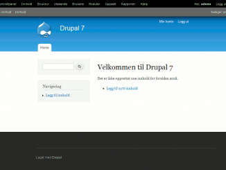
 Creative Theme is a very clean and modern business and portfolio Drupal 7 theme that is perfect for any small or large business website, corporate or portfolio. I have created this theme with a focus on simplicity. If you want a very clean yet powerful website, Creative Theme might be the theme you seek.
 Acquia Prosper is an advanced Drupal theme by TopNotchThemes, with a monochromatic look and clean lines. It is designed as an Ubercart e-commerce theme that is easy to customize but is extremely flexible for any type of site.
 ImpreZZ for Drupal is based on the WordPress theme ImpreZZ, which was created by ProductiveDreams for Smashing Magazine.
 It is true that, with the evolution of Smartphones and other Internet-enabled devices, the number of access made to websites from mobile devices has increased exponentially, and this is only expected to continue. Hence, optimizing the web content for mobile devices would be a great idea. This is where the idea of responsive designs came into, according to this web design, a website must adapt itself to the screen sizes of the targeted devices. The primary aim is to make a website automatically adapt to the layout changes from a device to another (which exhibits different display sizes and device-specific capabilities).
 Defining another essential User Experience (UX) element, the Adaptive Designs refers to the progressive enhancement of a website. It aims at delivering responsive design at the client side by following several resourceful tactics. This design is ideal for creating an adaptive web content that can be easily shared or distributed across any platform.
 In order to stand up to the expectations of all the different types of mobile devices and to make strive for an absolute UX, here we are pondering into a better approach, which is known as Adjustive design.
 Restrictions vary project wise. But there are certain restrictions that we have to encounter in almost all projects irrespective of their nature and clients’ specifications. Following are some basic constraints that trouble almost all web designers irrespective of the project scope –
 Designing a website with a subtle touch of creativity is certainly not an easy feat. Now, staying creative 24×7 is super tough and definitely not something for the faint-hearted. So, the easiest way to stay creative is to eliminate the unwanted distractions that come thick and fast whenever you hit the work desk. The best way you can eliminate these distractions is by imposing self restrictions. These restrictions will not let you go wild while designing templates and speed up the process. And you may never know these restrictions may help you rise above everything and excel in your field.
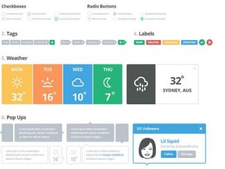

 Bubbl.us
 iMindMap
 MindCad
 StormBoard
 XMind
XMind
 Every good website needs to have well-streamlined content. In addition to this, there must be a nice separation between content and presentation. Drupal comes with modules/extensions that allow you to have full control over the content and its presentation for both standards as well as mobile websites. If you surf the internet, you’ll come across a large number of mobile modules that allow you to have a stable version of your website that runs flawlessly on both desktops/laptops as well as smartphones.