This short write up would be about some interesting technique I stumbled across gradually, about make digital artworks more interesting and less flat. You can apply this to almost all forms of digital artwork (digital painting or digital illustration), where you create the sense of depth and give volume to your subject by putting different shades of same color/hue. It can be applied where you are varying the value and hue too, once you get the underlying principle. To learn more checkout out our Online Digital Painting Course over at LawsOfColor.com on digital drawing and digital painting courses.
Let us take as simple example.
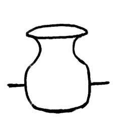
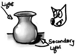
Line Art of a Vase
This is a simple line art of a vase or pot like object. Once you get the shape right, depending on the style or medium, you would start rendering its volume. First a light source is assumed, and color (or gray) is applied with varying value (intensity/shade). In this example let us assume the light source is on the left-top and behind the viewer.
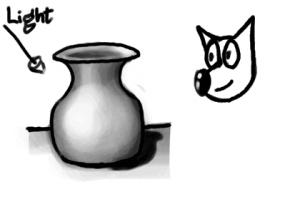
Vase shaded for simple light setup
It is pretty decent depiction of the shape of the vase, due to the varying intensity of light falling on different parts and surfaces. But it still seems to not have that character, and even with proper shading, looks a bit with out depth. The reason for this is, the above shading is not proper. It would have been proper if the vase was floating in empty space with the light source where we have assumed. Even with the shadow draw, it may not look convincing enough as we see in real life. So what are we missing?
The missing render is of, what may be called secondary light. It is the ambient light of the room, or some of the reflected light from the surface the vase is kept on. The moment you depict this secondary light, the artwork gains more character.
Vase shaded for light setup with secondary light
Here, I did exaggerate the light from the secondary source a bit more than I usually would so that it become clear. Observe the rim of reflected light drawn on the right hand surfaces of the vase, which are facing the ground/table.
When doing actual artwork, render the reflected light much lighter than the primary light source. Some times, the scene may have an actual secondary light source. The secondary light source may be almost as intense as the primary, but to get a dramatic artwork, always try to compose a scene having one strong primary light source.
In this example, to make it simple, I showed it in gray scale image. But when color/hue comes into play, the technique becomes even more interesting. Studying other established artists’ works, you can notice that most of them have a secondary light source color to be complementary of the primary light source. This, I think, is done to make an interesting composition by having color contrast in the artwork.
It freaks you out when you get interrupted by your senior designer just when you are about to do some awesome things with Photoshop. Yeah, this is a part of a website designer’s life. Every day we have to deal with extreme pressure, not to mention chasing insane target, and yet, people expect us to be creative 24×7 as if we are some sort of Martians. Well, we are not whining all the time. Work pressure is something normal with any creative work and definitely, we are not against this; rather what makes our job all the more difficult is the designing constraints. There are so many creative constraints in web design that make it tough for a designer to come up with something truly inspiring.
But constraints are not necessarily bad. They may look liked barbed wires restraining your movements and your creative freedom but in reality, they are not. They are the best tools for creativity. They challenge you and get the best out of you by pitting you in a position where you can let your creative part go wild. And because of these constraints, you will be trying to do new things and continue making experiments with the design part unless and until you come up with something aesthetically pleasing.
What these restrictions are?
Restrictions vary project wise. But there are certain restrictions that we have to encounter in almost all projects irrespective of their nature and clients’ specifications. Following are some basic constraints that trouble almost all web designers irrespective of the project scope –
* Timeline
* Preferences of the client
* Expectation of the Customer
* Browser restrictions
* Screen Size restrictions
* Our own personal preference
* Our inability to work on certain platforms
* Software restrictions
However, no matter how long this list of these restrictions may appear, these restrictions are not necessarily a bad thing. These restrictions will put you in a challenging position and thereby instigating you to rise above adversaries and deliver your best.
Too Much Freedom is certainly not A Great Thing
Freedom is all we desire. But in some cases, too much freedom can lead to trouble especially when you are in a creative domain. Chances are that when you are given unbridled freedom; you might get yourself lost in its vastness or vagueness. For say, if the client only says that he needs a great design and nothing else, will you be able to come up with anything? Definitely not, because the client has failed to specify in clear English, what he actually wants. So, if he has given some sort of specification like what he wants in the design and what he does not want, it will be easier for you to come up with something creative.
In short, restrictions help you stay focused and do our job the best way possible; without these restrictions, you will not be able to concentrate and waste your precise time on things that may not be related to the project. Here are the following benefits of restrictions that even the strongest supporters of freedom and democracy cannot rule out:
* Making it easier to take quick decision
* It helps us focus on things we are assigned with
* Increases precision
* It draws out our best
Take you out of our comfort Zone
Designing a website with a subtle touch of creativity is certainly not an easy feat. Now, staying creative 24×7 is super tough and definitely not something for the faint-hearted. So, the easiest way to stay creative is to eliminate the unwanted distractions that come thick and fast whenever you hit the work desk. The best way you can eliminate these distractions is by imposing self restrictions. These restrictions will not let you go wild while designing templates and speed up the process. And you may never know these restrictions may help you rise above everything and excel in your field.
You can even try new things like. You can impose a few more restrictions in a designing project apart from all those already set by the client just to challenge yourself a bit. You may never know you might be able to come up with something more interesting and awesome that you might have imaged ever. You can try any of these followings and I hope, it will get you out of your comfort zone:
* Using only standard web fonts
* Using only illustrator and no Photoshop
* No images above the fold
When you will be imposing restrictions like these, you will be entrusted with the responsibility of doing something great with the available resources. And because of the limitation of resources, you will have to do something extraordinary with the available options and probably, this will lead to the birth of something awesome.
So, hopefully, you have come to realize the importance of restrictions in a creative process.
It can be very much stated that the bygone years have been the years of flat design. All have been busy trying different levels of flat design and trust us, flat design is ever trending and seems to continue doing so. If you are also one of them who is ready to get started but are unsure about how you would go about it, we are there to help you explore them out right away.
If you are interested in swimming out a bit deeper and test out the flat design waters, here we go.
Flat design
So what is flat design? It is actually something that has the ability to trick and help the designers create a three-dimensional or even a realistic effect. This is one style that is often characterized by the minimalistic look and the muted and bold colors. Flat designs use typography that is simple along with simple icons and buttons. These often include drop shadows, artificial textures, and gradients.
Flat design can be held responsible for bringing back the emphasis on the minimalist design and have contributed in changing the attitude of the designers who have not been using the flat style techniques. They have returned back to the simple and the most basic typography. The emphasis is more on the sharp shapes and lines.
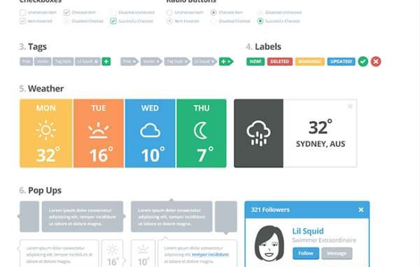
User interface kits
They are simply one of the best and greatest ways to get started on the flat design projects. When you are looking for trends, these kits can help you save time. A lot of user interface kits are available in PSD file formats and can be edited, provided you feel comfortable with the software. The options are growing with time and in the time to come, you will get plenty of them.
Don’t focus too much on the color while you choose one among the kits. A lot of kits are known to use colors that can be termed as ‘usable’ but the color scheme can be changed with just a few clicks. Pay attention to the saturation and contrast.
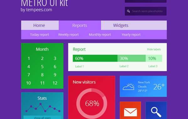
Metro UI kit
It is one of the brighter, beautiful and colorful kits that one can put into use. These have simple typography, attractive and colorful blocks and lot more interesting elements. It rules the usability factor when it comes to colors and style. This is also one kit that includes the chart, menus, icons, calendar, stats, and the search elements.
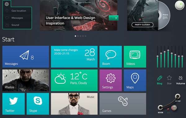
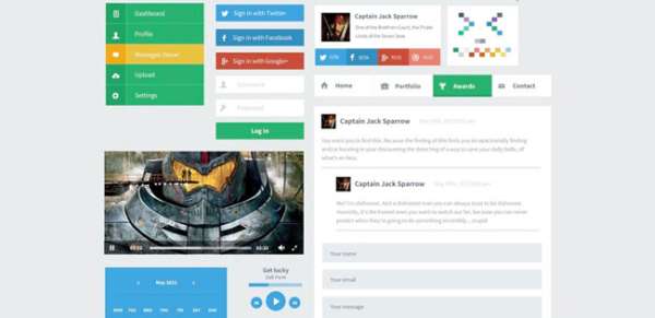
Polaris UI
These have a good range of panels and buttons and contain some of the exclusive features in the flat design. These kits include plenty of elements so enjoy and have fun.
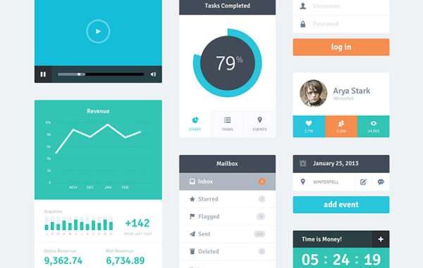
LIL UI kit
These have so many interesting elements and matched pieces and are definitely a treat for all who are willing to put them into use. These do include almost 18 categories of elements. Vector kit in this is known to be customizable and it was specifically designed keeping the visual consistency and simplicity in mind.
Erste UI
These contain a good number of basic elements such as the menus, media player and the social login buttons. Colors are one of the important and crucial characteristics of the flat design and are known to put primary hues palettes into use.
Flat UI kit
These kits contain a huge number of elements right from the interesting navigation to the drop-down menus and ecommerce modules to the social sharing tools and a lot more. With this kit at service, you are up for getting spoiled.
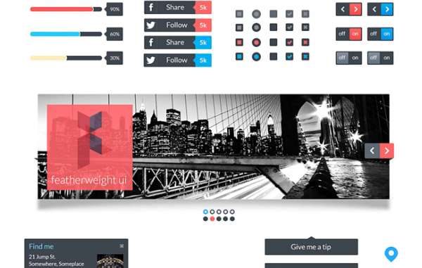
Featherweight UI
It is a simple UI kit that includes simple icons, photo scroll, menus, and scroll widgets. It has the capability of playing more retro color allowing people to choose from one of their favorite themes out there. Even though the kit is not that large, you can still expect it to be elegant in terms of style and substance.
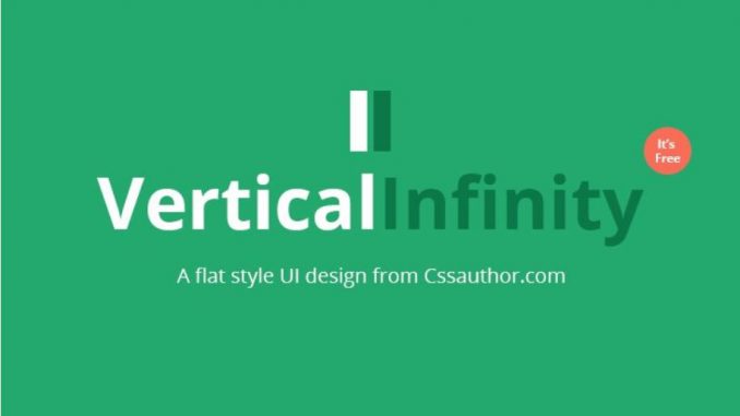
Vertical infinity
It is by the CSS author and also retina-ready. It should also be added that it is one of the biggest free kits that are available in the current time. It is highly manageable and actually includes plenty of other features such as the drop-down menus, widget formation and social icons and a lot more. It has a style that can actually be called “basic” without actually incorporating loads of extras. The good thing with these is that these can be easily used in almost any kind of application.
You can also grab the easily available free icons and most of the kits are available for almost free. A lot of those icons are specifically designed keeping the mobile device applications in mind. On the other hand, these icons can also serve plenty of other purposes and can go on to making some of the great and really amazing website buttons. While you are choosing them, make sure that you look for kits that do contain icons in different size options good enough to meet your requirements. However, when used too large, they can also lead to loss of quality.
The world of web design is evolving at a faster rate, making the emergence and fading away of different web design trends. Originally coined in the print design industry, whitespace is a design element which has gathered a tremendous amount of recognition among website designers residing in different parts of the world. Keep on reading this post as I’ll be unveiling everything about whitespaces and their role in enhancing the overall usability of the website.
What are Whitespaces?
Popularly known as negative spaces, white spaces are basically the portions of a web page which have been left unmarked or blank. To put it simply, white spaces are the spaces between graphics, images, columns, margins, graphics and a collection of elements spread all over the web page. These are the spaces which have been left untouched intentionally, so as to make the page more readable and thoroughly understandable.
Unleashing the potential of Whitespaces in enhancing a website’s usability
Whitespaces are in a way the welcoming signals for website visitors, encouraging them to stay on the site for longer durations of time.
Here’s a look at some of the ways in which including whitespaces in your web design can increase the user experience for your website:
1. Enhanced readability is guaranteed with the use of whitespaces
The more readable your site is, the more number of customers you can expect to visit your site on a regular basis. Well, content readability depends on a number of factors including font size and color, font type, text structure and many more. With the use of whitespaces, you can easily organize the arrangement and alignment of different text elements, right from large paragraphs to single letters.
2. Whitespaces add an emotional touch to your design
White spaces don’t necessarily have to be white in color. They can be of any color or pattern you like. Since background colors have a huge emotional effect on us, you can conveniently opt for using parallax scrolling for adding interactivity in your designs. Moreover, the tone that you set for your whitespaces will play a pivotal role in affecting the way site visitors receive your content. Considered as an autonomous design element, whitespace undoubtedly has a brilliant effect on your design.
3. A high level of comprehension is guaranteed with the use of whitespaces
As per recent research, it has been found that white spaces have the capability of increasing comprehension by a whopping 20%. By including white spaces around the text blocks and between paragraphs, you can easily improve the understandability of your web pages.
4. Whitespaces come with a contemporary look and feel
A web page filled with the right quantity of whitespaces can easily enhance the usability of your site. Moreover, it can also add to its visual appeal in the most refined manner. Ever since the trend of minimalistic websites has come under focus, whitespaces have been regarded as the best tools for achieving a perfect trustworthy look for the sites. Specifically talking about e-commerce websites, rendering extra space to the display of products makes them look stunning and more tempting.
5. Logical grouping becomes feasible with the use of whitespaces
Irrespective of the main theme behind your site, there are situations when you need to group some particular names, categories etc. It is here that the role of whitespaces comes to play. By adding white spaces between different lists, you can opt for creating groups which are fully logical and easy-to-interpret.
6. Legibility of a web page is determined by the use of whitespaces
Using white spaces at the micro level i.e. during kerning, leading or tracking can easily help in improving or destroying the web page legibility. If you need to accommodate a lot of content in a small amount of space, all you need to do is simply increase the leading or tracking for making the text easier-to-read.
7. Maintaining tidiness throughout the web pages is possible with whitespaces
It is with the correct use of whitespaces that your site can attain that perfect tidy look and feel. Apart from choosing the right layout or color scheme, including the white spaces in the right proportion can add a unique tint of individuality into your website.
Wrapping Up
There have always been arguments regarding the significance and usage of whitespaces. Here’s hoping after reading this post, you’d have gathered a detailed understanding of the same for all your upcoming web design ventures.
Buying and selling are no longer a haggle and waggle process. We have reached to such an advanced level of web development that we are not just using it for doing our work easy, but to disseminate and cater clients of business outright. To sell better, online sellers are now delving into neuromarketing to expand their customer and are covering intricate nuances that can plausibly affect the buying decision of a user. One of the important factors is color.
The first impression is the last impression! Quite a cliché, but you cannot ignore this, and I am not the only one saying this, as a study tells the same.
“If a good color sells, the right color sells better.”
Color theory is a proper guide to mixing proper color to come up with a proper color scheme that can help us to create imposing web designs. It is not just the functionalities that work in tandem, but even the colors also work in tandem to create an imposing effect on your website.
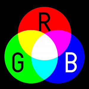
Color theory is a comprehensive guide that allows the users to pick up colors. Colors are further classified into three categories such as primary, secondary and tertiary and are also defined accordingly.
This is not a new concept, as it was discovered back then in c.1435 in the journals of Leone Battista Alberti and then in c.1490 in the writings of Leonardo da Vinci. However, the vision sciences and colorimetry gained grounds back in the eighteenth century.
Now in this century, we have come across the fact that colors invoke emotion and affect the purchasing decision of buyers.
Basic issues in the Color Theory
Pure or ideal colors were the basis on which the color theory was built, and it was dependent on the sensory experience rather than considering the attributes of the physical world. This has resulted in the inclusion of several inaccuracies in the theory, and this cannot be at times not remedied in the modern usage as well.
One of the most important problems is the mixing of the behavior of light mixtures, and they are known as the additive colors. Further, the mixtures of paint, ink, dye or pigment mixtures are called as subtractive colors. The prime reason for this is that the there are different rules that work between light by which light gets absorbed by material substances.
The second problem is that it does not describe the luminance contrast in which a surface reflects a color which is different from the color of lights. For instance, we have colors such as ochres that cannot appear in the mixture of light. Due to strong brightness and lightness contrast, there are times when colors appear different from what they actually are.
Lastly, the third problem is the tendency to elaborate the holistic effect of colors. For instance, the contract between “blue” and “yellow” is perceived as generic colors. Mostly the color in contrasts are based on three attributes that are:
lightness (which can be said as light vs. dark),
saturation
hue or color (e.g., red, orange, yellow, green, blue or purple).
Color harmony
All in all our basic motive as a web designer is to bring the colors in harmony, which implies that when the colors are seen together, they tend to produce a pleasing effect on the viewers’ eyes. Though achieving color harmony is quite a complex task as colors have a cognitive as well as an effective impact on users, and thus, emotions come in to play while judging things.
The way we respond to color and the impact of color harmony brings us to a series of different factors. Further, these factors are categorized into individual differences such as personal likings, monetary condition, gender, age, and others. Further, there are places where colors also invoke social stigmas depending on the religious or cultural beliefs of people. This must also be put into consideration which picking up your hues.
Along with this, the context has always played a crucial role in the response to users and color harmony. Moreover, factors such as emerging trend and perceptions that affect the human responses,
Mentioned below is the model to with the color harmony nowadays:
{Color harmony} = f(text{Col} 1, 2, 3, dots, n) cdot (ID + CE + CX + P + T)
Function (f) denotes color harmony within colors that are specified as (Col 1, 2, 3, …, n) and the factors that impinge positive responses.
ID- stands for individual differences
CE- cultural experience
CX- context
P- obtrusive perceptual effects
T- time as in the trends that are in vogue.
How many colors should you use?
Picking a color for your website is quite a contentious questions as there might be situations where the designer do not like a particular color or you being the website owner do not like what the designer has picked up for you.
However, it has been recommending using only to use three colors that must be quite visible to the website. One of the most logical ideas behind this is that the lesser color you use, the lesser efforts you need to put in while bringing all these color in harmony.
As designing is a part of aesthetics which means that while designing a website we can take inspiration from the famous 60-30-10 rule used by fashion and interior designers.
As per the rule, you need to select three odd colors and when it comes to usage make sure that you use to incorporate them in a ratio of 60%, 30% and 10% on your website.
This means 60% of your website will be using that particular color which is also referred to as the primary color or the overall tone in which your website will be painted.
The second color that will cover the 30% of your websites needs to be a contrasting color of the primary color and this will create a visually striking appearance.
The last color that will cover 10% of your website is termed as ‘accent color’, and this color needs to complement any of the two colors.
Tools for making your task a tad easier:
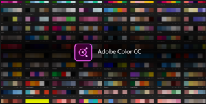
Adobe Color CC
Adobe Color CC formerly known as Adobe Kuler is an incredible tool to select a color scheme for your website. It is a web-based tool that can select a theme for your website. Though they have changed the name of the tool, the nature of the tool remains the same. Color CC allows you to create multiple themes, and each of these themes comprises of five colors. You can get desktop versions as well as browser-hosted sites. Those who have used a desktop version can directly import the color scheme formulated by this software into their designing software such as Photoshop, InDesign or any other.
Check my Colors
To check whether you have chosen the right color combination for your web design then you can make use of this incredible tool. Using this tool you can check the background and foreground color of DOM elements. This also helps to find out the contrast when viewed by a differently abled person. This software is created by Giovanni Scala, who happens to be a web designer and uses algorithms that are attested by World Wide Web Consortium.
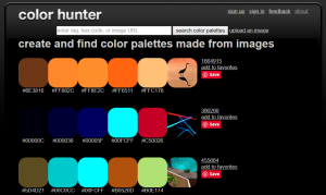
Color Hunter
Color Hunter renders a color palette that can be of your chosen image.
In the beginning, the tool would not be work apparently quite effective. However, it is helpful in finding out a particular color if you cannot find one. What you can do is to enter that you like into Color Hunter, and then you can use this tool to create a color palette from the image that you have picked up.
Isn’t it an amazing tool to create one’s own custom theme.
All in all!
Be it an automatic design tool or your choice you need to make sure that you create the best possible impact on users. To master the art of persuasion as a developer you need to make sure to cast a good impression on your users. To attract the users, you can make use of color as bait.
This Case Study is a guest post written by a Senior Web developer. In this hyper-interactive, IT space you need to only look for comprehensive custom web Development not just of high aesthetic value, but one that renders incredible functionality.

 Restrictions vary project wise. But there are certain restrictions that we have to encounter in almost all projects irrespective of their nature and clients’ specifications. Following are some basic constraints that trouble almost all web designers irrespective of the project scope –
 Designing a website with a subtle touch of creativity is certainly not an easy feat. Now, staying creative 24×7 is super tough and definitely not something for the faint-hearted. So, the easiest way to stay creative is to eliminate the unwanted distractions that come thick and fast whenever you hit the work desk. The best way you can eliminate these distractions is by imposing self restrictions. These restrictions will not let you go wild while designing templates and speed up the process. And you may never know these restrictions may help you rise above everything and excel in your field.
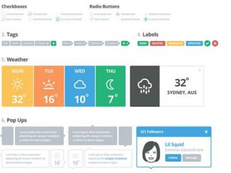

 What are Whitespaces?
 2. Whitespaces add an emotional touch to your design
 5. Logical grouping becomes feasible with the use of whitespaces
 7. Maintaining tidiness throughout the web pages is possible with whitespaces