This short write up would be about some interesting technique I stumbled across gradually, about make digital artworks more interesting and less flat. You can apply this to almost all forms of digital artwork (digital painting or digital illustration), where you create the sense of depth and give volume to your subject by putting different shades of same color/hue. It can be applied where you are varying the value and hue too, once you get the underlying principle. To learn more checkout out our Online Digital Painting Course over at LawsOfColor.com on digital drawing and digital painting courses.
Let us take as simple example.
Line Art of a Vase
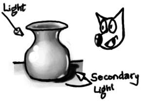
This is a simple line art of a vase or pot like object. Once you get the shape right, depending on the style or medium, you would start rendering its volume. First a light source is assumed, and color (or gray) is applied with varying value (intensity/shade). In this example let us assume the light source is on the left-top and behind the viewer.
Vase shaded for simple light setup
It is pretty decent depiction of the shape of the vase, due to the varying intensity of light falling on different parts and surfaces. But it still seems to not have that character, and even with proper shading, looks a bit with out depth. The reason for this is, the above shading is not proper. It would have been proper if the vase was floating in empty space with the light source where we have assumed. Even with the shadow draw, it may not look convincing enough as we see in real life. So what are we missing?
The missing render is of, what may be called secondary light. It is the ambient light of the room, or some of the reflected light from the surface the vase is kept on. The moment you depict this secondary light, the artwork gains more character.
Vase shaded for light setup with secondary light
Here, I did exaggerate the light from the secondary source a bit more than I usually would so that it become clear. Observe the rim of reflected light drawn on the right hand surfaces of the vase, which are facing the ground/table.
When doing actual artwork, render the reflected light much lighter than the primary light source. Some times, the scene may have an actual secondary light source. The secondary light source may be almost as intense as the primary, but to get a dramatic artwork, always try to compose a scene having one strong primary light source.
In this example, to make it simple, I showed it in gray scale image. But when color/hue comes into play, the technique becomes even more interesting. Studying other established artists’ works, you can notice that most of them have a secondary light source color to be complementary of the primary light source. This, I think, is done to make an interesting composition by having color contrast in the artwork.
Hey! What’s up! I’d like to talk to you about ways to improve your digital portrait painting skills. Here are the 5 tips or exercises to improve your portrait painting skills in Photoshop digital arts. Let’s get started!
Number 1: Study facial features.
My first tip to improve your portrait painting skills is to do studies of facial features. If you struggle painting lips for example, make a series of lip studies. Even quick and rough studies can help a lot. These quick studies of facial features usually don’t take up too much time so the chance of getting frustrated is smaller.
Number 2: Make a quick sketch.
My next tip is to make quick sketches and set yourself a time limit. Improving your skills is all about practicing, a LOT. Making quick sketches and limiting the time to 10 minutes for example enables you to get a lot of practice in a short amount of time. Also, don’t worry about the end result too much but think about the exercise itself and you are working on improving your skills with every sketch you make.
Number 3: Use the right hues of color.
Of course it is a lot of fun to make colorful portrait work but working in color is a lot harder than working in black and white. Values are extremely important when you want to make realistic portrait paintings. You can use all the right hues of color, but when the value is off the portrait won’t look very realistic. Specially when working with for example a skin palette colors. So working in gray scale is a great practice. When you make value paintings, you can focus more on shapes, edges, details in the facial features, etc. Once you are more confident painting portraits, you can switch to full color paintings or you can use coloring techniques to color your black and white portrait paintings.
Number 4: Learn construction.
My next tip is to learn construction, study the Loomis technique for example. Learning construction like this, helps you to decide where the facial features should be placed in your portrait painting. The head can be divided into three equal parts for example giving you markers for the hairline, the eyebrows and the underside of the nose. Learning techniques like this is a great way to practice measuring in your portraits and doing exercises with these techniques will improve your portrait paintings.
Number 5: Draw over your reference photos.
My final tip is to draw over your reference photos. This is a way to study construction by drawing over a photo and thinking about the basic shapes of the face. There are different ways to use this technique. You can make a rough lay over on your reference photo and copy these lines. You can then use this ‘line art’ to build up your painting, giving yourself a head start. You could also make an even more abstract layover of your reference, using mostly angular shapes. This makes the shapes very simple and easy to duplicate. This time, don’t just copy the line art, but draw it yourself. It is a wonderful exercise to improve your hand eye coordination. Next, you can use this abstract line work to build up your portrait painting. But perhaps you are not too confident about your drawing skills yet. What you can do is make a more detailed line drawing on top of your reference. People might say this is cheating, but I think it’s still a great practice since it will help you understand the structure of the face.
In time you will become more confident and continuously make your steps more challenging. So just go ahead and make the line work as detailed as you feel is needed for your skill level and use that line drawing as a base for your painting.
And remember, you’re not a cheat as long as you don’t claim you drew it by hand. Just enjoy the practice! These were my 5 tips to improve your portrait painting skills. I hope you liked these tips and you have learned from it.
Other great websites and resources: https://medium.com/@jaejohns/10-best-digital-painting-tutorials-to-help-you-paint-like-a-master-30b6b75a34d5
Buying and selling are no longer a haggle and waggle process. We have reached to such an advanced level of web development that we are not just using it for doing our work easy, but to disseminate and cater clients of business outright. To sell better, online sellers are now delving into neuromarketing to expand their customer and are covering intricate nuances that can plausibly affect the buying decision of a user. One of the important factors is color.
The first impression is the last impression! Quite a cliché, but you cannot ignore this, and I am not the only one saying this, as a study tells the same.
“If a good color sells, the right color sells better.”
Color theory is a proper guide to mixing proper color to come up with a proper color scheme that can help us to create imposing web designs. It is not just the functionalities that work in tandem, but even the colors also work in tandem to create an imposing effect on your website.
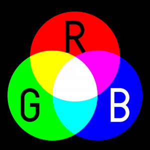
Color theory is a comprehensive guide that allows the users to pick up colors. Colors are further classified into three categories such as primary, secondary and tertiary and are also defined accordingly.
This is not a new concept, as it was discovered back then in c.1435 in the journals of Leone Battista Alberti and then in c.1490 in the writings of Leonardo da Vinci. However, the vision sciences and colorimetry gained grounds back in the eighteenth century.
Now in this century, we have come across the fact that colors invoke emotion and affect the purchasing decision of buyers.
Basic issues in the Color Theory
Pure or ideal colors were the basis on which the color theory was built, and it was dependent on the sensory experience rather than considering the attributes of the physical world. This has resulted in the inclusion of several inaccuracies in the theory, and this cannot be at times not remedied in the modern usage as well.
One of the most important problems is the mixing of the behavior of light mixtures, and they are known as the additive colors. Further, the mixtures of paint, ink, dye or pigment mixtures are called as subtractive colors. The prime reason for this is that the there are different rules that work between light by which light gets absorbed by material substances.
The second problem is that it does not describe the luminance contrast in which a surface reflects a color which is different from the color of lights. For instance, we have colors such as ochres that cannot appear in the mixture of light. Due to strong brightness and lightness contrast, there are times when colors appear different from what they actually are.
Lastly, the third problem is the tendency to elaborate the holistic effect of colors. For instance, the contract between “blue” and “yellow” is perceived as generic colors. Mostly the color in contrasts are based on three attributes that are:
lightness (which can be said as light vs. dark),
saturation
hue or color (e.g., red, orange, yellow, green, blue or purple).
Color harmony
All in all our basic motive as a web designer is to bring the colors in harmony, which implies that when the colors are seen together, they tend to produce a pleasing effect on the viewers’ eyes. Though achieving color harmony is quite a complex task as colors have a cognitive as well as an effective impact on users, and thus, emotions come in to play while judging things.
The way we respond to color and the impact of color harmony brings us to a series of different factors. Further, these factors are categorized into individual differences such as personal likings, monetary condition, gender, age, and others. Further, there are places where colors also invoke social stigmas depending on the religious or cultural beliefs of people. This must also be put into consideration which picking up your hues.
Along with this, the context has always played a crucial role in the response to users and color harmony. Moreover, factors such as emerging trend and perceptions that affect the human responses,
Mentioned below is the model to with the color harmony nowadays:
{Color harmony} = f(text{Col} 1, 2, 3, dots, n) cdot (ID + CE + CX + P + T)
Function (f) denotes color harmony within colors that are specified as (Col 1, 2, 3, …, n) and the factors that impinge positive responses.
ID- stands for individual differences
CE- cultural experience
CX- context
P- obtrusive perceptual effects
T- time as in the trends that are in vogue.
How many colors should you use?
Picking a color for your website is quite a contentious questions as there might be situations where the designer do not like a particular color or you being the website owner do not like what the designer has picked up for you.
However, it has been recommending using only to use three colors that must be quite visible to the website. One of the most logical ideas behind this is that the lesser color you use, the lesser efforts you need to put in while bringing all these color in harmony.
As designing is a part of aesthetics which means that while designing a website we can take inspiration from the famous 60-30-10 rule used by fashion and interior designers.
As per the rule, you need to select three odd colors and when it comes to usage make sure that you use to incorporate them in a ratio of 60%, 30% and 10% on your website.
This means 60% of your website will be using that particular color which is also referred to as the primary color or the overall tone in which your website will be painted.
The second color that will cover the 30% of your websites needs to be a contrasting color of the primary color and this will create a visually striking appearance.
The last color that will cover 10% of your website is termed as ‘accent color’, and this color needs to complement any of the two colors.
Tools for making your task a tad easier:
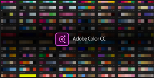
Adobe Color CC
Adobe Color CC formerly known as Adobe Kuler is an incredible tool to select a color scheme for your website. It is a web-based tool that can select a theme for your website. Though they have changed the name of the tool, the nature of the tool remains the same. Color CC allows you to create multiple themes, and each of these themes comprises of five colors. You can get desktop versions as well as browser-hosted sites. Those who have used a desktop version can directly import the color scheme formulated by this software into their designing software such as Photoshop, InDesign or any other.
Check my Colors
To check whether you have chosen the right color combination for your web design then you can make use of this incredible tool. Using this tool you can check the background and foreground color of DOM elements. This also helps to find out the contrast when viewed by a differently abled person. This software is created by Giovanni Scala, who happens to be a web designer and uses algorithms that are attested by World Wide Web Consortium.
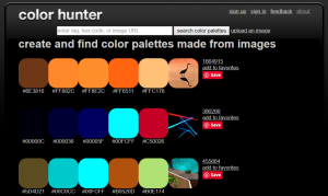
Color Hunter
Color Hunter renders a color palette that can be of your chosen image.
In the beginning, the tool would not be work apparently quite effective. However, it is helpful in finding out a particular color if you cannot find one. What you can do is to enter that you like into Color Hunter, and then you can use this tool to create a color palette from the image that you have picked up.
Isn’t it an amazing tool to create one’s own custom theme.
All in all!
Be it an automatic design tool or your choice you need to make sure that you create the best possible impact on users. To master the art of persuasion as a developer you need to make sure to cast a good impression on your users. To attract the users, you can make use of color as bait.
This Case Study is a guest post written by a Senior Web developer. In this hyper-interactive, IT space you need to only look for comprehensive custom web Development not just of high aesthetic value, but one that renders incredible functionality.


 Number 3: Use the right hues of color.
 My final tip is to draw over your reference photos. This is a way to study construction by drawing over a photo and thinking about the basic shapes of the face. There are different ways to use this technique. You can make a rough lay over on your reference photo and copy these lines. You can then use this ‘line art’ to build up your painting, giving yourself a head start. You could also make an even more abstract layover of your reference, using mostly angular shapes. This makes the shapes very simple and easy to duplicate. This time, don’t just copy the line art, but draw it yourself. It is a wonderful exercise to improve your hand eye coordination. Next, you can use this abstract line work to build up your portrait painting. But perhaps you are not too confident about your drawing skills yet. What you can do is make a more detailed line drawing on top of your reference. People might say this is cheating, but I think it’s still a great practice since it will help you understand the structure of the face.