web design san diego

Web Design, Digital Marketing and PPC

February 26, 2020 DESIGNirvana 0

Web Site Development and Design (UI/UX)

As the technological boundaries shift and bandwidth increases, sites all over the Internet are showcasing Web 2.0 web site design and technologies. The developers in our web design company have years of experience working with a wide variety of programming languages, database technologies, and computer hardware. Whether you’re interested in adding a blog, building a contact form, or redesigning your entire web presence, we can work with you and your technical team to provide a web page design and solution that will seamlessly be integrated into your current site architecture and website design technology.

Custom WordPress Content Management System

WordPress Content Management SystemWhile managing your online presence the need may arise to periodically make changes to your site. This is where the need for a content management system comes into play. Also known as a CMS. A web design company can provide you with a full content management system that gives you complete control over your online presence and web page design. We can also work within your existing content management system allowing you to refresh your site’s web page design while maintaining the familiarity of your existing website design and workflow. Find Out More

E-Commerce Web Site Development

The team of experts at San Diego Web Design company will help you get your online store off the ground. By utilizing W3C standards and leading search engine optimization web site design techniques, DesigNirvana ensures that your new eCommerce web site design will not only look and function great, but gives you the ability to gain maximum ROI on your SEO campaigns. We work with all of the popular eCommerce website design platforms including Magento™, Ubercart, Joomla!® and Yahoo!® Merchant Services to name a few. Embark upon your next eCommerce web site design or development project with DesigNirvana.

It would truly be a feat to create a website that is entirely self optimizing, however many companies embark upon website development projects and find out their site’s architecture prevents them from taking full advantage of their search engine optimization campaigns. We pride ourselves in offering search engine friendly web development services that not only engages the user but meets your company’s SEO goals.

SEO friendly web development servicesAt DesigNirvana web development company, our website development services ensure high visibility and traffic to your site first, and then build an engaging user experience on top of that strong, SEO foundation.

If you are in the initial stages of building your website, you are in the perfect position for SEO friendly web development services. Building on a structure of search engine optimization is ideal, and will make any kind of updates easier in the future.

If you have a functioning website that’s been up for several years, it’s not too late – we can help you too! We can restructure your site design for search engine optimization to attract customers, give them a great experience and turn their interest into ROI for your business or company.

Our website development company takes a two-sided approach to our SEO friendly website development services with both web design and web development with an SEO mentality. Our designers create the layout of your site with SEO guidelines in mind, then our web development technicians implement proven SEO techniques that can help put your site at the top of the search engine rankings.

The SEO experts at our web site development company have years of experience working with a wide variety of programming languages, database technologies, and computer hardware. Whether you’re interested in adding a blog, building a contact form, or redesigning your entire web presence, we can work with you and your technical team to provide SEO web development services that will seamlessly be integrated into your current site architecture and technology.


How to create a 2021-ready website?

December 29, 2018 DESIGNirvana 0

Here we stand at the dawn of yet another year. 2021 saw the birth of some new trends, while some trends disappeared altogether. Although this holds true for every industry, here we are concerned with the ever-evolving world of the Internet where things change constantly.  Even as we talk about it right now, new innovations are happening in the online industry. Chula Vista Web design, which is a natural extension of the Internet marketing, or also known as digital marketing is experiencing a revolution of sorts and the coming year will see the culmination of some cool web design trends.

Web design is the most important aspect of a website. Just like everyone having a business, however small or big, needs a website, similarly every website needs good web design. But what exactly makes web design important?

Why do you want to care about web design?

A good web design is as important as having a website itself. Think about it. What is the purpose of your website?

It might be conversion or brand awareness or maybe it is just pure information that you want to provide through the website.

Whatever might be the intention, your efforts should be on providing the visitors with quick and easy access to what they came looking for. And this is why good web design matters. Whenever a visitor comes to your website he already knows what he is there for and the landing page should be able to present him with all that without him even requiring scrolling. A good design facilitates a similar end result creating a loyal fan following or customer base.

Things that you might consider including in your web design in 2021

With the evolution of technology, there are certain necessary amendments required to keep websites relevant and consumer friendly. The emergence of mobile is the biggest game changer that has transformed the web design industry in the last few years.  As more people use smartphones and other mobile devices like tablets for accessing the web, designers are adopting new techniques and trends for meeting the new challenges. If you are a website owner, here are some of the changes that you also might consider including in the coming year:

Infinite scrolling:

Infinite scrolling is one of the most acclaimed techniques in the world of web design, and yet we are still far away from witnessing widespread adoption of it in websites.  Also known as endless scrolling or continuous scrolling, the technique auto loads the content of second page when the user reaches at the bottom of the page so that it is not necessary to look for pagination buttons to go to the next part.  From the current notable examples, Facebook Newsfeed uses it. This scrolling was also a feature of Apple’s iBook 3.0 where the reader could easily go through a bestseller using vertical scrolling.

Handwritten fonts & Flat design:

In the age of social media, adding a personal touch to every communication is the latest fad. Its obvious advantage is the feeling that it comes directly from a person and not a computer or robotic device. Such personalization has always been welcomed in the world of signage and sign companies.

It wouldn’t be wrong to say that 2019 was the year of flat design. When a whole operating system (Windows 8) is modeled on the principles of flat design, you can easily predict the importance and the bright future associated with it. Apple went flat with its iOS7 which featured a complete flat design overhaul and it has quickly crept into website design. The benefits are more than just visual appeal. It also boosts the existing performance level.

Responsive mobile design:

Much has already been said about the importance of responsive design. Mobile traffic now accounts for more than one-third of the total website traffic and it’s only going to increase in 2019. Earlier mobile-specific websites were created to address these consumers, which needed a separate design team, server space and maintenance costs. However, with responsive design, it all boiled down to sticking to specific CSS and HTML5 codes so as to make a site react as per the screen size on which it is being viewed. Not only does it reduce the expenses of maintaining a separate website, it also lends it a professional aura. 2019 will make RWD the de facto standard rather than an anomaly in website designing.

Collection of 15+ uniquely beautiful & professional free Drupal themes

December 26, 2018 DESIGNirvana 0

Drupal is a free and open-source content management system (CMS) coded purely in PHP and distributed under the GNU General Public License. More than 2.1% of all websites worldwide are running on Drupal ranging from personal blogs to corporate, political, and government sites including whitehouse.gov and data.gov.uk. It is also used for knowledge management and business collaboration. Drupal is highly customizable and easy to use even for people with very limited knowledge in web design. The user interface is really simple and comprehensible to common people.

The strength of Drupal as a CMS is mainly the community support, it is supported across globally by a large community of developers and designers who are specializing in Drupal framework.

With Drupal themes, we can easily and very quickly change the look and feel of the site with just a button click. There are a large number of free quality Drupal themes available online for download from various sources including the official Drupal theme directory. Finding uniquely beautiful and professional looking themes from the chunk of themes is really tough at times. So, here we have collected more than 15 beautiful and quality free Drupal themes which you can use in your next Drupal project.

1. Creative Theme

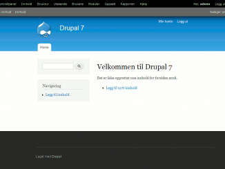
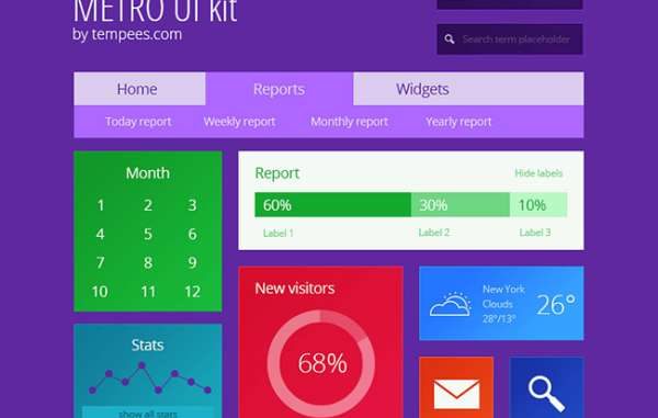
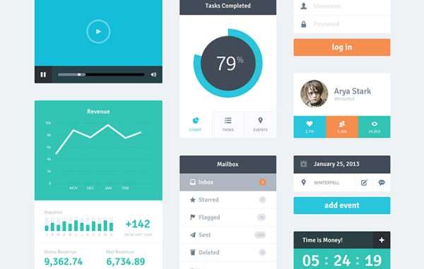
Creative Theme is a very clean and modern business and portfolio Drupal 7 theme that is perfect for any small or large business website, corporate or portfolio. I have created this theme with a focus on simplicity. If you want a very clean yet powerful website, Creative Theme might be the theme you seek.

2. Magazeen Lite

Magazeen Lite by More than (just) Themes is based on the WordPress’ Magazeen theme plus the addition of a slideshow, which was created by the talented WeFunction Design Agency for Smashing Magazine and its readers.

Magazeen Lite theme has been ported to Drupal and is supported by More than (just) Themes, as part of our ongoing effort to bring top quality themes to Drupal community.

3. Journal Crunch

JournalCruch for Drupal by More than (just) Themes is based on the WordPress’ JournalCruch theme, which was designed by Site5 for Smashing Magazine and its readers.

JournalCruch has been ported to Drupal and is supported by More than (just) Themes, as part of our ongoing effort to bring quality themes to Drupal community.

4. TB Methys

Looking for refreshment in Drupal theme? This may be your choice.

TB Methys is designed in simple and bold style: bold font set and wide slideshow. Furthermore, it supports multi-color skin tone, which gives more choices to customize the theme.

TB Methys comes with a set of features as you know from our Drupal themes. TB Methys is the first theme supporting multi-color serving for fashion and live style content.

5. Fold

Fold is a fixed width (980px) theme. The theme is not dependent on any core theme or module. Its very lightweight with a modern look.

6. Corporate Clean

Corporate Clean for Drupal by More than (just) Themes is based on the homonymous PSD template, which was designed and published by Zsolt Kacso.

Corporate Clean theme has been ported to Drupal and is supported by More than (just) Themes, as part of our ongoing effort to bring top quality themes to Drupal community. Corporate Clean theme 7.x-2.x releases come with a responsive grid layout.

7. Acquia Prosper

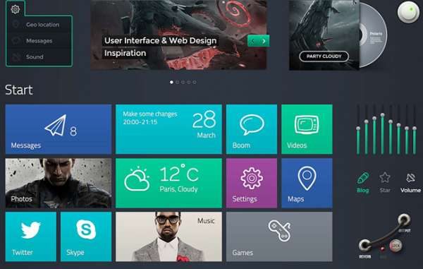
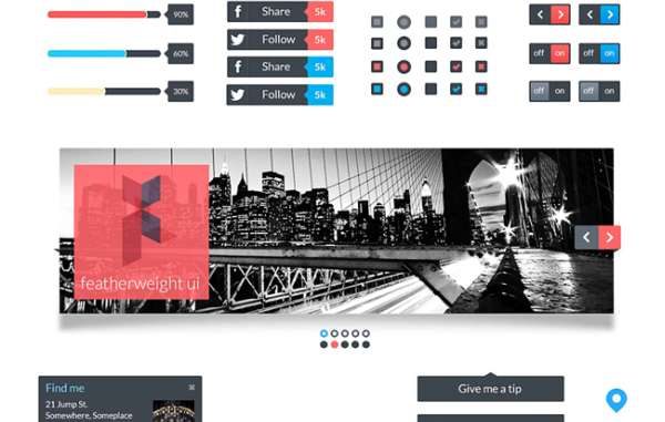
Acquia Prosper is an advanced Drupal theme by TopNotchThemes, with a monochromatic look and clean lines. It is designed as an Ubercart e-commerce theme that is easy to customize but is extremely flexible for any type of site.

8. TB Sirate

Impress your business partners with a well-organized, an informative online profile and a professional look. Clean layout and lightweight code make TB Sirate becomes a great theme for small, medium-sized businesses or big corporations to get up and run quickly. TB Sirate features as a sub-theme of Drupal Nucleus.

9. TB Blog

TB Blog is the easiest way to get your Drupal Journal started. It is kept very airy and simple with the subtle body background texture. You can post blog entries with preformatted image styles, auto-resizing thumbnails.

Are you interested in starting a forum as well? This theme gives Drupal’s default forum the look people feel more familiar interacting with, try it out.

10. Plasma

Plasma is a Drupal 7 theme by DrupalYag.

Plasma is a fixed width (980px) theme. The theme is not dependent on any core theme. Its very lightweight for fast loading with a modern look.

11. TB Neris

Neris is a clean business portfolio theme with a modern and simple touch. A highlight for your products and services on the web.

12. Rave

Looking for a site to publish news or built your magazine site, this Drupal theme TB Rave will be a perfect suit.

TB Rave supports great articles posting, pop-up photos viewing, forum, twitter buzz and many more. Along with the clean and simple design, all in one site to give you the best experience of a magazine, news site could do.

With Multi-color feature, TB Rave gives you the best choices to quickly change colors of theme as well as customize it.

13. ImpreZZ

ImpreZZ for Drupal is based on the WordPress theme ImpreZZ, which was created by ProductiveDreams for Smashing Magazine.

ImpreZZ has been ported to Drupal and is supported by More than Themes, as part of our ongoing effort to bring quality WP themes to Drupal.

14. Touch

Touch is a great looking Drupal 7 theme. The theme is not dependent on any core theme.

Its very lightweight with a modern look and feel.

15. Skeleton

Skeleton theme for Drupal by More than (just) Themes is a responsive theme, built upon the Skeleton Boilerplate. It has been inspired by the excellent Skeleton WordPress theme, which was designed by Simple themes.

16. BlueMasters

BlueMasters for Drupal by More than (just) Themes is based on the homonymous PSD template, which was designed by Wendell Fernandes and released for Smashing Magazine and its readers.


Which web design approach will meet the next era of UX

November 28, 2018 DESIGNirvana 0

Web design is the paramount that helps attain the viewer’s attention and keep them engaged with a website. An outdated web design will eventually push your website down in ranking and thus, will affect your site’s potential traffic.

Though, it is quite hard to keep pace with the ever-fluctuating web design trends but, it’s extremely essential to make your website boast a visually appealing and trendy design in order to maintain a successful online presence.

With the advancement in the Internet and mobile technology, today, we have truckloads of devices in the market that possesses different platforms, screen size, hardware, and software. The current designing trends including Responsive and Adaptive designs allow websites to easily target a huge user base who access them through diverse devices. However since no UX (user experience) is the same as the other, there has to be some other way out to ensure ultimate UX.

How about stopping the guesswork and letting users decide the course of a website design?

You can keep the creative control to yourself, but allow your users to tinker around the display specs of your website. But, more on that later. Let us first go back to the more popular approaches and take it off from there.

Responsive Designs

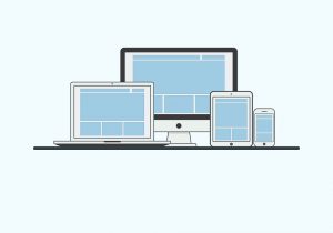
It is true that, with the evolution of Smartphones and other Internet-enabled devices, the number of access made to websites from mobile devices has increased exponentially, and this is only expected to continue. Hence, optimizing the web content for mobile devices would be a great idea. This is where the idea of responsive designs came into, according to this web design, a website must adapt itself to the screen sizes of the targeted devices. The primary aim is to make a website automatically adapt to the layout changes from a device to another (which exhibits different display sizes and device-specific capabilities).

The responsive web design concept allows auto-simplification of multiple column layouts into a few column layouts depending upon the available screen size. Unlike traditional graphic designs, this approach separates the web content and its presentation. For responding to any display size, developers can implement standard CSS3 media queries. It includes a flexible grid layout, instead of fixed grids.

This approach is quite popular and has been adopted by several global companies including Boston Globe, American Express, and more.

Adaptive Designs

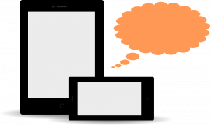
Defining another essential User Experience (UX) element, the Adaptive Designs refers to the progressive enhancement of a website. It aims at delivering responsive design at the client side by following several resourceful tactics. This design is ideal for creating an adaptive web content that can be easily shared or distributed across any platform.

This approach includes content re-usability, assiduous content structure, integration of resourceful metadata, implementation of an absolute Content Management System (CMS), etc.

If you consider the emerging designs of the latest mobile devices, it can be observed that there are two trends that are being followed by mobile devices. It is that the Smartphone and tablets like mobile devices say that “bigger is better”, on the contrary, the devices like wearable follow “smaller is simpler” approach.

Adjustive Designs

In order to stand up to the expectations of all the different types of mobile devices and to make strive for an absolute UX, here we are pondering into a better approach, which is known as Adjustive design.

Adjustive Web Designs are ideal for designing a website with a feature that enables the user to adjust certain aspects layout in a desirable fashion in order to access the site with greater convenience. It basically includes the key aspects of Adaptive content and follows the responsive approach to represent the web content while auto adjusting to the targeted screen sizes.

For instance, accessing some UI elements on the large-screen mobile devices (including tablets, “phablets”, etc.) could be a daunting task for hands. The fix-positioned hamburger-style site header (or any other responsively adjusted UI control) won’t ensure easy accessibility to a user.

However, with the Adjustive web design approach, you can allow your website users to adjust (relocate) the crucial UI elements at an easily accessible location on their mobile screen. Thus, they can have a more intuitive and interesting UI.

With the rapid improvements in the mobile realm, especially considering the User Experience, it is essential to make strives to enhance the online content to successfully reach a huge audience base of mobile users. To target the gigantic mobile market that features numerous screen sizes, platform capabilities, etc., you must deploy a web design that is simple, intuitive, adjustive and updated with the latest trend.

The fluctuating user behavior and web trends, one ensure that their site possesses an optimized designing approach and frameworks. Adapting the pace with which the technology is advancing will help you ensure a powerful and successful presence in the market.


Creative Restraints: Why They Are Not Necessarily Bad

November 26, 2018 DESIGNirvana 0

It freaks you out when you get interrupted by your senior designer just when you are about to do some awesome things with Photoshop. Yeah, this is a part of a website designer’s life. Every day we have to deal with extreme pressure, not to mention chasing insane target, and yet, people expect us to be creative 24×7 as if we are some sort of Martians. Well, we are not whining all the time. Work pressure is something normal with any creative work and definitely, we are not against this; rather what makes our job all the more difficult is the designing constraints. There are so many creative constraints in web design that make it tough for a designer to come up with something truly inspiring.

But constraints are not necessarily bad. They may look liked barbed wires restraining your movements and your creative freedom but in reality, they are not. They are the best tools for creativity. They challenge you and get the best out of you by pitting you in a position where you can let your creative part go wild. And because of these constraints, you will be trying to do new things and continue making experiments with the design part unless and until you come up with something aesthetically pleasing.

What these restrictions are?

Restrictions vary project wise. But there are certain restrictions that we have to encounter in almost all projects irrespective of their nature and clients’ specifications. Following are some basic constraints that trouble almost all web designers irrespective of the project scope –

*  Timeline
*  Preferences of the client
*  Expectation of the Customer
*  Browser restrictions
*  Screen Size restrictions
*  Our own personal preference
*  Our inability to work on certain platforms
*  Software restrictions

However, no matter how long this list of these restrictions may appear, these restrictions are not necessarily a bad thing. These restrictions will put you in a challenging position and thereby instigating you to rise above adversaries and deliver your best.

Too Much Freedom is certainly not A Great Thing

Freedom is all we desire. But in some cases, too much freedom can lead to trouble especially when you are in a creative domain. Chances are that when you are given unbridled freedom; you might get yourself lost in its vastness or vagueness. For say, if the client only says that he needs a great design and nothing else, will you be able to come up with anything? Definitely not, because the client has failed to specify in clear English, what he actually wants. So, if he has given some sort of specification like what he wants in the design and what he does not want, it will be easier for you to come up with something creative.

In short, restrictions help you stay focused and do our job the best way possible; without these restrictions, you will not be able to concentrate and waste your precise time on things that may not be related to the project. Here are the following benefits of restrictions that even the strongest supporters of freedom and democracy cannot rule out:

*  Making it easier to take quick decision
*  It helps us focus on things we are assigned with
*  Increases precision
*  It draws out our best

Take you out of our comfort Zone

Designing a website with a subtle touch of creativity is certainly not an easy feat. Now, staying creative 24×7 is super tough and definitely not something for the faint-hearted. So, the easiest way to stay creative is to eliminate the unwanted distractions that come thick and fast whenever you hit the work desk. The best way you can eliminate these distractions is by imposing self restrictions. These restrictions will not let you go wild while designing templates and speed up the process. And you may never know these restrictions may help you rise above everything and excel in your field.

You can even try new things like. You can impose a few more restrictions in a designing project apart from all those already set by the client just to challenge yourself a bit. You may never know you might be able to come up with something more interesting and awesome that you might have imaged ever. You can try any of these followings and I hope, it will get you out of your comfort zone:

*  Using only standard web fonts
*  Using only illustrator and no Photoshop
*  No images above the fold

When you will be imposing restrictions like these, you will be entrusted with the responsibility of doing something great with the available resources. And because of the limitation of resources, you will have to do something extraordinary with the available options and probably, this will lead to the birth of something awesome.

So, hopefully, you have come to realize the importance of restrictions in a creative process.


Ultimate guide to impressive and flat design

October 9, 2018 DESIGNirvana 0

It can be very much stated that the bygone years have been the years of flat design. All have been busy trying different levels of flat design and trust us, flat design is ever trending and seems to continue doing so. If you are also one of them who is ready to get started but are unsure about how you would go about it, we are there to help you explore them out right away.

If you are interested in swimming out a bit deeper and test out the flat design waters, here we go.

Flat design

So what is flat design? It is actually something that has the ability to trick and help the designers create a three-dimensional or even a realistic effect. This is one style that is often characterized by the minimalistic look and the muted and bold colors. Flat designs use typography that is simple along with simple icons and buttons. These often include drop shadows, artificial textures, and gradients.

Flat design can be held responsible for bringing back the emphasis on the minimalist design and have contributed in changing the attitude of the designers who have not been using the flat style techniques. They have returned back to the simple and the most basic typography. The emphasis is more on the sharp shapes and lines.

User interface kits

They are simply one of the best and greatest ways to get started on the flat design projects. When you are looking for trends, these kits can help you save time. A lot of user interface kits are available in PSD file formats and can be edited, provided you feel comfortable with the software. The options are growing with time and in the time to come, you will get plenty of them.

Don’t focus too much on the color while you choose one among the kits. A lot of kits are known to use colors that can be termed as ‘usable’ but the color scheme can be changed with just a few clicks. Pay attention to the saturation and contrast.

Metro UI kit

It is one of the brighter, beautiful and colorful kits that one can put into use. These have simple typography, attractive and colorful blocks and lot more interesting elements. It rules the usability factor when it comes to colors and style. This is also one kit that includes the chart, menus, icons, calendar, stats, and the search elements.

Polaris UI

These have a good range of panels and buttons and contain some of the exclusive features in the flat design. These kits include plenty of elements so enjoy and have fun.

LIL UI kit

These have so many interesting elements and matched pieces and are definitely a treat for all who are willing to put them into use. These do include almost 18 categories of elements. Vector kit in this is known to be customizable and it was specifically designed keeping the visual consistency and simplicity in mind.

Erste UI

These contain a good number of basic elements such as the menus, media player and the social login buttons. Colors are one of the important and crucial characteristics of the flat design and are known to put primary hues palettes into use.

Flat UI kit

These kits contain a huge number of elements right from the interesting navigation to the drop-down menus and ecommerce modules to the social sharing tools and a lot more. With this kit at service, you are up for getting spoiled.

Featherweight UI

It is a simple UI kit that includes simple icons, photo scroll, menus, and scroll widgets. It has the capability of playing more retro color allowing people to choose from one of their favorite themes out there. Even though the kit is not that large, you can still expect it to be elegant in terms of style and substance.

Vertical infinity

It is by the CSS author and also retina-ready. It should also be added that it is one of the biggest free kits that are available in the current time. It is highly manageable and actually includes plenty of other features such as the drop-down menus, widget formation and social icons and a lot more. It has a style that can actually be called “basic” without actually incorporating loads of extras. The good thing with these is that these can be easily used in almost any kind of application.

You can also grab the easily available free icons and most of the kits are available for almost free. A lot of those icons are specifically designed keeping the mobile device applications in mind. On the other hand, these icons can also serve plenty of other purposes and can go on to making some of the great and really amazing website buttons. While you are choosing them, make sure that you look for kits that do contain icons in different size options good enough to meet your requirements. However, when used too large, they can also lead to loss of quality.


Can Drupal be the right choice for mobile / web application development?

August 12, 2018 DESIGNirvana 0

Developing websites and applications for the mobile audience is quite different from developing the same for the desktop/laptop/tablet users. Whether you’re building a website/application for yourself or your clients, you need to be aware of this thin line of difference between developing for mobile audience and for the laptop/desktop customers. Increasing customer loyalty and adding revenue have always been the sole reasons behind website/web app development. As an alert entrepreneur, you need to opt for a web development platform that renders you the flexibility of meeting both these reasons with excellence. With a wide range of web-based content management systems available in the web market, choosing the right one is a tedious job.

Drupal is one of the most renowned web development platforms used for building simple as well as complex websites and web applications. The question here is whether Drupal can serve as the right software for building mobile websites and web applications? Well, this blog is an answer to this question which often arises in the minds of people who’ve loved Drupal for developing desktop websites/web apps but are quite dicy about using it for building mobile responsive website/web applications.

Drupal- Offering a nice separation between content and presentation

Every good website needs to have well-streamlined content. In addition to this, there must be a nice separation between content and presentation. Drupal comes with modules/extensions that allow you to have full control over the content and its presentation for both standards as well as mobile websites. If you surf the internet, you’ll come across a large number of mobile modules that allow you to have a stable version of your website that runs flawlessly on both desktops/laptops as well as smartphones. 

Drupal- Offering flexibility of serving multiple domains via a single site

Every website owner wants to have a unique domain for standard as well as the mobile version of his/her portal. Drupal comes with the flexibility of serving different domains from the same site: Domain Access. The webmaster just needs to enable Domain Access for receiving two separate versions of the website. After receiving the versions, he/she can easily set different themes for each of them, followed by customizing the same to suit the preferences of site visitors. And that’s not all, there are tons of other Drupal modules that can well be integrated with Domain Access for rendering options that can ensure the effective functioning of your website/web application.

Drupal encompasses reduced deployment time

One of the distinct advantages of using Drupal for building a mobile app is the reduced deployment time. Since the developed mobile app already has a companion Drupal site for traditional web browsers, you can expect it to reach a larger audience within a short span of time. The best part of Drupal powered mobile apps is that you need not worry about their compatibility with the traditional web browsers. The mobile responsive themes of these Drupal apps allow you to stay worry-free about building a native app that’s compatible with the older web browsers. The web version of the respective Drupal app is readily available just by requesting the specific URL.

Once you’re familiar with the target mobile browsers, integrating mobile features into the Drupal site becomes simple and can be easily performed with the help of following modules:

  • Browscap– This is a module that will assist you in detecting the browser type.
  • Mobile Tools– This module helps you with browser detection, redirection to mobile site and theme switching that’s based on the device type.
  • Mobile Plugin– This is a handy module for detecting the device and performing image scaling.
  • WURFL– This is a module that detects mobile device capabilities.
  • Mobile jQuery Theme– This is a theming module that utilizes jQuery Mobile framework for theming.
  • Mobile– This is yet another theming module that can be used as a custom theme base.
  • Fusion Mobile– This is a Fusion Core sub-theme that’s targeted for mobile users.

Buzz around Drupal and mobile is getting bigger and better

Considering all the aforementioned factors, it’s quite simple to say that the buzz around Drupal and mobile is getting better with each passing day. It’s hard to imagine a single day wherein developers will be building apps using the mobile IDEs. Whether it’s about making code edits to a module file or committing codes via your phone, Drupal has built-in features that allow you to perform all this and much more.

Conclusion

From everything mentioned above, it’s quite clear that Drupal has the potential to contain your content, user management, business logic, and search functionality. With the never-ending demand for mobile apps development, the usage of Drupal will definitely witness an incredible amount of popularity.


Top 15 most talked-about web design trends

August 5, 2018 DESIGNirvana 0

Designing a website is a work of art and it requires complete knowledge of the latest tools, trends, and techniques. There have been new design trends coming in limelight from time to time and this changing trend has been there to attract and influence website visitors in a positive manner. As we move further with the latest design technologies, the web today is changing dynamically with vibrant updates. New website designs are aimed at easing the access of information, networking with social contacts and accomplishment of other tasks. Out of all the trending designs of the year, these 15 designs have gained a top spot among various other design techniques.

The introduction of CSS3 and HTML5 has completely changed the whole design approach in a progressive manner, designers got the much-needed momentum to try out and explore various new design techniques purely using CSS and HTML.

Here is a collection of top 15 most talked-about web design trends to watch for!

Responsive Single-Page Designs

The trend of responsive web layouts has been there for some time and is there for a prime motto of creating a single design matching all the devices available. However, designing websites on a single page is the latest trend followed nowadays. The combination of the responsive design of a single page website is trending a lot among the designers of today.

Retina Display Support

Devices with retina displays have been already introduced to the consumers that are capable of displaying high-resolution media. So, the latest trend follows with creating high-resolution retina-display compatible web pages.

Fixed Header Bars & Mobile Navigation

Making navigation easy has been the prime task of all the web designers. Following this concern, fixed header bars have been introduced at the top of a web page that is visible continuously at the top of the web page to provide easy access. Also, mobile navigation links are gaining popularity that provides ease of navigation to the user while navigating through the site.

Fullscreen Backgrounds & Typography

The idea of full-screen backgrounds and attractive typography is a brilliant attention grabber for visitors. A proper fitting provides a pleasing design to the viewers giving an extra edge to the website design.

Transparent Elements

CSS3 provides advanced properties for adding transparency to web page elements. This transparency provides a lively look to the web page design and is trending a lot.

Simple and Minimal Landing Page

The latest idea for selling products online is to keep the website simple and focus on a minimalist view for core focus on the product.

QR Codes

Barcodes have been replaced by Quick Response (QR) codes. These codes have evolved to catch up with the fast response needs. These codes have found a place on websites to provide quick access to coded data.

Illustrative Web pages

Illustrations are a better way of capturing the attention of a visitor. Creating illustrative web pages requires artistic and creative skills to create appealing designs.

Infinite Scrolling

The idea of infinite scrolling has been over the internet for some time, but it is now that this design has gained a spot in trending designs.

Featured Homepages & Sliding Panels

An example of illustrated webpages lies in featured homepages describing the website and regularly sliding panels highlighting products at the top of the page.

Animations & Circular Elements

Animations are an excellent approach to holding the attention of the visitor to the website. Animated effects are used to graphically describe a particular product/service for which the website has been built. While, the use of circles for description purposes is an easy, clean and compatible with every layout.

Vertical Navigation

Vertical navigation panels have not been a famous design for various web sites. While many creative designers have attracted other designers to this view by creating some elegant designs and has put this design into the latest trends.

Social Media Badges

The success of a website depends primarily on the marketing of a website. Marketing through social media is becoming a vital component of successful marketing of a website. Almost all the online social communities have their own badges for sharing on different websites that can be pinned at any place in a layout over an article or a blog. These badges help a reader quickly share the content of a website on popular social networking websites.

Deep Box Shadows

Deep shadowed boxes are trending in web designs today, where the shadows of boxes infused with the modern designs of a website provide an attractive effect. This effect gives an amazing look to the website without reducing the aesthetic value of the website. The implementation of this design seemed to be difficult before because of the need for long and difficult codes of Javascript or some other elements. With the introduction of CSS, this design can be created with simple script code.

Blurred Backgrounds

The use of a blurred background adds to the depth of a website and enhances the visual interest of the viewer. This design helps to grab the attention of the viewer towards the main content or visual elements of a website. These designs also translate easily to mobile versions of websites without compromising on the impact of the design. The background added is not meant to provide any message to the viewer; rather, it is there to provide a viewpoint that the content visible clearly holds more significance.

All these designs have gained a high popularity among designers and have been proved very successful in attracting a huge number of visitors. The user interface is the first preference for the design of a website that is created today, which these designing trends aim to provide to the user. A lot of examples can be found over the internet with the implementation of these latest design trends.


Web Design versus Graphic Design: Which is more important for the web?

July 17, 2018 DESIGNirvana 0

John Naughton says in his Guardian post, how graphic designing is ruining the web, presenting various valid points and arguments. This post elicited many responses from the web community, coming from various noted blogs such as this and this.  While this is open discussion dates back to a couple of years, the relevance is not lost. The debate continues. 

Why do people have a problem with the graphic design being a part of the web?

John’s feature in The Guardian which basically started this debate raises a number of points, and most of them are not in the favor of graphic designers.

Here’s what a part of the community thinks of graphic design:

The web was once nothing more than a collection of simple text pages marked up with some tags. Those were the times when browsers controlled how the web pages were displayed to the user, which, apparently didn’t go down too well with graphic designers. It wasn’t long before Web pages became more visually appealing, started to have animations, images, video components, and other interactive media all thanks to graphic designers.

However, now, instead of fetching the web page from a single location, browsers assembled its various components from different locations, combined them all and presented to the user when requested and this is where the problem began. All these images, graphics, and other visual elements began adding weight to the webpage, which grew from an average 93.7kB to over 679kB from 2003 to 2011. Now, if you are a lover of minimalist design, or have a slightly overt logical bent of mind, this would appear a sheer wastage of bandwidth. After all, you are using 679kB of bandwidth to convey, perhaps, not more than 10kB of information.

But can the web exist without graphic designers?

What is it that first catches your attention in any object, tangible or intangible? It is definitely its physical attributed such as shape, size and color. The same goes true for any webpage. While the content of any website is essentially one of its mainstays, it is its design that includes elements such as color, typography (read font play), shapes, logos, and layout that make or break the deal. A graphic designer’s role is greater than just making a website pleasant to look at. A person who dons a hat of graphic designer has to establish a communication bridge between the audience and the site.

A lot of things combine together to make for a great website and graphics is one of them. While having good graphics is no excuse for having a weak content, for those conducting business on the web graphic design can make a huge difference. The web is swarming with billions of pages, with millions being created every single day. People are always in hurry and have become used to give only a fraction of their attention to web pages. They quickly scan pages and exit if it fails to engage them and one sure shot way of stopping them from doing the same is by using engaging and well-designed graphics.

Good graphics initiates a call to action

Good visuals give your visitors confidence in your business. In addition, a graphic designer helps initiate a call to action by facilitating tasks such as buying something online. After all, human beings are most impacted by what they see. Good graphics can help evoke an emotional connection with the visitors. There is ample proven research to show that colors are able to affect our moods and thus consequentially affect the decision-making process. A graphic designer’s job is thus to use these colors in persuading people to do things that are in their interests, as said by the iconic designer Milton Glaser.

Finally, graphic design also adds a creative spirit to the website and be recognized with the overall branding strategy of the product, business or website where it is being used.

However, a slow loading website is still a pervasive problem, and no one seems to like it.

It was never about Graphic design versus Web design. It’s Graphic design with efficient Web design

Jack Schofield, in his blog made various points about the factors that might be contributing to the bloating of web pages. Countering John’s rant against graphic designers, he rightfully pointed out that an attractive design has got little to do with painfully slow websites. Often web designers are guided by a pervasive notion that a useful website must have a lot of plug-ins, widgets for social networking, fancy flash, videos, and other shiny stuff, not to forget the complicated code.  These are the major culprits that make a website literally suck.

Websites are hardly an exclusive property of graphic designers.

They are only called in to bring in aesthetic sensibility to a site, in order to ring emotional bells with customers. While graphic designers often tend to focus hard on aesthetics, sometimes to the detriment of other factors, but that’s where other members of the team have a role to play. A web designer is also an important voice on the table and shares greater responsibility of keeping the website up and running smoothly while maintaining the best possible visual standards.

Be it any industry, the way forward has been to create products that not only have better utility than their predecessors but also register a better visual appeal with the audience. Whether it is cars, motorbikes, pens, bags, ships, or yachts, designers will continue to push the boundaries with their imagination.  On the same lines, technology and engineering should also continue pushing themselves to give products that are simply not better, but better than the rest. The same way, web designers should keep up with their graphic counterparts to ensure the website machinery keeps flowing smoothly and without glitches.  That includes taking efforts to minimize JavaScript and CSS files, optimizing images and enabling HTTP compression amongst other stuff.

Graphic design and Web design: Twin wheels of a good website

The onus of a better website doesn’t rest solely on the shoulders of graphic designers and therefore, blaming them for laggy performance is nothing more than eyewash. Good websites are a product of superb design, optimized code, and informative content.  While a person applying for a graphic designer’s job should also keep in mind the technical constraints of web designing, it is ultimately the test of a programmer’s and web designer’s expertise, abilities and skills to ensure a perfect appearance doesn’t undermine the performance of the website.


How to design your website to increase conversions

July 7, 2018 DESIGNirvana 0

Attracting traffic to your website is just part of the story. Obviously, it’s important that people visit your site, but it does not really help if the traffic does not lead to an increase in conversions. You need to ensure that people who visit your website go on to buy your products, or pay for your service. This is the only way you are going to increase profits and help your business to grow.

There are actions you can take which is more likely that traffic will convert into sales. Let’s take a look at some of the most important things to consider when you are designing your website.

Make the buyer journey simple

No-one wants life to be complicated. When people are buying online, they want the whole process to be easy to navigate and complete. If you have a sign-up process, do not make it too lengthy. You only really need to know a person’s full name and email address from the outset; asking lots of other questions will put people off. It’s often a good idea to give people the option of purchasing as a guest, without the need to register. This is popular with busy people who are looking to make a quick purchase.

Keep information clear and concise

Think about what you would want to know about your brand that would make you want to make a purchase. Make sure the information you provide is to the point and tells people what you can do for them.   If you have additional information, that could be useful, consider creating an online brochure or magazine. Doing this means that people can access the additional information if they choose to, but it does not detract from the direct message of your home page.

Consider different payment methods

Not everyone wants to use a bank card or a credit card online. If you stick to allowing only these payment methods, you are not going to optimize your conversion potential. Online wallets, such as PayPal, are popular with many people as they provide a secure and simple way to make purchases online. It’s a good idea to allow visitors to your website to use alternative payment methods. Conversely, you should not provide so many options that the process becomes unwieldy and puts people off completing their purchases.

Show alternative products

When people are shopping for a product on your website, take the opportunity to provide suggestions about other products they may be interested in. You can do this while they are browsing or when they are actually making a purchase. People are often attracted by a product that can accompany an item they are buying. There is also the chance that someone has decided against purchasing a certain item, but decides that the alternative you suggest is just right for them.

Make sure calls to action are prominent

Calls to action need to be created carefully. You do not want people to feel as though you are being too invasive, but you need to be clear as to the action they should take. It’s often a good idea to include a call to action on each page. Make sure they are prominent and included in the early part of your content.

Include relevant and real testimonials

People tend to follow the example of others when it comes to making a purchase or using a service. This is why including honest testimonials on your website can be such a useful tool. If you receive an email from a customer, complimenting you on your service, ask for their permission to use it as a testimonial. You can also create testimonials by using a well-crafted feedback form. Think about the questions you need to ask in order to get the information you need. Always remember to ask permission before you use any customer comments.

Use video to demonstrate your product

People often like to see how a product works, before they make a purchase. This is why including an instructional video on your website is often a good idea. Remember to keep videos to the point, so that people will be more inclined to watch. If you need help with your marketing videos, speak to an expert in marketing online. They can give you the benefit of their experience and expertise.

Your website should be designed with conversion in mind. As you can see from the points we have included, you need to show people what you can do for them, make all of your information clear, and make the buying process as simple as possible.


Major security concerns or risks invovled in HTML5 development

July 1, 2018 DESIGNirvana 0

Security Risks in HTML5

HTML5 has been a revolutionary change in the field of web development making websites more visually attractive and interactive. It has been the perfect answer to the growing demand for multi-device user needs. It has found great acceptance in the developer’s community with most businesses opting for HTML5 powered websites.  One of the greatest advantages of HTML5 is the fact that it has brought in a native app life feeling to websites bringing most of the features and functionalities to the client instead of the server as had been the norm for years.

But with all these advantages HTML5 also has its own drawbacks. Security is one such issue as vulnerability have been unearthed that pose serious risks to a web and mobile development. It is vulnerable to stealth and silent attacks often compromising the privacy of the users. The vulnerability is more in the case of smartphones and tablets where the concept of traditional browser-based browsing isn’t popular.  HTML5 powered apps can pose serious dangers to the client as well as the server. Here we shall discuss some of these risks that every developer should be aware of.

Risks In Data Storage

One of the biggest risks that HTML5 poses is to do with the enhanced data storage capabilities. We have already mentioned that HTML5 introduces a new system where most of the data is stored on the client’s side. Developers term it as one of the biggest beauties as well as dangers of the new markup language. Earlier versions of HTML could only store session information or login information in the form of cookies. HTML5, on the other hand, has introduced sessionStorage, localStorage, and client-side databases that allow a vast amount of data to be stored on the client’s side that provides easier access of information even in the offline mode. This feature allows websites to offer uninterrupted experience to the users even when connection snaps for a short time span. This opens a window of opportunity for an attacker as the data can easily be retrieved and manipulate and can be uploaded back to the server to attack others. Along with this, there are also many risks when it comes to temporary storage through the issues isn’t as grave as permanent storage that we have so far discussed.

Offering Access To Camera, GPS, and Microphone

In a bid to make websites more interactive many web developers have extensively used imaging, location, and voice-based functionalities while developing websites. Many web-based applications require the users to grant access to their cameras, microphones and GPS systems. For example, there are sites that require users to authenticate their identity using an image or their voice. The Geo-location feature in HTML5 offers highly customized search results based on a user’s location. Most of the users are likely to grant access to such services without considering the security and privacy implications. An attacker can easily make use of these devices on an HTML5 powered website and compromise and peek into the activities and location of the user with them even being aware of it. What’s worrying is the fact that on most occasions the user won’t even be aware of the fact that his or her security has been compromised.

Third Party Code

Another security concern for developers in HTML5 comes from the use of third-party codes. HTML5 is known to offer dynamism to web development with the use of third-party codes and this opens potential vulnerabilities for the website. In the previous versions of the markup language JavaScript had limited usage in requesting resourced from the domain. For instance, the previous versions of HTML didn’t allow pages from one domain to pass or access data in pages from another domain.  This prevented a malicious site from interpreting the data from a legitimate site in the form of popups.  In HTML5 JavaScript is requesting resources from different domains in a new method known as cross-origin resource sharing (CORS). Here JavaScript can access information from multiple domains at the same time. This allows a website to offer information from multiple domains at the same time. However, HTML5 doesn’t have any mechanism to check the origin of the content. This offers a great opportunity for the hackers to access information both from the server as well as the clients.

All these security vulnerabilities do have their own remedies and it depends on the skills of the developers how he or she can develop a website negotiating these risks. HTML5 presents a wonderful opportunity for a developer to expand into the new horizons of web development and developers are making use of this technology to take web development to a new level and offered more opportunity to the businesses with their users and vice versa.


Collection of more than 15 funny web design related comic strips

June 17, 2018 DESIGNirvana 0

It’s always good to start the day with some fresh humor. It has the power to release your stress and make you feel good. Many researches shows that people who laugh more live longer. Comic strips have its roots in the late 19th century, however, the art form which combines words and pictures evolved gradually, and there are many examples of proto-comic strips.

The first thing most people look for in a newspaper is the comic strip which usually portrays the present political happenings or incidents in a funny way. Now with the popularity of the internet, comic strips started gaining popularity online. The online comic strips are often known as webcomics or internet comics. Most of the traditional newspaper comic strips have its presence online, and there are other exclusive websites which publish only webcomics.

Comic strips are being released on almost all topics, even though politics is the major subject. Here as part of this post, we have collected some interesting real-life comic strips related to web design and technology. Most of these comics are outstanding and creative works which conveys a tough thing or scenario in an interesting manner. All these webcomic strips are bookmarked with the original URL. Each of these comics has its own copyright terms of usage. If you’d like to use one of these images in your projects, please read their copyright terms of usage or contact the copyright owner for the right permission.

Tools for Fools – Romantic evening with a web designer

Web Designer Hell – Design looks good, But…

Freelance web designer

You are fired for being honest

A hack of a Web designer dad

Web design for free comic

Good design to add in portfolio

Bandwidth Clogging

Importance of IE6 for Web designers

Political Responsive Design

Feedback on new website design

The Life and Death of Web Design

Shocking surprise

Design logo prototype

Internal design review

Webdesigner career challenges

The Customer Is Always Right


5 important tips to improve your website performance

May 30, 2018 DESIGNirvana 0

Website has become a major tool for modern day business promotion, marketing, and brand building strategies. New customers are being targeted through Internet marketing, social media, and online advertising very effectively. Potential Customers are everywhere in the world, and social media provides an opportunity to go online and find new business quickly.

In order to stand firm and to make their business base stronger, business start-ups should definitely have a quality website in place. Online identity is equally important to companies and individual entrepreneurs who are looking to make their ideas famous and want to be heard. New business strategies define their success pace, but the promotional package starts with the website. Online marketing, social media, etc won’t work without a good website.

It’s essential to have a web presence to seal a success in rapidly growing challenging world today. It shall come to the website owner to keep all major tune-ups and aspects in mind about improving the website performance. Website owner needs to learn knowledge continuously about website performance and improvements which can help Search Engine Optimization and user experience.

5 Tips to Improve your Website Performance

Given below are 5 important tips which can help you improve your website’s overall performance.

1. Make the Modern Design

The website design should definitely be an important thing. In the traditional advertising field, usually advertising companies try to focus on the graphics design and try to make ads attracting eyes. It doesn’t mean banner ads would start talking to anyone, but it certainly means the quality and innovation should be touching height.

2. Creativity in the Graphics

Good design and creative UI improves a website’s visibility and social media reputation. When people like any website’s appearance and graphics, it tends them to share with their family and friends. In blogging, when a visitor reaches on the blog, (s)he starts looking the design of the blog before jumping to the content of the blog, so creative graphics of a website also helps in keeping the visitors.

3. Lightweight pages for SEO

SEO experts believe to make web pages light and simple. E.G. some website owners don’t restrict to use images, but extra large images with heavy size pictures will definitely slow down the page load speed which gives the signal to the search engines that send the visitor to the website about this lacking point. Instead of heavy pages, if a website owner speeds up page loading, it would help website ranking in the search engines. Complex coding and DB queries also make complications for a website. SEO experts usually avoid the use of JavaScript and Action Script in order to achieve lightweight website development.

4. Detailed Text Content for explanation

Text content is the most part of a website. Text-based content helps search engines read the content and index the website in result of the better search engine ranking. Bloggers give importance to both images and text content. The most important thing on a blog is content which includes text and images of the articles.

5. High-Quality Website Host

Web hosting is another important factor of a quality site. If a website is not hosted on a high-quality web hosting, it will never perform up to the mark. The most painful thing about bad web host is that search engines would identify those websites with low-quality website hosting by crawling to them and find out by low-quality web hosting servers. Web hosting should be chosen with care in order to achieve the best results of a website.


The Most Embarrassing Designing Mistakes You Should Be Aware of

March 12, 2018 DESIGNirvana 0

Designing a website can be a Herculean task, but the real challenge is how to make it useful and pleasing in the eyes of its visitors. The problem with most of the web designers is that they follow only what is “trending in”. They often forget that it’s the users and their needs which should be their priority. Once you enter into a creative field there are a lot of things that you shouldn’t do. Giving away usability and experience in front of creativity is what that most of the web designers often do. This can have a serious impact on the overall quality of a website and can prove very costly in the long run.

In the mad rush of creating a “trendy” website, designers often sacrifice the basic elements that contribute to the overall design and experience of a website. Users don’t like to get puzzled as they crave for simplicity and design practicality. Therefore, it’s the responsibility of designers to ensure that whatever they design looks not only impressive but also offers value to its user.

In this post, we are focusing on some of the common mistakes that web designers often commit while designing a website. Hopefully, you find the post useful and learn from the tips provided. Happy reading!

1. Try Not to Confuse Your Visitors

There is a tendency among website designers that they very easily get carried away by “over-the-top” designing elements. Design is not only about beauty, but it’s also about arranging various elements in such a way that can capture the clear view of your customers’ experience. While overwhelming them with cumbersome or time-consuming elements can alienate them fast.

There is no harm of using artistic designs unless until you are making sure that they are revolving around the core of your website. Anything that’s not complimenting the objectives of your business can make users confused and thus forcing them to navigate off from your website.

2. Think About Search Box

You just can’t overstate the fact that the web is an archive of information. Irrespective of what kind of website you are designing – be a corporate or a casual one for blogging, giving a neat and clean way of information searching is a perfect way to start. A nicely designed search box helps your visitors to explore your website in the most effective manner. Take Google’s search box as an example; the box looks clean and gives an efficient way for searching anything visitors look for.

3. Too Much Advertisements Suck

True, advertising is an effective way of expanding your customers reach and take your business ahead. But, overloading your website with a variety of third-party ads can negatively influence the perspective of your customers.

The biggest problem of displaying third-party ads is that in a way you are giving an opportunity to some other brand to make revenue through your website. And the worst part is, the random appearance of these ads generally lead to customer frustration and ultimately force them to navigate off from your website.

4. Font Overload

A clear and well-organized design attracts user’s attraction and therefore it is important to make use of the fonts that give a neat and clean look to your website. You need to ensure that your type appears consistent, so don’t complicate your user’s experience by overburdening your website with loads of different fonts.

As the rule of thumb, make sure you choose one or two readable fonts on your website, which can be used to differentiate and highlight significant areas. This helps your visitors to understand the most important sections of your website and make them grasp the content in the best possible manner.

5. Pages Loading in a Rag-tag Manner

Paying attention to the speed at which your pages are loading in front of the visitors will serve you well. Customers find websites frustrating that take too much time to load or break up while responding. If a website fails to display the key content right to the audience, it can be assumed that the set of code used while developing it are not compatible with all types of browsers, or it can be said that the codes are not organized properly. This type of problems can make a website vulnerable to security attacks and dropping from search engines.

6. Inconsistent Design of Interface

There is a tendency among web designers to take creative elements to another level by creating different designs for each and every page. This is something that really confuses your visitors, something which is utterly annoying. No matter how attractive and over-the-top website you have designed, if the overall look and feel are not in-tune with each other, users cannot establish any link with the website and feel less committed towards it.

Therefore, it is crucial to make use of a consistent theme in every page provided with the links for the main section of the website. Design should be friendly enough to make your visitors feel controlled and directed towards your website.

7. Outdated or Grammatically Incorrect Content

Websites that include old, outdated content often fail to leave any positive impression in the mind of its users. It is crucial for web owners to ensure that their website uses fresh or updated content for desirable results. Fresh content helps in a good website ranking and also shows your active participation in reaching to your customers.

Not only this, but the content you publish on your website should also be grammatically correct. Make sure you proofread each and every article before publishing it finally.

Conclusion

Your website is your business, therefore it is necessary to show visitors that you are serious about your business by giving them a clean, friendly, and easy to navigate website, thus open up new possibilities for you.


Whitespaces- A must-have design element for enhancing website usability

March 10, 2018 DESIGNirvana 0

The world of web design is evolving at a faster rate, making the emergence and fading away of different web design trends. Originally coined in the print design industry, whitespace is a design element which has gathered a tremendous amount of recognition among website designers residing in different parts of the world. Keep on reading this post as I’ll be unveiling everything about whitespaces and their role in enhancing the overall usability of the website.

What are Whitespaces?

Popularly known as negative spaces, white spaces are basically the portions of a web page which have been left unmarked or blank. To put it simply, white spaces are the spaces between graphics, images, columns, margins, graphics and a collection of elements spread all over the web page. These are the spaces which have been left untouched intentionally, so as to make the page more readable and thoroughly understandable.

Unleashing the potential of Whitespaces in enhancing a website’s usability

Whitespaces are in a way the welcoming signals for website visitors, encouraging them to stay on the site for longer durations of time.

Here’s a look at some of the ways in which including whitespaces in your web design can increase the user experience for your website:

1. Enhanced readability is guaranteed with the use of whitespaces

The more readable your site is, the more number of customers you can expect to visit your site on a regular basis. Well, content readability depends on a number of factors including font size and color, font type, text structure and many more. With the use of whitespaces, you can easily organize the arrangement and alignment of different text elements, right from large paragraphs to single letters.

2. Whitespaces add an emotional touch to your design

White spaces don’t necessarily have to be white in color. They can be of any color or pattern you like. Since background colors have a huge emotional effect on us, you can conveniently opt for using parallax scrolling for adding interactivity in your designs. Moreover, the tone that you set for your whitespaces will play a pivotal role in affecting the way site visitors receive your content. Considered as an autonomous design element, whitespace undoubtedly has a brilliant effect on your design.

3. A high level of comprehension is guaranteed with the use of whitespaces

As per recent research, it has been found that white spaces have the capability of increasing comprehension by a whopping 20%. By including white spaces around the text blocks and between paragraphs, you can easily improve the understandability of your web pages.

4. Whitespaces come with a contemporary look and feel

A web page filled with the right quantity of whitespaces can easily enhance the usability of your site. Moreover, it can also add to its visual appeal in the most refined manner. Ever since the trend of minimalistic websites has come under focus, whitespaces have been regarded as the best tools for achieving a perfect trustworthy look for the sites. Specifically talking about e-commerce websites, rendering extra space to the display of products makes them look stunning and more tempting.

5. Logical grouping becomes feasible with the use of whitespaces

Irrespective of the main theme behind your site, there are situations when you need to group some particular names, categories etc. It is here that the role of whitespaces comes to play. By adding white spaces between different lists, you can opt for creating groups which are fully logical and easy-to-interpret.

6. Legibility of a web page is determined by the use of whitespaces

Using white spaces at the micro level i.e. during kerning, leading or tracking can easily help in improving or destroying the web page legibility. If you need to accommodate a lot of content in a small amount of space, all you need to do is simply increase the leading or tracking for making the text easier-to-read.

7. Maintaining tidiness throughout the web pages is possible with whitespaces

It is with the correct use of whitespaces that your site can attain that perfect tidy look and feel. Apart from choosing the right layout or color scheme, including the white spaces in the right proportion can add a unique tint of individuality into your website.

Wrapping Up

There have always been arguments regarding the significance and usage of whitespaces. Here’s hoping after reading this post, you’d have gathered a detailed understanding of the same for all your upcoming web design ventures.


Using An Appropriate Coloring System While Designing Your Website

March 10, 2018 DESIGNirvana 0

Buying and selling are no longer a haggle and waggle process. We have reached to such an advanced level of web development that we are not just using it for doing our work easy, but to disseminate and cater clients of business outright. To sell better, online sellers are now delving into neuromarketing to expand their customer and are covering intricate nuances that can plausibly affect the buying decision of a user. One of the important factors is color.

The first impression is the last impression! Quite a cliché, but you cannot ignore this, and I am not the only one saying this, as a study tells the same.


“If a good color sells, the right color sells better.”

Color theory is a proper guide to mixing proper color to come up with a proper color scheme that can help us to create imposing web designs. It is not just the functionalities that work in tandem, but even the colors also work in tandem to create an imposing effect on your website.


Color theory is a comprehensive guide that allows the users to pick up colors. Colors are further classified into three categories such as primary, secondary and tertiary and are also defined accordingly.

This is not a new concept, as it was discovered back then in c.1435 in the journals of Leone Battista Alberti and then in c.1490 in the writings of Leonardo da Vinci. However, the vision sciences and colorimetry gained grounds back in the eighteenth century.

Now in this century, we have come across the fact that colors invoke emotion and affect the purchasing decision of buyers.

Basic issues in the Color Theory

Pure or ideal colors were the basis on which the color theory was built, and it was dependent on the sensory experience rather than considering the attributes of the physical world. This has resulted in the inclusion of several inaccuracies in the theory, and this cannot be at times not remedied in the modern usage as well.

One of the most important problems is the mixing of the behavior of light mixtures, and they are known as the additive colors. Further, the mixtures of paint, ink, dye or pigment mixtures are called as subtractive colors. The prime reason for this is that the there are different rules that work between light by which light gets absorbed by material substances.

The second problem is that it does not describe the luminance contrast in which a surface reflects a color which is different from the color of lights. For instance, we have colors such as ochres that cannot appear in the mixture of light. Due to strong brightness and lightness contrast, there are times when colors appear different from what they actually are.

Lastly, the third problem is the tendency to elaborate the holistic effect of colors. For instance, the contract between “blue” and “yellow” is perceived as generic colors. Mostly the color in contrasts are based on three attributes that are:

  • lightness (which can be said as light vs. dark),
  • saturation
  • hue or color (e.g., red, orange, yellow, green, blue or purple).

Color harmony

All in all our basic motive as a web designer is to bring the colors in harmony, which implies that when the colors are seen together, they tend to produce a pleasing effect on the viewers’ eyes. Though achieving color harmony is quite a complex task as colors have a cognitive as well as an effective impact on users, and thus, emotions come in to play while judging things.

The way we respond to color and the impact of color harmony brings us to a series of different factors. Further, these factors are categorized into individual differences such as personal likings, monetary condition, gender, age, and others. Further, there are places where colors also invoke social stigmas depending on the religious or cultural beliefs of people. This must also be put into consideration which picking up your hues.

Along with this, the context has always played a crucial role in the response to users and color harmony. Moreover, factors such as emerging trend and perceptions that affect the human responses,

Mentioned below is the model to with the color harmony nowadays:

{Color harmony} = f(text{Col} 1, 2, 3, dots, n) cdot (ID + CE + CX + P + T)

Function (f) denotes color harmony within colors that are specified as (Col 1, 2, 3, …, n) and the factors that impinge positive responses.

ID- stands for individual differences
CE- cultural experience
CX- context
P- obtrusive perceptual effects
T- time as in the trends that are in vogue.

How many colors should you use?

Picking a color for your website is quite a contentious questions as there might be situations where the designer do not like a particular color or you being the website owner do not like what the designer has picked up for you.

However, it has been recommending using only to use three colors that must be quite visible to the website. One of the most logical ideas behind this is that the lesser color you use, the lesser efforts you need to put in while bringing all these color in harmony.

As designing is a part of aesthetics which means that while designing a website we can take inspiration from the famous 60-30-10 rule used by fashion and interior designers.

As per the rule, you need to select three odd colors and when it comes to usage make sure that you use to incorporate them in a  ratio of 60%, 30% and 10%  on your website.

This means  60% of your website will be using that particular color which is also referred to as the primary color or the overall tone in which your website will be painted.

The second color that will cover the 30%  of your websites needs to be a  contrasting color of the primary color and this will create a visually striking appearance.

The last color that will cover  10%  of your website is termed as ‘accent color’, and this color needs to complement any of the two colors.

Tools for making your task a tad easier:

Adobe Color CC

Adobe Color CC formerly known as Adobe Kuler is an incredible tool to select a color scheme for your website. It is a web-based tool that can select a theme for your website. Though they have changed the name of the tool, the nature of the tool remains the same. Color CC allows you to create multiple themes, and each of these themes comprises of five colors. You can get desktop versions as well as browser-hosted sites. Those who have used a desktop version can directly import the color scheme formulated by this software into their designing software such as Photoshop, InDesign or any other.

Check my Colors

To check whether you have chosen the right color combination for your web design then you can make use of this incredible tool. Using this tool you can check the background and foreground color of  DOM elements. This also helps to find out the contrast when viewed by a differently abled person.  This software is created by Giovanni Scala, who happens to be a web designer and uses algorithms that are attested by World Wide Web Consortium.

Color Hunter

Color Hunter renders a color palette that can be of your chosen image.

In the beginning, the tool would not be work apparently quite effective. However, it is helpful in finding out a particular color if you cannot find one. What you can do is to enter that you like into Color Hunter, and then you can use this tool to create a color palette from the image that you have picked up.

Isn’t it an amazing tool to create one’s own custom theme.

All in all!

Be it an automatic design tool or your choice you need to make sure that you create the best possible impact on users. To master the art of persuasion as a developer you need to make sure to cast a good impression on your users. To attract the users, you can make use of color as bait.

This Case Study is a guest post written by a Senior Web developer. In this hyper-interactive, IT space you need to only look for comprehensive custom web Development not just of high aesthetic value, but one that renders incredible functionality.


Using An Appropriate Coloring System While Designing Your Website

10 fresh highly useful free web design tools

February 17, 2018 DESIGNirvana 0

Web designing has become a very vital part of any business or service. You have to create your own website to boost up your product sales. In the previous decades, people have to rely on only the professionals in web designing to get their new website design done. They have charged more than the nominal fees for it as they were the only option for designing your website. However, nowadays we have so many facilities for creating a new website. Many ready-made tools and software are available to make you more convenient in the process of web designing. Therefore, you can now come up with your own, a highly professional and an appealing website without the influence of any professional web designers using the various free high-quality website designing tools and downloads.

You have so many such tools available online. However, you may face a little dilemma in selecting the right tool for the right task, as the options are not limited and new tools are being released in vast numbers each day. Therefore, this article comes as an inspiration to help you in finding some awesome and fresh tools that can help your web design job. Listed below are the top nine web building tools that can be useful to you.

Yeoman 1.0 – Modern workflows for modern web apps

Yeoman is an open source project which defines an opinionated stack for web application development. It includes a golden bundle of tools and frameworks, provided with documentation and authority. The aim is to help developers quickly build beautiful web applications.

Viewport Resizer

Viewport resizer is a browser-based tool and bookmarklet to test any website’s responsiveness. You just have to save the bookmarklet, go to the page you want to test the responsiveness, and click on your created bookmarklet and check the page in all kinds of screen resolutions.

Typicons

Typicons are free-to-use vector icons embedded in a web font kit for easy use in your UI, whether it be on the web or in a native application. Typicons save space and time by pairing a vector icon to a character, just like Webdings or Windings. Then, using the CSS3 pseudo-selector:: before, the appropriate characters are bound to their respective classes (eliminating the need to remember the correct index of each icon).

BootMetro

A simple and complete web UI framework to create web apps with Windows 8 Metro user interface. Flexible HTML, CSS, and Javascript for web apps that want to use the “Windows 8 App Store” style, without the need to run on Windows 8.

Proto

Proto helps you knock up quick responsive layout concepts by providing a set of predefined CSS classes. All that’s needed to get going is the proto.scss file and some basic HTML.

Photon CSS 3D Lighting Engine

Photon is a JavaScript library that adds simple lighting effects to DOM elements in 3D space. It’s rather processor-intensive, so please use responsibly.

Foundation

Foundation by ZURB is the most advanced responsive front-end framework in the world.

Fontello

Easy way to create a custom icon font for your site. Select images from a large collection, and make a webfont pack with one click.

Subtle Patterns

Free high-quality backgrounds or patterns for your next web design project.

Stylo

The idea of stylo is to let people design basic web apps using a Fireworks like user interface, ultimately exporting the finished design as CSS.


Must have free android apps for web designers and developers

January 31, 2018 DESIGNirvana 0

Android is a Linux-based operating system developed mainly for touchscreen mobile devices such as smartphones and tablet computers. Android is an open-source operating system owned by Google. What makes android special is the community support. Android has the support of a large developer community who writes applications. Android applications are used to extend the basic functionality. As of October 2012, there were approximately 700,000 android apps available in the app market, and the estimated number of applications downloaded from Google Play, Android’s primary app store, was more than 25 billion.

With these powerful apps, people can now perform almost all things on the go, which were previously possible only with computers. As far as web designers are concerned, they can now perform so many web design related things on the move using an Android powered device. That is the power of Android apps.

Here in this post, we have collected more than 5 best and useful android applications for web designers and developers. You can download the application from the play store,.

WM FTP Client

WM FTP Client is an FTP client developed with WinDev Mobile edited by PC SOFT.
This application will allow you to easily interact with an FTP server from your smartphone or your tablet.
You will be able to, among other things, rename, delete, download and send some files.

Adobe Photoshop Express

Edit and share photos virtually anywhere. Touch to crop, rotate, adjust color, and add artistic effects. Access all your photos and videos directly from your free Photoshop.com account. Quickly share with family and friends. Requires SD card. By downloading you agree to the Terms of Use at www.photoshop.com/misc/terms.html

DroidEdit (free code editor)

DroidEdit is a text and source code editor (similar to Notepad++ or gedit) for android tablets and phones with the following features:

– Syntax Highlighting for several languages (C, C++, C#, Java, HTML, CSS, Javascript, Python, Ruby, Lua, LaTeX, SQL, …)

Color Pal

Easily find color palettes and schemes for any design project. Whether you’re a web designer or just looking to paint your son’s room, you’ll find some of the best color palettes/schemes available.

Google Analytics

The Google Analytics app shows what is new and what is important on your Google Analytics profiles. See real-time statistics, customizable dashboards and intelligence events on your phone.


WebRank SEO

One of the Best SEO App in the Market.

Hurry! Ad-free version is available for a limited period only.

WebRank SEO gives you Website Ranks(Google Pagerank, Alexa Rank and Compete Rank), Sociometer(Facebook like tweets and google plus count), Pages Indexed and Backlinks in various search engines(Google, Bing, and Yahoo). A Search Engine Optimization(SEO) Tool for competitive website analysis.


Mobile UX dissection – The right approach to deliver remarkable user experiences

January 7, 2018 DESIGNirvana 0

With an amazing population leveraging mobile technology to the fullest, the need for delivering the finest mobile experiences has become vital. As an app developer, you can make sure that your mobile experience meets the end users’ expectations in the best possible manner. For this, a possible strategy is to identify the potential problems that can hamper the performance of your mobile application. With a detailed diagnosis of your app’s UX, you can even gather brilliant insights on redesigning the applications for enhanced functioning.

So, keep on reading this blog to get a clear idea about mobile UX scrutiny which will save you from receiving bad reviews for your application.

Why and when to perform an evaluation of Mobile UX?

It is vital for you to be familiar with the difference between app testing and mobile UX diagnosis. Unlike the case of app testing, performing a mobile UX diagnostic will unwind a number of issues related to the usability of the application. If you too are planning to conduct mobile UX diagnostic, then the best time to do it is during the app design and development phase. Here, you can ensure that your app is in compliance with the practices and guidelines that need to be followed for developing high-end mobile applications. Although UX Diagnosis can be done by a single annotator, the process can be handled best when undertaken by multiple annotators hailing from different backgrounds and possessing unique expertise.

Now, let me walk you through the 4 Steps that are involved in the evaluation of mobile UX

Step 1 – Identifying end users and specific scenarios

As a mobile UX evaluator, you need to be sure about the target audience for your app. Also, you should step into the end users’ shoes and check out all the possibilities available with the mobile application. You need to seek answers to questions including: Which devices are being used by the target users? Which operating system version is being used by the target users? What is the main competition for the mobile app?

Step 2 – Perform the app UX analysis

If you have appointed a team for conducting the mobile UX diagnosis, then ensure that each team member is being allotted an individual work on different aspects as explained below:

Adherence to 80/20 rule

As per the 80/20 rule, a whopping 80% of app users prefer using just 20% of its functionality. You need to check out whether the vital 20% functionality incorporated within the app is intuitive or not. The results attained thereafter would allow you to cut down unwanted features right away.

Rapid Competitive Benchmarking

Well, Rapid Competitive Benchmarking is basically a process where you can compare your mobile UX with multiple competitors that offer similar functionality. Here, you can make a note of all the areas where your competitors are offering a better user experience. 

Reviewing the app’s overall UX feedback

The process of reviewing the overall UX feedback involves documenting the way users install your app, the cross-platform experience, the cross-device experience, reviews received by your app in multiple app stores and comments/feedback of users received via email.

Step 3 – Organize a Team Review session

Once your team is done with analyzing app UX, it is time for you to organize a team review session. This collaboration of all team members would enable you to compare and validate individual findings. You can ask one of the evaluators to facilitate the discussion, enabling others to verify whether they have come across similar issues or not. Finally, you should identify all possible solutions for the problems and jot down the same in the form of a consolidated list. If possible, you can even invite experienced app designers for reviewing your team discussion. Doing this would allow you to explore areas for further improvement.

Step 4 – Use a slide presentation for problems and feasible recommendations pertaining to app UX

Although a spreadsheet is a handy technique of reporting issues and solutions; choosing the visual way is perhaps a lot more impressive. Hence, you can indulge in creating powerpoint slides for summarizing your journey of diagnosing the mobile UX. Dedicating one slide to one problem will make it simpler for you to plan the re-design in a stress-free way. Plus, you can even incorporate the use of callouts and screen-shots for adding understandability to your app UX evaluation project. Grouping less severe problems together will allow you to address each one with an equal amount of attention.

Conclusion

Mobile user experience can make or break the reputation of your app. If you have just started with designing an app or already have one live, conducting a planned UX analysis will always work in your favor. I hope the overview presented above would have motivated you to gear up with Mobile UX analysis. By focusing on individual UX elements, you can effectively create a pleasing experience for the targeted app users.


Top quality free jquery plugins for web designers

December 1, 2017 DESIGNirvana 0

Jquery is becoming one of the most sought-after skill-set for any web designer, it is such a powerful tool these days for front end development. It can provide more interactive user experience with very limited effort. Jquery plugins are becoming more and more popular among the web design community mainly because of its simplicity and effectiveness. Anybody with very basic programming knowledge can easily customize and install a jquery plugin in his web design project. There is a huge repository of free jquery plugins online, new plugins are being added constantly each day.

Finding quality fresh jquery plugins from the huge repository can often be a tough task for a common man. Here we are doing the research part for you and here is a showcase of more than 15 high quality fresh free jquery plugins for web designers and developers. All these plugins are linked to its original source.

Arctext.js – Curving Text with CSS3 and jQuery

While CSS3 allows us to rotate letters, it is quite complicated to arrange each letter along a curved path. Arctext.js is a jQuery plugin that let’s you do exactly that. Based on Lettering.js, it calculates the right rotation of each letter and distributes the letters equally across the imaginary arc of the given radius.

Responsive Img – a jquery plugin

Using a PHP file, Responsive Img creates new images on the fly the first time they’re needed and puts them on your server.
Therefore, you can add Responsive Img to any site, without creating new images.
Responsive Img takes pixel ratio into account and uses larger images for Retina display and displays with other pixel ratios.

typeahead.js – a fast and fully-featured autocomplete library

Twitter has open sourced a very nice project named Typeahead.js for building smart auto-complete form fields.
It comes as a jQuery plugin shows suggestion as-users-type and can feature top suggestions with the help of styling.

Jquery Joyride

Joyride is extremely flexible and lets you take control of how people interact with your tour. We programmed it to be cross-browser compatible with modern browsers and even used some fancy CSS to avoid images. Now let’s see just how easy it is to take your first ride without getting the fuzz involved.

FitText – Jquery Plugin

FitText makes font-sizes flexible. Use this plugin on your fluid or responsive layout to achieve scalable headlines that fill the width of a parent element.

Reveal: jQuery Modals Made Easy

Reveal Jquery Modal Window Plugin – Reveal is awesome because it’s easy to implement, is cross-browser compatible with modern browsers (with some graceful degradation of course) and lightweight coming in at only 1.75KB. What that means for you is that it’s fast, sexy and just works. Now let’s see how easy is can be to get Reveal working!

Orbit: A Slick jQuery Image Slider Plugin

Orbit: A Slick jQuery Image Slider Plugin
Sick of confusing and bloated image sliders that never work?
Rock ZURB’s Orbit for a mere 4KB
Note: Works best in Chrome, Safari, FF3.5+ ( but is tested for IE7+, FF3.5+, Chrome, and Safari )

Tablecloth.js – Making HTML tables suck less

We’ve all been there. Either you’re redesigning a large site or working on a completely new one… styling tables is typically tedious and time-consuming. If you’d rather spend your valuable time making the other elements of your site pretty, use a tablecloth to do the heavy lifting.

Picker

A jQuery plugin for replacing default checkboxes and radios. Replace those boring default checkboxes and radio inputs with a custom picker.

ResponsiveSlides – Responsive slider plugin

ResponsiveSlides.js is a tiny jQuery plugin that creates a responsive slider using elements inside a container. It has been used on sites like Microsoft’s Build 2012 and Gridset App. ResponsiveSLides.js works with a wide range of browsers including all IE versions from IE6 and up. It also adds CSS max-width support for IE6 and other browsers that don’t natively support it. The only dependency is jQuery (1.6 and up supported) and that all the images are the same size.

Custom scrollbar plugin that’s fully customizable with CSS. Features vertical/horizontal scrolling, mouse-wheel support (via jQuery mousewheel plugin), scrolling buttons, scroll inertia with easing, auto-adjustable scrollbar length, nested scrollbars, scroll-to functionality, user-defined callbacks and much more.

Flipping Circle Slideshow

A simple circular slideshow where we flip the image in order to navigate.
It’s an experimental concept and the idea is to flip a circle in a specific angle depending on which spot of the circle we click. There are three different possibilities for each side: top, middle, and bottom. For example, when clicking on the top right part of the image, the circle will flip in the associated angle, making it look as if we press down that part and reveal the next image that is on the back face of the circle.

stickyMojo – contained sticky sidebar jQuery plugin

stickyMojo is a contained sticky sidebar jQuery plugin brought to you by MojoTech. It is lightweight, fast, flexible and compatible with Firefox, Chrome, Safari, and IE8+. It will degrade gracefully in older versions of IE.

PageSlide

Clicking on a button or link slides the page over to reveal a hidden pane,
one that usually contains secondary navigation, a form, or additional information.

Sidr – jQuery plugin for creating responsive side menus

Sidr – The best jQuery plugin for creating side menus and the easiest way for doing your menu responsive.

Spectrum – The No Hassle jQuery Colorpicker

The No Hassle jQuery Colorpicker which is lightweight and easily customizable.

Super Scroll Orama

Superscrollorama is powered by TweenMax and the Greensock Tweening Engine. Go to greensock.com for documentation on how to use it. Why Greensock/TweenMax? Great performance, ease-of-use, expandability and basically because it is awesome.


7 Uniquely beautiful online shopping interfaces

July 23, 2017 DESIGNirvana 0

Online shopping has become more and more popular day after day and new shopping websites are being introduced almost every day with unique and innovative features. Nowadays with the change in the lifestyles, there is a vast and drastic change in people’s shopping habits. People hate shopping in crowds and they are searching for unique and quality products for less in the convenience of their home. Since online shopping eliminates the middlemen, consumers can purchase things directly from the buyer in real time. This is the main reason why online shopping sites are able to give frequent discounts and offer to its customers.

The heart of any online shopping application is the user interface or website design. The design itself has the power to make or break the business. In conventional offline shopping, the sellers keep their shop attractive, clean and organized. They arrange their products in such a way that it looks impressive to the customers so that they will go for it. Similarly, look and feel plays a very important role in the case of an online shopping system as well. Since the product is not directly accessible to the customer in online shopping to touch or feel, people won’t buy them if it is not very well presented. The presentation part, therefore, is critical and needs very good attention and research. Webeden (a free website builder for small shops) is an easy and reliable way to make a shop interface that will help you sell products, so do check it out if you’re looking to create your own website.

Here in this post, we are presenting you with some cool looking e-commerce websites which are selected randomly from the online shopping world.  

Stylemint

Stylemint an innovative and unique online shopping experience which comes from Mary-Kate Olsen and Ashley Olsen also known as the Olsen Twins collectively are American actresses and fashion designers. The website layout provides a super cool feeling with a clean minimalistic layout in simple lighter shades. Unlike other popular online shopping sites, Stylemint will not let you explore the product section right away. You have to be a registered user to see the product selections. You can use your email id facebook account to register. Once you are registered and logged in, they will ask you some questions and based on your answer they will generate a list of products best suited for you and presented to you in a personalized and attractive way. This intelligent mechanism is the unique feature which gives a personal touch to the entire Stylemint shopping experience. The shopping workflow and layout is all the way unique and fresh. The products are arranged elegantly and systematically.

Gilt

Gilt is another ‘member only shopping’ website, where you need to become a member to explore the product range. The best part about gilt is the entire sales take place online and you will not get their collections from anywhere else. It gets you something unique and new every day which is available on first come – first serve basis. If you want to get the most unique piece which has the fresh looks, keep an eye on their updates. Another cool feature to note is their advance preview service. They give you a preview of their upcoming items well in advance. The website layout looks really professional and attractive. They have used a product-centered design method which is the best approach for an ecom website UI. The products are presented in a way that it gets the maximum attention. They have a done a really good job in the product preview part, the product can be previewed as if you are looking at it in real. The entire website is on a grey theme which gives the product more attention and the products are looking more attractive to buy.

Myntra

The unique quality of Myntra is the wide range of products. They have the largest collection of lifestyle products which comes around 30,000 plus styles ranging from more than 500 top brands. This is such a huge product range for an online web store. Arranging and managing such a wide range of products is not at all easy and it is the most challenging part in the entire shopping website design, and they have done a brilliant job here. The product grouping, categorization, and presentation are simply awesome. The products are systematically grouped on the basis of category, brand, style, gender and what not. You could easily locate your favorite range of products simply with a click or two. The presentation part is very well done which provides a clear view of the product presented. The product can be previewed from many angles and even a video preview is available for many products.

Timefy

Timefy is a French shopping website exclusively for men’s designer watches. It has a huge collection of designer watches from across all top brands. The website design is simply beautiful, which uses lighter colors and shades of black and white primarily. The overall grey colored theme gives the website an elegant and professional look. The product presentation is amazing where the primary focus goes to the product image. It is designed in such a way that it doesn’t look cluttered when the number of products is too high. The best part about the design is, simplicity and minimalism. The shopping cart layout and design are highly user-friendly.

Firstcry

It is an exclusive online web store for Baby Care Products and kids accessories. It has an excellent collection of baby care products and accessories from all popular brands. The products are arranged systematically and in good order. The product presentation and preview is amazing. Though the website layout look bit crowded on first look, it is appealing and colorful. The entire theme is centered on kids, with cool bright colors and nice graphics. All little models who pose for dresses are looking cute and smart. Overall the website design and layout is perfect for a kids shopping website.

Solesociety

An exclusive online store for high quality shoes, handbags and other women’s accessories. The best part about the webstore UI is that, it is so simple and clean. They have done a wonderful job in making the web interface look simple and elegant. The colors used are primarily lighter shades, which gives it a complete professional look. The product photographs look terrific and high quality. You could preview the product from various angles and also can preview various color options of that product.

Zaino

Zaino sells exclusive bags and cases for kids. The website interface is too good as a kid’s store. It uses bright colors brilliantly in the base theme. Whitespaces are brilliantly used to prioritize content and to define the right flow. Product list and preview page layout makes this website more user-friendly. Even though the base theme color is pink, other colors such as blue-green and orange are blended along with it nicely to catch the attention of those little ones out there online. The slider on the homepage gives the website a lively effect and it catches the attention.


How to integrate Google Plus Commenting feature in WordPress blog

July 3, 2017 DESIGNirvana 0

Yes all of us are familiar with the development now that Google+ has added Google+ comments in the WordPress comments section now. Let’s accept it, we all love to see comments on our blogs as they signify recognition and to some extent, appreciation and WordPress being the best Content Management System attracts most of them. Now with Google+ too as a part of it, we have much more to look forward to in terms of getting comments on our posts and commenting on others to fuel interaction. However, lately people have been facing glitches in terms of adding the Google Plus comment system to their WordPress sites and there are more than one way to add this comment system to your site, be it through Code, Code for Thesis or through the ample number of plugins available.

Let us discuss in detail about Google+ comment system, the advantages and disadvantages it has and the process to add them to your WordPress website.

Google+ Comments: Pros and Cons

Though Facebook is still ahead, Google+ too has been able to gather a number of users with its sleek looking comment systems and the promise to increase their visibility which is why the whole Google+ comment system has come up. In terms of pros, we cannot deny the fact that it is Google at the end of the day, the king of SEO and it will definitely increase your followers and visibility. Another factor is that the Google+ comments will fuel your interaction with other bloggers which will ultimately be good for you. The other reasons would be the convenience of syncing with the Gmail account and the ability to just sign in with your Gmail account and get access to WordPress as well, and the other benefit or the SEO benefits which Google is known for. SEO or Search Engine Optimization is what makes or breaks your presence over the internet, which is why factors like page rankings and keywords hold so much importance. We also know Google is the most frequently used search engines ever and if you will use their own comment system, your posts are likely to score better when people enter the related keywords. This is a huge benefit of having the Google+ Comment System added to your WordPress site.

Enough of pros, now let’s get familiarized with a few cons as well. The disadvantages come in with things like unofficial plugins and nothing official from Google’s end till date, which means less convenience as the comments will have to be checked manually. This is because there is no notifications option present to track down the comments or replies you received on your blog. Also, a few might be worried about losing their comments as well, as though it seems next to impossible, some of us are paranoid enough to consider that Google will shut down one day and all our comments will be lost. Though far fetched, this uncertainty too can be counted as a con to Google+ comments.  This is all to it and now we jump to the tips to add Google+ comments to WordPress sites.

Adding Google+ Comments

This won’t be the toughest job you have done on your WordPress site and involves the download, installation, and activation of the Google+ Comments for WordPress Plugin. Once you have activated it, you will be able to gain control over it through Comments >> G+Comments. Not just Google+, you now will also be able to add other platforms like Facebook and other default WordPress comments and you can now choose the way the comments want to be placed. This can be done by going to Comments >> G+Comments, which will ultimately lead to its configuration.

Google+ is great also because it gives you the option of adding the tabbed commenting area which means that now you can also include other comments, as mentioned above. The other platforms include Facebook, Disqus and Default WordPress comments. The other features which this plugin provides you with include being able to arrange the order and the platforms which you would want to be displayed in the comments section and changing the label of each tab according to your own choice. Once you are done making all the needed changes, the next step is to click on the Save Changes button so that your changes aren’t lost. Once it is done it will be ready to be used.

Definitely, the pros outweigh the cons and it will not be a bad thing for you to use Google+ comments on your and other blog posts and WordPress websites. The whole process of adding Google+ comment system is also not a very tough task which makes it even easier for people to avail benefits of what Google has to offer us, in the best way possible.


10 easy and powerful online resources to create free websites

April 9, 2017 DESIGNirvana 0

A website is becoming an integral part of the success of any business establishment. The tendency of building a new website from its scratch has gone. People want to save time and it raises the need for ready-made website designing tools. We have so many such website builder tools available today for both free of cost and for some nominal charges. You just need to focus only on other important aspects of your website such as the content, branding, typography, etc. Your business whether it is online or offline certainly needs your web presence. Instead of doing it yourself or paying high fees to professionals, you can simply do it through these easy web designing tools.

You should have a clear idea about the layout, content, branding, etc. As long as you are ok with that, the web designing tools that we are going to discuss here will guide you in the web design process. Using these free website builder tools, you can simply and quickly create a quality website and make it up and running online.

Below are some of those highly powerful yet simple online tools/resources with the help of which you can create a quality website in minutes.

1. WIX

WIX is a free tool that lets you create and even host your website online. They have an easy to use simple interface. They have a huge repository of templates using the latest technologies such as HTML5 and CSS3. Most of these templates are responsive, therefore you can make sure that your website is accessible on all devices including a computer and other handheld devices. Here, the basic things are offered free, but if you wish to use some advanced features like removing ads from your website or linking some other websites to yours may cost some fees.

2. Getshopped

With Getshopped, you can set up your eCommerce website for free. It is also possible to create free webpages, websites, and blogs using Getshopped. It offers a facility to sell your products online. Getshopped has integration with major payment processors like PayPal, Google Checkout, etc. therefore, you can be assured of security in all your payments through Getshopped.

3. Jimdo

It is another free tool for creating your website online. Just sign up with them and follow the given link to create your webpage. Customize your webpage, as you want it to be. For the upgrades, you may be required to pay some dollars. The upgrades include some special features and custom newsletters that make the website more interactive.

4. Yola

Yola is another cool website building facility, it has a great collection of beautiful templates with a lot of customization options. Yola offers a variety of easy to use tools and services along. The highlight of Yola is the free web hosting services they offer.

5. Google sites

Google, a well-known brand offers the facility to create webpages easily. If you already own a Google account, then you can easily access Google sites and create your own website for free. You can even add some other contributors to your site through Google sites. You will get lots of customization options in the administration area, using which you can create a unique website.

6. Webnode

From scratch to end, you can create a perfect website using Webnode. The tool provides you all simple ways to create an excellent website. The major advantage with Webnode is they do not put any ads on your website. In addition to that, their interface is much easier than any other interface and perfect for the beginners in web designing.

7. IM Creator

Wanna make your own site for free? Do it easily with IM Creator. Even a beginner in web designing can come up with such a perfect and professional website with the help of IM Creator. It offers all simple ways to create a website.


8. Edicy

If you are in a need to create a website urgently and most importantly to make it alive on the internet in a matter of minutes, then the best choice is to go with Edicy. No extra software needed and therefore, no extra time for your works. Just choose any of the readymade template designs and get your website done in minutes.

9. 350 pages

350 pages let you create your website in a simple way, but the special part is you can edit your webpages from anywhere at any time. No download or installation is necessary as everything is loaded on a stable secure server.


10. doTemplate

It is a specially designed free website template creator. You have the option to download all the available templates. However, you can also make many customizations online before downloading. It’s really an awesome tool for beginners.


How to make your app site look irresistible and awesome

April 2, 2017 DESIGNirvana 0

Since you are reading this article on a computer or mobile devices, I hope that it is safe to assume that you have at a certain point of your life have actually used mobile applications. In fact, unless you are not using those bulky and UN-smartphones that are on the verge of oblivion, you are mostly like to use some apps on a regular basis.

In fact, there are no such things as too many apps. We simply cannot get enough of them because apps are seriously making our lives simpler and bearable. Ok, it seems that you are not willing to agree. Well, in that case, I would request you to turn off all the apps that are currently running on your Smartphone and tablet computer and try to spend a week without them.

Don’t even think about it because if you dare to do such an insane thing, it will make your life really miserable. Apps help us manage things when they become unmanageable and simplify the way we try to live our complex lives and of course not to forget the fact that apps make our lives more bearable.

Now, there are hundreds and thousands of apps are out there but only a few of them make it to the top. So, as you can understand, in this cut-throat competition, the only way to survive and gain popularity is by doing something different from the other.

Of course, you have to follow the basic tenets of social media marketing; I mean the app needs to have a website where people can gather information from. A typical website meant for marketing app usually tells us what the app is all about and why the visitors should get this app installed on their devices. But these are those basic things that everyone around is doing and that means, if you wish to make a cut here, you have to go beyond this:

Try the boring Idea of A Landing Page

Of course, your website is meant for making people aware of the fact that your app exists, but the website has a larger and bigger role to play. The purpose of your website is to get people to use your app. You can educate them and can make them believe that your App is going to revolutionize the way they live, but unless you push and convince them, they are not really gonna use your app.

So, here comes the importance of incorporating some of the most common ingredients of a landing page into your website so that the readers take action and you will see visible change. These changes will have a positive impact on the user experience front.

The good thing is, you would not have to make any drastic change for making people take desired actions. Just put the focus on Call to Action Button. Make people aware of what is going to happen when they click on the ‘Call to Action’ button and also make sure that you have described in proper English what your app is going to do in the Above the Fold section of your website.

However, if I am not asking much, you need to use your graphic design skills to create some nice images of the app in action and bulleted points in the page to make your proposition more strong and robust.

Try to Narrate A Nice Story

Well, check any other App based websites and you will see the front page is stuffed with technicalities or in other words technical specifications about the app. From the perspective of a website owner, it might appear that the website is doing a great job but in reality, you are devastating all your chances.

When you are presenting specifications about your app directly to your visitors, there are good chances that they will be comparing and contrasting them with other apps. Well, I hope that this is not what you actually intended. In that case, it would be better if you can tell a story instead.

By telling a story, you will make it easier for people to relate to the app. And of course, the app needs to be believable. Please do not come up with another boring story describing how your app has solved the problems of a writer struggling with keeping distractions at a bay [if your app happens to be something to do with managing distractions]. That would not be enough to make a cut

Rather, you should try this. Narrate how a writer was facing trouble, lost his girlfriend and all that sort of stuff as he failed to concentrate on his writing and how your nice and shiny app solved all problems and helped him reunited with his girlfriend. How does that sound? I hope your targeted audience is going to appreciate this.

Do Not Focus on Screenshot of the App heavily

It is quite expected that you are going to put the focus on the screenshots of the app so that the visitors can understand how it is going to solve their problem. There is a better way to do this. Rather than following this often trodden path, why not feature a man or woman telling how the app has solved their problems.

A video would be great, however, if you cannot manage that, it is okay still. You can feature images of an average Emily or Joe holding a phone with your app in action. It will be a powerful impact on the audience and they will get to see that people are actually using your app and they are getting benefited from it.

Try To Match Your App With Your Design

Though this one is quite common, I think it would not hurt you if I reiterate the fact that your app and your website design should complement one another. What I mean to say is that if your app is simple and has a sober color combination, you should not make your website [where you will be promoting] complicated and it should also not have a riot of colors.

Top 5 Mobile App Design Tips That Help Your App to Succeed

March 24, 2017 DESIGNirvana 0

With the constant growth of mobile technology, mobile phones have become a necessity and this is the reason why every businessman should have a mobile app for his business. Mobile applications can help you to showcase your products, services, and represent your business among your customers.

In recent times, mobile app development has flourished in the market at a very fast rate. From health & fitness to news to online shopping for games, there is nothing in the mobile market that is left.

Often, marketers are finding it difficult to design an application for their business that produces effective results. However, the reality depends on your survey and research that in return help you select the best option for your target audience. It is highly important that you design and develop one such app that fulfills all the requirements of users.

But how will you keep your users engaged with your mobile application? The answer to this question is “attractive user-experience”. A bad and unattractive UI design can affect your application’s credibility. Therefore, it becomes important that you consider both UI and UX while the app designing as both can break or make your app.

Here are some of the important design tips for your mobile app design.

Selecting Right Colors & Make Sure to Exile Clutter

If you will opt for including a lot of features and functionalities in your application, it will make your app’s user interface cluttered and quite difficult to navigate. You should not do that at any cost.

Make sure that your application has a clear and one main purpose as it will help you in designing and optimizing the user experience in an amazing way. Significantly, you should create more relevant content for your app as it will go far in developing brand engagement and increase loyalty as well.

Through a written outline, you can get a complete idea about the total number of pages that you need for your application’s content. Along with it, colors are playing a very important role in making your application attractive among your users.

Through colors, you can define the emotional relationship that your customers have with your service/products. When you design an app, you should keep in mind that every culture links with different colors with different symbols.

Try to Make It As Simple As Possible

Talking about designing a mobile application, simplicity is the most important point that must be considered while designing. Always design your app thinking about the first-time users of your app as you don’t want to puzzle them.

To get his required information if a user needs to navigate through four levels of menus, there are high chances that your application will be instantly uninstalled by them. Usually, users don’t like apps that have complex navigation. So, try to embed simplicity in your app’s UI with the latest style, so users do not need any special instructions while using the app.

If you have an application that is easy-to-use and intuitive, it motivates users to download and visit often. You should ensure that you follow the agreements of back-button behavior and keep it, where it is supposed to be.

Define Your Targeted Audience

As we all know that in various cases, the audience is defining your mobile app design. So, the below-mentioned steps will help you to know your targeted audience:

  • You should think, who will be interested in using your application. However, these are the actual users, but their main models will enable you to forecast users’ decisions concerning your application.
  • You should try to predict the user’s’ behavior. After comprehending their behavior, it will be easy for you to design a UI, which meet users’ expectations.

Rule of Accessibility

Many times, we accidentally click on the wrong button on the application and reach to any random screen. As the human fingers are bigger than the mouse cursors; therefore, it is essential to keep in mind a finger-friendly design that can give a positive impact on your application.

You should provide sufficient space for users so that they can easily tap their fingers whether they want to minimize, search or click on any button. However, fingers are about 45-57 pixels wide that are much larger than most of the design guidelines.

You should also keep in mind that people usually hold their phones in different ways like one thumb, two hands or two thumbs. Thus, you can keep this thumb and finger rule in your mind while adding touch buttons in the app.

Go with Flat UI

Do you know that designs are mainly focused on trends? It is true that designs mainly focus on the latest trends. This information will help you to make sure that your application is beyond and matching with the top industry standards.

Currently, flat design is in fashion as users find it attractive. Along with it, you can improve the usability of your app by considering device-specific shades like posture, thumb placement, and orientation.

These are the top 5 mobile design tips that can help you to make your application successful by designing it in a way it should be. Consider these tips and make your app apart from other applications.