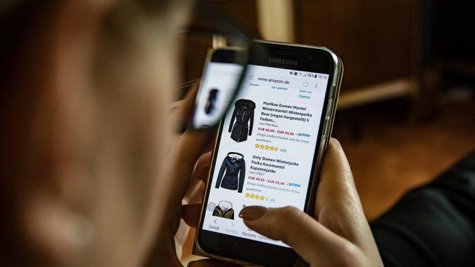
Online shopping has become more and more popular day after day and new shopping websites are being introduced almost every day with unique and innovative features. Nowadays with the change in the lifestyles, there is a vast and drastic change in people’s shopping habits. People hate shopping in crowds and they are searching for unique and quality products for less in the convenience of their home. Since online shopping eliminates the middlemen, consumers can purchase things directly from the buyer in real time. This is the main reason why online shopping sites are able to give frequent discounts and offer to its customers.
The heart of any online shopping application is the user interface or website design. The design itself has the power to make or break the business. In conventional offline shopping, the sellers keep their shop attractive, clean and organized. They arrange their products in such a way that it looks impressive to the customers so that they will go for it. Similarly, look and feel plays a very important role in the case of an online shopping system as well. Since the product is not directly accessible to the customer in online shopping to touch or feel, people won’t buy them if it is not very well presented. The presentation part, therefore, is critical and needs very good attention and research. Webeden (a free website builder for small shops) is an easy and reliable way to make a shop interface that will help you sell products, so do check it out if you’re looking to create your own website.
Here in this post, we are presenting you with some cool looking e-commerce websites which are selected randomly from the online shopping world.
 Stylemint
Stylemint an innovative and unique online shopping experience which comes from Mary-Kate Olsen and Ashley Olsen also known as the Olsen Twins collectively are American actresses and fashion designers. The website layout provides a super cool feeling with a clean minimalistic layout in simple lighter shades. Unlike other popular online shopping sites, Stylemint will not let you explore the product section right away. You have to be a registered user to see the product selections. You can use your email id facebook account to register. Once you are registered and logged in, they will ask you some questions and based on your answer they will generate a list of products best suited for you and presented to you in a personalized and attractive way. This intelligent mechanism is the unique feature which gives a personal touch to the entire Stylemint shopping experience. The shopping workflow and layout is all the way unique and fresh. The products are arranged elegantly and systematically.
Gilt
Gilt is another ‘member only shopping’ website, where you need to become a member to explore the product range. The best part about gilt is the entire sales take place online and you will not get their collections from anywhere else. It gets you something unique and new every day which is available on first come – first serve basis. If you want to get the most unique piece which has the fresh looks, keep an eye on their updates. Another cool feature to note is their advance preview service. They give you a preview of their upcoming items well in advance. The website layout looks really professional and attractive. They have used a product-centered design method which is the best approach for an ecom website UI. The products are presented in a way that it gets the maximum attention. They have a done a really good job in the product preview part, the product can be previewed as if you are looking at it in real. The entire website is on a grey theme which gives the product more attention and the products are looking more attractive to buy.
 Myntra
The unique quality of Myntra is the wide range of products. They have the largest collection of lifestyle products which comes around 30,000 plus styles ranging from more than 500 top brands. This is such a huge product range for an online web store. Arranging and managing such a wide range of products is not at all easy and it is the most challenging part in the entire shopping website design, and they have done a brilliant job here. The product grouping, categorization, and presentation are simply awesome. The products are systematically grouped on the basis of category, brand, style, gender and what not. You could easily locate your favorite range of products simply with a click or two. The presentation part is very well done which provides a clear view of the product presented. The product can be previewed from many angles and even a video preview is available for many products.
Timefy
Timefy is a French shopping website exclusively for men’s designer watches. It has a huge collection of designer watches from across all top brands. The website design is simply beautiful, which uses lighter colors and shades of black and white primarily. The overall grey colored theme gives the website an elegant and professional look. The product presentation is amazing where the primary focus goes to the product image. It is designed in such a way that it doesn’t look cluttered when the number of products is too high. The best part about the design is, simplicity and minimalism. The shopping cart layout and design are highly user-friendly.
 Firstcry
It is an exclusive online web store for Baby Care Products and kids accessories. It has an excellent collection of baby care products and accessories from all popular brands. The products are arranged systematically and in good order. The product presentation and preview is amazing. Though the website layout look bit crowded on first look, it is appealing and colorful. The entire theme is centered on kids, with cool bright colors and nice graphics. All little models who pose for dresses are looking cute and smart. Overall the website design and layout is perfect for a kids shopping website.
Solesociety
An exclusive online store for high quality shoes, handbags and other women’s accessories. The best part about the webstore UI is that, it is so simple and clean. They have done a wonderful job in making the web interface look simple and elegant. The colors used are primarily lighter shades, which gives it a complete professional look. The product photographs look terrific and high quality. You could preview the product from various angles and also can preview various color options of that product.
 Zaino
Zaino
Zaino sells exclusive bags and cases for kids. The website interface is too good as a kid’s store. It uses bright colors brilliantly in the base theme. Whitespaces are brilliantly used to prioritize content and to define the right flow. Product list and preview page layout makes this website more user-friendly. Even though the base theme color is pink, other colors such as blue-green and orange are blended along with it nicely to catch the attention of those little ones out there online. The slider on the homepage gives the website a lively effect and it catches the attention.

 Stylemint
 Myntra
 Firstcry
 Zaino
Zaino