
How to create a 2021-ready website?
Here we stand at the dawn of yet another year. 2021 saw the birth of some new trends, while some trends disappeared altogether. Although this holds true for every industry, here we are concerned with the ever-evolving world of the Internet where things change constantly. Even as we talk about it right now, new innovations are happening in the online industry. Chula Vista Web design, which is a natural extension of the Internet marketing, or also known as digital marketing is experiencing a revolution of sorts and the coming year will see the culmination of some cool web design trends.
Web design is the most important aspect of a website. Just like everyone having a business, however small or big, needs a website, similarly every website needs good web design. But what exactly makes web design important?
Why do you want to care about web design?
 A good web design is as important as having a website itself. Think about it. What is the purpose of your website?
It might be conversion or brand awareness or maybe it is just pure information that you want to provide through the website.
Whatever might be the intention, your efforts should be on providing the visitors with quick and easy access to what they came looking for. And this is why good web design matters. Whenever a visitor comes to your website he already knows what he is there for and the landing page should be able to present him with all that without him even requiring scrolling. A good design facilitates a similar end result creating a loyal fan following or customer base.
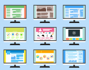
Things that you might consider including in your web design in 2021
With the evolution of technology, there are certain necessary amendments required to keep websites relevant and consumer friendly. The emergence of mobile is the biggest game changer that has transformed the web design industry in the last few years. As more people use smartphones and other mobile devices like tablets for accessing the web, designers are adopting new techniques and trends for meeting the new challenges. If you are a website owner, here are some of the changes that you also might consider including in the coming year:
Infinite scrolling:
Infinite scrolling is one of the most acclaimed techniques in the world of web design, and yet we are still far away from witnessing widespread adoption of it in websites. Also known as endless scrolling or continuous scrolling, the technique auto loads the content of second page when the user reaches at the bottom of the page so that it is not necessary to look for pagination buttons to go to the next part. From the current notable examples, Facebook Newsfeed uses it. This scrolling was also a feature of Apple’s iBook 3.0 where the reader could easily go through a bestseller using vertical scrolling.
Handwritten fonts & Flat design:
 In the age of social media, adding a personal touch to every communication is the latest fad. Its obvious advantage is the feeling that it comes directly from a person and not a computer or robotic device. Such personalization has always been welcomed in the world of signage and sign companies.
It wouldn’t be wrong to say that 2019 was the year of flat design. When a whole operating system (Windows 8) is modeled on the principles of flat design, you can easily predict the importance and the bright future associated with it. Apple went flat with its iOS7 which featured a complete flat design overhaul and it has quickly crept into website design. The benefits are more than just visual appeal. It also boosts the existing performance level.
Responsive mobile design:
Much has already been said about the importance of responsive design. Mobile traffic now accounts for more than one-third of the total website traffic and it’s only going to increase in 2019. Earlier mobile-specific websites were created to address these consumers, which needed a separate design team, server space and maintenance costs. However, with responsive design, it all boiled down to sticking to specific CSS and HTML5 codes so as to make a site react as per the screen size on which it is being viewed. Not only does it reduce the expenses of maintaining a separate website, it also lends it a professional aura. 2019 will make RWD the de facto standard rather than an anomaly in website designing.

 It is true that, with the evolution of Smartphones and other Internet-enabled devices, the number of access made to websites from mobile devices has increased exponentially, and this is only expected to continue. Hence, optimizing the web content for mobile devices would be a great idea. This is where the idea of responsive designs came into, according to this web design, a website must adapt itself to the screen sizes of the targeted devices. The primary aim is to make a website automatically adapt to the layout changes from a device to another (which exhibits different display sizes and device-specific capabilities).
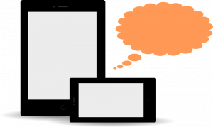 Defining another essential User Experience (UX) element, the Adaptive Designs refers to the progressive enhancement of a website. It aims at delivering responsive design at the client side by following several resourceful tactics. This design is ideal for creating an adaptive web content that can be easily shared or distributed across any platform.
 In order to stand up to the expectations of all the different types of mobile devices and to make strive for an absolute UX, here we are pondering into a better approach, which is known as Adjustive design.
 Restrictions vary project wise. But there are certain restrictions that we have to encounter in almost all projects irrespective of their nature and clients’ specifications. Following are some basic constraints that trouble almost all web designers irrespective of the project scope –
 Designing a website with a subtle touch of creativity is certainly not an easy feat. Now, staying creative 24×7 is super tough and definitely not something for the faint-hearted. So, the easiest way to stay creative is to eliminate the unwanted distractions that come thick and fast whenever you hit the work desk. The best way you can eliminate these distractions is by imposing self restrictions. These restrictions will not let you go wild while designing templates and speed up the process. And you may never know these restrictions may help you rise above everything and excel in your field.
 The web was once nothing more than a collection of simple text pages marked up with some tags. Those were the times when browsers controlled how the web pages were displayed to the user, which, apparently didn’t go down too well with graphic designers. It wasn’t long before Web pages became more visually appealing, started to have animations, images, video components, and other interactive media all thanks to graphic designers.
 Good visuals give your visitors confidence in your business. In addition, a graphic designer helps initiate a call to action by facilitating tasks such as buying something online. After all, human beings are most impacted by what they see. Good graphics can help evoke an emotional connection with the visitors. There is ample proven research to show that colors are able to affect our moods and thus consequentially affect the decision-making process. A graphic designer’s job is thus to use these colors in persuading people to do things that are in their interests, as said by the iconic designer Milton Glaser.
 They are only called in to bring in aesthetic sensibility to a site, in order to ring emotional bells with customers. While graphic designers often tend to focus hard on aesthetics, sometimes to the detriment of other factors, but that’s where other members of the team have a role to play. A web designer is also an important voice on the table and shares greater responsibility of keeping the website up and running smoothly while maintaining the best possible visual standards.