Top 15 most talked-about web design trends

August 5, 2018 John Wells 0

Designing a website is a work of art and it requires complete knowledge of the latest tools, trends, and techniques. There have been new design trends coming in limelight from time to time and this changing trend has been there to attract and influence website visitors in a positive manner. As we move further with the latest design technologies, the web today is changing dynamically with vibrant updates. New website designs are aimed at easing the access of information, networking with social contacts and accomplishment of other tasks. Out of all the trending designs of the year, these 15 designs have gained a top spot among various other design techniques.

The introduction of CSS3 and HTML5 has completely changed the whole design approach in a progressive manner, designers got the much-needed momentum to try out and explore various new design techniques purely using CSS and HTML.

Here is a collection of top 15 most talked-about web design trends to watch for!

Responsive Single-Page Designs

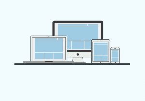
The trend of responsive web layouts has been there for some time and is there for a prime motto of creating a single design matching all the devices available. However, designing websites on a single page is the latest trend followed nowadays. The combination of the responsive design of a single page website is trending a lot among the designers of today.

Retina Display Support

Devices with retina displays have been already introduced to the consumers that are capable of displaying high-resolution media. So, the latest trend follows with creating high-resolution retina-display compatible web pages.

Fixed Header Bars & Mobile Navigation

Making navigation easy has been the prime task of all the web designers. Following this concern, fixed header bars have been introduced at the top of a web page that is visible continuously at the top of the web page to provide easy access. Also, mobile navigation links are gaining popularity that provides ease of navigation to the user while navigating through the site.

Fullscreen Backgrounds & Typography

The idea of full-screen backgrounds and attractive typography is a brilliant attention grabber for visitors. A proper fitting provides a pleasing design to the viewers giving an extra edge to the website design.

Transparent Elements

CSS3 provides advanced properties for adding transparency to web page elements. This transparency provides a lively look to the web page design and is trending a lot.

Simple and Minimal Landing Page

The latest idea for selling products online is to keep the website simple and focus on a minimalist view for core focus on the product.

QR Codes

Barcodes have been replaced by Quick Response (QR) codes. These codes have evolved to catch up with the fast response needs. These codes have found a place on websites to provide quick access to coded data.

Illustrative Web pages

Illustrations are a better way of capturing the attention of a visitor. Creating illustrative web pages requires artistic and creative skills to create appealing designs.

Infinite Scrolling

The idea of infinite scrolling has been over the internet for some time, but it is now that this design has gained a spot in trending designs.

Featured Homepages & Sliding Panels

An example of illustrated webpages lies in featured homepages describing the website and regularly sliding panels highlighting products at the top of the page.

Animations & Circular Elements

Animations are an excellent approach to holding the attention of the visitor to the website. Animated effects are used to graphically describe a particular product/service for which the website has been built. While, the use of circles for description purposes is an easy, clean and compatible with every layout.

Vertical Navigation

Vertical navigation panels have not been a famous design for various web sites. While many creative designers have attracted other designers to this view by creating some elegant designs and has put this design into the latest trends.

Social Media Badges

The success of a website depends primarily on the marketing of a website. Marketing through social media is becoming a vital component of successful marketing of a website. Almost all the online social communities have their own badges for sharing on different websites that can be pinned at any place in a layout over an article or a blog. These badges help a reader quickly share the content of a website on popular social networking websites.

Deep Box Shadows

Deep shadowed boxes are trending in web designs today, where the shadows of boxes infused with the modern designs of a website provide an attractive effect. This effect gives an amazing look to the website without reducing the aesthetic value of the website. The implementation of this design seemed to be difficult before because of the need for long and difficult codes of Javascript or some other elements. With the introduction of CSS, this design can be created with simple script code.

Blurred Backgrounds

The use of a blurred background adds to the depth of a website and enhances the visual interest of the viewer. This design helps to grab the attention of the viewer towards the main content or visual elements of a website. These designs also translate easily to mobile versions of websites without compromising on the impact of the design. The background added is not meant to provide any message to the viewer; rather, it is there to provide a viewpoint that the content visible clearly holds more significance.

All these designs have gained a high popularity among designers and have been proved very successful in attracting a huge number of visitors. The user interface is the first preference for the design of a website that is created today, which these designing trends aim to provide to the user. A lot of examples can be found over the internet with the implementation of these latest design trends.

 

Web Design versus Graphic Design: Which is more important for the web?

July 17, 2018 John Wells 0

John Naughton says in his Guardian post, how graphic designing is ruining the web, presenting various valid points and arguments. This post elicited many responses from the web community, coming from various noted blogs such as this and this.  While this is open discussion dates back to a couple of years, the relevance is not lost. The debate continues. 

Why do people have a problem with the graphic design being a part of the web?

John’s feature in The Guardian which basically started this debate raises a number of points, and most of them are not in the favor of graphic designers.

Here’s what a part of the community thinks of graphic design:

The web was once nothing more than a collection of simple text pages marked up with some tags. Those were the times when browsers controlled how the web pages were displayed to the user, which, apparently didn’t go down too well with graphic designers. It wasn’t long before Web pages became more visually appealing, started to have animations, images, video components, and other interactive media all thanks to graphic designers.

However, now, instead of fetching the web page from a single location, browsers assembled its various components from different locations, combined them all and presented to the user when requested and this is where the problem began. All these images, graphics, and other visual elements began adding weight to the webpage, which grew from an average 93.7kB to over 679kB from 2003 to 2011. Now, if you are a lover of minimalist design, or have a slightly overt logical bent of mind, this would appear a sheer wastage of bandwidth. After all, you are using 679kB of bandwidth to convey, perhaps, not more than 10kB of information.

But can the web exist without graphic designers?

What is it that first catches your attention in any object, tangible or intangible? It is definitely its physical attributed such as shape, size and color. The same goes true for any webpage. While the content of any website is essentially one of its mainstays, it is its design that includes elements such as color, typography (read font play), shapes, logos, and layout that make or break the deal. A graphic designer’s role is greater than just making a website pleasant to look at. A person who dons a hat of graphic designer has to establish a communication bridge between the audience and the site.

A lot of things combine together to make for a great website and graphics is one of them. While having good graphics is no excuse for having a weak content, for those conducting business on the web graphic design can make a huge difference. The web is swarming with billions of pages, with millions being created every single day. People are always in hurry and have become used to give only a fraction of their attention to web pages. They quickly scan pages and exit if it fails to engage them and one sure shot way of stopping them from doing the same is by using engaging and well-designed graphics.

Good graphics initiates a call to action

Good visuals give your visitors confidence in your business. In addition, a graphic designer helps initiate a call to action by facilitating tasks such as buying something online. After all, human beings are most impacted by what they see. Good graphics can help evoke an emotional connection with the visitors. There is ample proven research to show that colors are able to affect our moods and thus consequentially affect the decision-making process. A graphic designer’s job is thus to use these colors in persuading people to do things that are in their interests, as said by the iconic designer Milton Glaser.

Finally, graphic design also adds a creative spirit to the website and be recognized with the overall branding strategy of the product, business or website where it is being used.

However, a slow loading website is still a pervasive problem, and no one seems to like it.

It was never about Graphic design versus Web design. It’s Graphic design with efficient Web design

Jack Schofield, in his blog made various points about the factors that might be contributing to the bloating of web pages. Countering John’s rant against graphic designers, he rightfully pointed out that an attractive design has got little to do with painfully slow websites. Often web designers are guided by a pervasive notion that a useful website must have a lot of plug-ins, widgets for social networking, fancy flash, videos, and other shiny stuff, not to forget the complicated code.  These are the major culprits that make a website literally suck.

Websites are hardly an exclusive property of graphic designers.

They are only called in to bring in aesthetic sensibility to a site, in order to ring emotional bells with customers. While graphic designers often tend to focus hard on aesthetics, sometimes to the detriment of other factors, but that’s where other members of the team have a role to play. A web designer is also an important voice on the table and shares greater responsibility of keeping the website up and running smoothly while maintaining the best possible visual standards.

Be it any industry, the way forward has been to create products that not only have better utility than their predecessors but also register a better visual appeal with the audience. Whether it is cars, motorbikes, pens, bags, ships, or yachts, designers will continue to push the boundaries with their imagination.  On the same lines, technology and engineering should also continue pushing themselves to give products that are simply not better, but better than the rest. The same way, web designers should keep up with their graphic counterparts to ensure the website machinery keeps flowing smoothly and without glitches.  That includes taking efforts to minimize JavaScript and CSS files, optimizing images and enabling HTTP compression amongst other stuff.

Graphic design and Web design: Twin wheels of a good website

The onus of a better website doesn’t rest solely on the shoulders of graphic designers and therefore, blaming them for laggy performance is nothing more than eyewash. Good websites are a product of superb design, optimized code, and informative content.  While a person applying for a graphic designer’s job should also keep in mind the technical constraints of web designing, it is ultimately the test of a programmer’s and web designer’s expertise, abilities and skills to ensure a perfect appearance doesn’t undermine the performance of the website.


How to design your website to increase conversions

July 7, 2018 John Wells 0

Attracting traffic to your website is just part of the story. Obviously, it’s important that people visit your site, but it does not really help if the traffic does not lead to an increase in conversions. You need to ensure that people who visit your website go on to buy your products, or pay for your service. This is the only way you are going to increase profits and help your business to grow.

There are actions you can take which is more likely that traffic will convert into sales. Let’s take a look at some of the most important things to consider when you are designing your website.

Make the buyer journey simple

No-one wants life to be complicated. When people are buying online, they want the whole process to be easy to navigate and complete. If you have a sign-up process, do not make it too lengthy. You only really need to know a person’s full name and email address from the outset; asking lots of other questions will put people off. It’s often a good idea to give people the option of purchasing as a guest, without the need to register. This is popular with busy people who are looking to make a quick purchase.

Keep information clear and concise

Think about what you would want to know about your brand that would make you want to make a purchase. Make sure the information you provide is to the point and tells people what you can do for them.   If you have additional information, that could be useful, consider creating an online brochure or magazine. Doing this means that people can access the additional information if they choose to, but it does not detract from the direct message of your home page.

Consider different payment methods

Not everyone wants to use a bank card or a credit card online. If you stick to allowing only these payment methods, you are not going to optimize your conversion potential. Online wallets, such as PayPal, are popular with many people as they provide a secure and simple way to make purchases online. It’s a good idea to allow visitors to your website to use alternative payment methods. Conversely, you should not provide so many options that the process becomes unwieldy and puts people off completing their purchases.

Show alternative products

When people are shopping for a product on your website, take the opportunity to provide suggestions about other products they may be interested in. You can do this while they are browsing or when they are actually making a purchase. People are often attracted by a product that can accompany an item they are buying. There is also the chance that someone has decided against purchasing a certain item, but decides that the alternative you suggest is just right for them.

Make sure calls to action are prominent

Calls to action need to be created carefully. You do not want people to feel as though you are being too invasive, but you need to be clear as to the action they should take. It’s often a good idea to include a call to action on each page. Make sure they are prominent and included in the early part of your content.

Include relevant and real testimonials

People tend to follow the example of others when it comes to making a purchase or using a service. This is why including honest testimonials on your website can be such a useful tool. If you receive an email from a customer, complimenting you on your service, ask for their permission to use it as a testimonial. You can also create testimonials by using a well-crafted feedback form. Think about the questions you need to ask in order to get the information you need. Always remember to ask permission before you use any customer comments.

Use video to demonstrate your product

People often like to see how a product works, before they make a purchase. This is why including an instructional video on your website is often a good idea. Remember to keep videos to the point, so that people will be more inclined to watch. If you need help with your marketing videos, speak to an expert in marketing online. They can give you the benefit of their experience and expertise.

Your website should be designed with conversion in mind. As you can see from the points we have included, you need to show people what you can do for them, make all of your information clear, and make the buying process as simple as possible.


Major security concerns or risks invovled in HTML5 development

July 1, 2018 John Wells 0

Security Risks in HTML5

HTML5 has been a revolutionary change in the field of web development making websites more visually attractive and interactive. It has been the perfect answer to the growing demand for multi-device user needs. It has found great acceptance in the developer’s community with most businesses opting for HTML5 powered websites.  One of the greatest advantages of HTML5 is the fact that it has brought in a native app life feeling to websites bringing most of the features and functionalities to the client instead of the server as had been the norm for years.

But with all these advantages HTML5 also has its own drawbacks. Security is one such issue as vulnerability have been unearthed that pose serious risks to a web and mobile development. It is vulnerable to stealth and silent attacks often compromising the privacy of the users. The vulnerability is more in the case of smartphones and tablets where the concept of traditional browser-based browsing isn’t popular.  HTML5 powered apps can pose serious dangers to the client as well as the server. Here we shall discuss some of these risks that every developer should be aware of.

Risks In Data Storage

One of the biggest risks that HTML5 poses is to do with the enhanced data storage capabilities. We have already mentioned that HTML5 introduces a new system where most of the data is stored on the client’s side. Developers term it as one of the biggest beauties as well as dangers of the new markup language. Earlier versions of HTML could only store session information or login information in the form of cookies. HTML5, on the other hand, has introduced sessionStorage, localStorage, and client-side databases that allow a vast amount of data to be stored on the client’s side that provides easier access of information even in the offline mode. This feature allows websites to offer uninterrupted experience to the users even when connection snaps for a short time span. This opens a window of opportunity for an attacker as the data can easily be retrieved and manipulate and can be uploaded back to the server to attack others. Along with this, there are also many risks when it comes to temporary storage through the issues isn’t as grave as permanent storage that we have so far discussed.

Offering Access To Camera, GPS, and Microphone

In a bid to make websites more interactive many web developers have extensively used imaging, location, and voice-based functionalities while developing websites. Many web-based applications require the users to grant access to their cameras, microphones and GPS systems. For example, there are sites that require users to authenticate their identity using an image or their voice. The Geo-location feature in HTML5 offers highly customized search results based on a user’s location. Most of the users are likely to grant access to such services without considering the security and privacy implications. An attacker can easily make use of these devices on an HTML5 powered website and compromise and peek into the activities and location of the user with them even being aware of it. What’s worrying is the fact that on most occasions the user won’t even be aware of the fact that his or her security has been compromised.

Third Party Code

Another security concern for developers in HTML5 comes from the use of third-party codes. HTML5 is known to offer dynamism to web development with the use of third-party codes and this opens potential vulnerabilities for the website. In the previous versions of the markup language JavaScript had limited usage in requesting resourced from the domain. For instance, the previous versions of HTML didn’t allow pages from one domain to pass or access data in pages from another domain.  This prevented a malicious site from interpreting the data from a legitimate site in the form of popups.  In HTML5 JavaScript is requesting resources from different domains in a new method known as cross-origin resource sharing (CORS). Here JavaScript can access information from multiple domains at the same time. This allows a website to offer information from multiple domains at the same time. However, HTML5 doesn’t have any mechanism to check the origin of the content. This offers a great opportunity for the hackers to access information both from the server as well as the clients.

All these security vulnerabilities do have their own remedies and it depends on the skills of the developers how he or she can develop a website negotiating these risks. HTML5 presents a wonderful opportunity for a developer to expand into the new horizons of web development and developers are making use of this technology to take web development to a new level and offered more opportunity to the businesses with their users and vice versa.


Collection of more than 15 funny web design related comic strips

June 17, 2018 John Wells 0

It’s always good to start the day with some fresh humor. It has the power to release your stress and make you feel good. Many researches shows that people who laugh more live longer. Comic strips have its roots in the late 19th century, however, the art form which combines words and pictures evolved gradually, and there are many examples of proto-comic strips.

The first thing most people look for in a newspaper is the comic strip which usually portrays the present political happenings or incidents in a funny way. Now with the popularity of the internet, comic strips started gaining popularity online. The online comic strips are often known as webcomics or internet comics. Most of the traditional newspaper comic strips have its presence online, and there are other exclusive websites which publish only webcomics.

Comic strips are being released on almost all topics, even though politics is the major subject. Here as part of this post, we have collected some interesting real-life comic strips related to web design and technology. Most of these comics are outstanding and creative works which conveys a tough thing or scenario in an interesting manner. All these webcomic strips are bookmarked with the original URL. Each of these comics has its own copyright terms of usage. If you’d like to use one of these images in your projects, please read their copyright terms of usage or contact the copyright owner for the right permission.

Tools for Fools – Romantic evening with a web designer

Web Designer Hell – Design looks good, But…

Freelance web designer

You are fired for being honest

A hack of a Web designer dad

Web design for free comic

Good design to add in portfolio

Bandwidth Clogging

Importance of IE6 for Web designers

Political Responsive Design

Feedback on new website design

The Life and Death of Web Design

Shocking surprise

Design logo prototype

Internal design review

Webdesigner career challenges

The Customer Is Always Right


5 important tips to improve your website performance

May 30, 2018 John Wells 0

Website has become a major tool for modern day business promotion, marketing, and brand building strategies. New customers are being targeted through Internet marketing, social media, and online advertising very effectively. Potential Customers are everywhere in the world, and social media provides an opportunity to go online and find new business quickly.

In order to stand firm and to make their business base stronger, business start-ups should definitely have a quality website in place. Online identity is equally important to companies and individual entrepreneurs who are looking to make their ideas famous and want to be heard. New business strategies define their success pace, but the promotional package starts with the website. Online marketing, social media, etc won’t work without a good website.

It’s essential to have a web presence to seal a success in rapidly growing challenging world today. It shall come to the website owner to keep all major tune-ups and aspects in mind about improving the website performance. Website owner needs to learn knowledge continuously about website performance and improvements which can help Search Engine Optimization and user experience.

5 Tips to Improve your Website Performance

Given below are 5 important tips which can help you improve your website’s overall performance.

1. Make the Modern Design

The website design should definitely be an important thing. In the traditional advertising field, usually advertising companies try to focus on the graphics design and try to make ads attracting eyes. It doesn’t mean banner ads would start talking to anyone, but it certainly means the quality and innovation should be touching height.

2. Creativity in the Graphics

Good design and creative UI improves a website’s visibility and social media reputation. When people like any website’s appearance and graphics, it tends them to share with their family and friends. In blogging, when a visitor reaches on the blog, (s)he starts looking the design of the blog before jumping to the content of the blog, so creative graphics of a website also helps in keeping the visitors.

3. Lightweight pages for SEO

SEO experts believe to make web pages light and simple. E.G. some website owners don’t restrict to use images, but extra large images with heavy size pictures will definitely slow down the page load speed which gives the signal to the search engines that send the visitor to the website about this lacking point. Instead of heavy pages, if a website owner speeds up page loading, it would help website ranking in the search engines. Complex coding and DB queries also make complications for a website. SEO experts usually avoid the use of JavaScript and Action Script in order to achieve lightweight website development.

4. Detailed Text Content for explanation

Text content is the most part of a website. Text-based content helps search engines read the content and index the website in result of the better search engine ranking. Bloggers give importance to both images and text content. The most important thing on a blog is content which includes text and images of the articles.

5. High-Quality Website Host

Web hosting is another important factor of a quality site. If a website is not hosted on a high-quality web hosting, it will never perform up to the mark. The most painful thing about bad web host is that search engines would identify those websites with low-quality website hosting by crawling to them and find out by low-quality web hosting servers. Web hosting should be chosen with care in order to achieve the best results of a website.


10 unique social networking apps for your smartphone

May 29, 2018 John Wells 0

Social networking is the process of building social relations with people who share similar interests or people from similar backgrounds. The social networking practice is mostly carried out using a web-based online application or interface. These online applications are commonly referred to as social networking sites. There are a number of highly popular social networking websites such as Facebook, Twitter, Linkedin, Google Plus etc. Today almost all people who know how to access the internet will have an account with any of the above mentioned social networking websites.

A recent report published on TechCrunch states that more than 50% of Facebook’s active monthly users (AMUs) are mobile users. The number of users who access Facebook every day, on average, grew 8 percent to 665 million in March, from 618 million in December. The number of people who access social networking sites using smartphones or tablet computers has been growing so rapidly.

Even though there are many social media networks on the internet today, each has its own unique focus, user-base, and intended use. Facebook is a general purpose personal networking service, Twitter is also a general social networking service which is basically about sending short messages known as tweets, while LinkedIn is purely a professional networking platform. Similarly, each social networking platforms has its own intended use.

Here in this post, we are presenting some of those coolest social networking mobile apps, each of these apps are unique in its own way. All these applications are available both for Android and iPhone devices.

Tango Text, Voice, and Video

With Tango, you will be able to make the highest quality video & phone calls, texts, photo & video sharing, games and more for FREE! It’s an all-in-one social networking application that finally combines every way you want to interact with your dear ones. Join over 100 million people around the world using Tango today!

Snapchat

Snapchat is one of the fastest ways to share a moment with your friends. You have the full control on how long your friends can view your message – simply set the timer up to ten seconds and send the message.

Badoo – Meet New People

Badoo is another social network service using which you can meet new people. With over 180 million users, Badoo is really good for chatting, making friends, sharing interests, and even dating! Badoo is completely free and user-friendly. Try and find new people near you now!

WeChat – The new way to connect

WeChat is an emerging networking app which supports free texting, voice messages and video calls in your pocket. 300 million people love WeChat because it’s really fast, reliable, private and always on.

Skout for android

Skout is the global network application for meeting new people. Instantly meet people near you or around the world. Find new friends at a local bar or in Barcelona. Millions of people are connecting and meeting through Skout every day. Use skout’s exciting in-app features to increase your chances of meeting or chatting!

Bump

Bump is a groundbreaking innovative concept, use Bump™ to share contact info, photos, videos, and files simply by bumping two phones together. Just open Bump, hold your phones, and gently bump your hands together – Bump will magically do all the rest.

Text Plus

textPlus is a perfect option for free SMS texting and inexpensive local and international calls. It is damn easy if your friends and family have this app installed on their devices, it’s always free. textPlus works on all popular smartphones and tablets.

Seesmic

With Seesmic for Android, you will be able to view and update your Facebook and Twitter accounts all at the same time. Share photos, videos and take advantage of the Android shortcuts for direct access to your @ Replies from one of your Twitter accounts, or you can access your feeds from one of your Facebook pages and much more!

Tagged

Tagged – Meet, Date, Chat, Flirt, Free, Fun!
With over 300 million members make Tagged the largest and best FREE app to meet new people and make new buddies for flirting, dating, friendship and fun! Completely Free to download and – unlike other dating apps it’s free to connect with people too!

MeetMe

MeetMe shows you who’s sitting nearby and ready to chat, Kik, and meet — Completely FREE!
Whether you’re at the bar, on the beach, or hanging out at home, MeetMe is always the BEST app for meeting new people near you!


The Most Embarrassing Designing Mistakes You Should Be Aware of

March 12, 2018 John Wells 0

Designing a website can be a Herculean task, but the real challenge is how to make it useful and pleasing in the eyes of its visitors. The problem with most of the web designers is that they follow only what is “trending in”. They often forget that it’s the users and their needs which should be their priority. Once you enter into a creative field there are a lot of things that you shouldn’t do. Giving away usability and experience in front of creativity is what that most of the web designers often do. This can have a serious impact on the overall quality of a website and can prove very costly in the long run.

In the mad rush of creating a “trendy” website, designers often sacrifice the basic elements that contribute to the overall design and experience of a website. Users don’t like to get puzzled as they crave for simplicity and design practicality. Therefore, it’s the responsibility of designers to ensure that whatever they design looks not only impressive but also offers value to its user.

In this post, we are focusing on some of the common mistakes that web designers often commit while designing a website. Hopefully, you find the post useful and learn from the tips provided. Happy reading!

1. Try Not to Confuse Your Visitors

There is a tendency among website designers that they very easily get carried away by “over-the-top” designing elements. Design is not only about beauty, but it’s also about arranging various elements in such a way that can capture the clear view of your customers’ experience. While overwhelming them with cumbersome or time-consuming elements can alienate them fast.

There is no harm of using artistic designs unless until you are making sure that they are revolving around the core of your website. Anything that’s not complimenting the objectives of your business can make users confused and thus forcing them to navigate off from your website.

2. Think About Search Box

You just can’t overstate the fact that the web is an archive of information. Irrespective of what kind of website you are designing – be a corporate or a casual one for blogging, giving a neat and clean way of information searching is a perfect way to start. A nicely designed search box helps your visitors to explore your website in the most effective manner. Take Google’s search box as an example; the box looks clean and gives an efficient way for searching anything visitors look for.

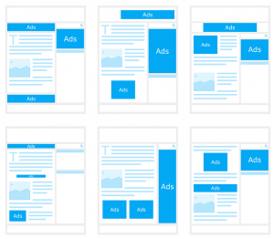
3. Too Much Advertisements Suck

True, advertising is an effective way of expanding your customers reach and take your business ahead. But, overloading your website with a variety of third-party ads can negatively influence the perspective of your customers.

The biggest problem of displaying third-party ads is that in a way you are giving an opportunity to some other brand to make revenue through your website. And the worst part is, the random appearance of these ads generally lead to customer frustration and ultimately force them to navigate off from your website.

4. Font Overload

A clear and well-organized design attracts user’s attraction and therefore it is important to make use of the fonts that give a neat and clean look to your website. You need to ensure that your type appears consistent, so don’t complicate your user’s experience by overburdening your website with loads of different fonts.

As the rule of thumb, make sure you choose one or two readable fonts on your website, which can be used to differentiate and highlight significant areas. This helps your visitors to understand the most important sections of your website and make them grasp the content in the best possible manner.

5. Pages Loading in a Rag-tag Manner

Paying attention to the speed at which your pages are loading in front of the visitors will serve you well. Customers find websites frustrating that take too much time to load or break up while responding. If a website fails to display the key content right to the audience, it can be assumed that the set of code used while developing it are not compatible with all types of browsers, or it can be said that the codes are not organized properly. This type of problems can make a website vulnerable to security attacks and dropping from search engines.

6. Inconsistent Design of Interface

There is a tendency among web designers to take creative elements to another level by creating different designs for each and every page. This is something that really confuses your visitors, something which is utterly annoying. No matter how attractive and over-the-top website you have designed, if the overall look and feel are not in-tune with each other, users cannot establish any link with the website and feel less committed towards it.

Therefore, it is crucial to make use of a consistent theme in every page provided with the links for the main section of the website. Design should be friendly enough to make your visitors feel controlled and directed towards your website.

7. Outdated or Grammatically Incorrect Content

Websites that include old, outdated content often fail to leave any positive impression in the mind of its users. It is crucial for web owners to ensure that their website uses fresh or updated content for desirable results. Fresh content helps in a good website ranking and also shows your active participation in reaching to your customers.

Not only this, but the content you publish on your website should also be grammatically correct. Make sure you proofread each and every article before publishing it finally.

Conclusion

Your website is your business, therefore it is necessary to show visitors that you are serious about your business by giving them a clean, friendly, and easy to navigate website, thus open up new possibilities for you.


Whitespaces- A must-have design element for enhancing website usability

March 10, 2018 John Wells 0

The world of web design is evolving at a faster rate, making the emergence and fading away of different web design trends. Originally coined in the print design industry, whitespace is a design element which has gathered a tremendous amount of recognition among website designers residing in different parts of the world. Keep on reading this post as I’ll be unveiling everything about whitespaces and their role in enhancing the overall usability of the website.

What are Whitespaces?

Popularly known as negative spaces, white spaces are basically the portions of a web page which have been left unmarked or blank. To put it simply, white spaces are the spaces between graphics, images, columns, margins, graphics and a collection of elements spread all over the web page. These are the spaces which have been left untouched intentionally, so as to make the page more readable and thoroughly understandable.

Unleashing the potential of Whitespaces in enhancing a website’s usability

Whitespaces are in a way the welcoming signals for website visitors, encouraging them to stay on the site for longer durations of time.

Here’s a look at some of the ways in which including whitespaces in your web design can increase the user experience for your website:

1. Enhanced readability is guaranteed with the use of whitespaces

The more readable your site is, the more number of customers you can expect to visit your site on a regular basis. Well, content readability depends on a number of factors including font size and color, font type, text structure and many more. With the use of whitespaces, you can easily organize the arrangement and alignment of different text elements, right from large paragraphs to single letters.

2. Whitespaces add an emotional touch to your design

White spaces don’t necessarily have to be white in color. They can be of any color or pattern you like. Since background colors have a huge emotional effect on us, you can conveniently opt for using parallax scrolling for adding interactivity in your designs. Moreover, the tone that you set for your whitespaces will play a pivotal role in affecting the way site visitors receive your content. Considered as an autonomous design element, whitespace undoubtedly has a brilliant effect on your design.

3. A high level of comprehension is guaranteed with the use of whitespaces

As per recent research, it has been found that white spaces have the capability of increasing comprehension by a whopping 20%. By including white spaces around the text blocks and between paragraphs, you can easily improve the understandability of your web pages.

4. Whitespaces come with a contemporary look and feel

A web page filled with the right quantity of whitespaces can easily enhance the usability of your site. Moreover, it can also add to its visual appeal in the most refined manner. Ever since the trend of minimalistic websites has come under focus, whitespaces have been regarded as the best tools for achieving a perfect trustworthy look for the sites. Specifically talking about e-commerce websites, rendering extra space to the display of products makes them look stunning and more tempting.

5. Logical grouping becomes feasible with the use of whitespaces

Irrespective of the main theme behind your site, there are situations when you need to group some particular names, categories etc. It is here that the role of whitespaces comes to play. By adding white spaces between different lists, you can opt for creating groups which are fully logical and easy-to-interpret.

6. Legibility of a web page is determined by the use of whitespaces

Using white spaces at the micro level i.e. during kerning, leading or tracking can easily help in improving or destroying the web page legibility. If you need to accommodate a lot of content in a small amount of space, all you need to do is simply increase the leading or tracking for making the text easier-to-read.

7. Maintaining tidiness throughout the web pages is possible with whitespaces

It is with the correct use of whitespaces that your site can attain that perfect tidy look and feel. Apart from choosing the right layout or color scheme, including the white spaces in the right proportion can add a unique tint of individuality into your website.

Wrapping Up

There have always been arguments regarding the significance and usage of whitespaces. Here’s hoping after reading this post, you’d have gathered a detailed understanding of the same for all your upcoming web design ventures.


Using An Appropriate Coloring System While Designing Your Website

March 10, 2018 John Wells 0

Buying and selling are no longer a haggle and waggle process. We have reached to such an advanced level of web development that we are not just using it for doing our work easy, but to disseminate and cater clients of business outright. To sell better, online sellers are now delving into neuromarketing to expand their customer and are covering intricate nuances that can plausibly affect the buying decision of a user. One of the important factors is color.

The first impression is the last impression! Quite a cliché, but you cannot ignore this, and I am not the only one saying this, as a study tells the same.


“If a good color sells, the right color sells better.”

Color theory is a proper guide to mixing proper color to come up with a proper color scheme that can help us to create imposing web designs. It is not just the functionalities that work in tandem, but even the colors also work in tandem to create an imposing effect on your website.


Color theory is a comprehensive guide that allows the users to pick up colors. Colors are further classified into three categories such as primary, secondary and tertiary and are also defined accordingly.

This is not a new concept, as it was discovered back then in c.1435 in the journals of Leone Battista Alberti and then in c.1490 in the writings of Leonardo da Vinci. However, the vision sciences and colorimetry gained grounds back in the eighteenth century.

Now in this century, we have come across the fact that colors invoke emotion and affect the purchasing decision of buyers.

Basic issues in the Color Theory

Pure or ideal colors were the basis on which the color theory was built, and it was dependent on the sensory experience rather than considering the attributes of the physical world. This has resulted in the inclusion of several inaccuracies in the theory, and this cannot be at times not remedied in the modern usage as well.

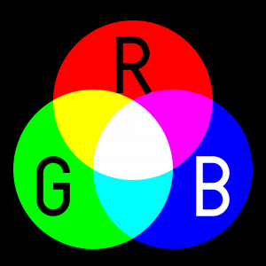
One of the most important problems is the mixing of the behavior of light mixtures, and they are known as the additive colors. Further, the mixtures of paint, ink, dye or pigment mixtures are called as subtractive colors. The prime reason for this is that the there are different rules that work between light by which light gets absorbed by material substances.

The second problem is that it does not describe the luminance contrast in which a surface reflects a color which is different from the color of lights. For instance, we have colors such as ochres that cannot appear in the mixture of light. Due to strong brightness and lightness contrast, there are times when colors appear different from what they actually are.

Lastly, the third problem is the tendency to elaborate the holistic effect of colors. For instance, the contract between “blue” and “yellow” is perceived as generic colors. Mostly the color in contrasts are based on three attributes that are:

  • lightness (which can be said as light vs. dark),
  • saturation
  • hue or color (e.g., red, orange, yellow, green, blue or purple).

Color harmony

All in all our basic motive as a web designer is to bring the colors in harmony, which implies that when the colors are seen together, they tend to produce a pleasing effect on the viewers’ eyes. Though achieving color harmony is quite a complex task as colors have a cognitive as well as an effective impact on users, and thus, emotions come in to play while judging things.

The way we respond to color and the impact of color harmony brings us to a series of different factors. Further, these factors are categorized into individual differences such as personal likings, monetary condition, gender, age, and others. Further, there are places where colors also invoke social stigmas depending on the religious or cultural beliefs of people. This must also be put into consideration which picking up your hues.

Along with this, the context has always played a crucial role in the response to users and color harmony. Moreover, factors such as emerging trend and perceptions that affect the human responses,

Mentioned below is the model to with the color harmony nowadays:

{Color harmony} = f(text{Col} 1, 2, 3, dots, n) cdot (ID + CE + CX + P + T)

Function (f) denotes color harmony within colors that are specified as (Col 1, 2, 3, …, n) and the factors that impinge positive responses.

ID- stands for individual differences
CE- cultural experience
CX- context
P- obtrusive perceptual effects
T- time as in the trends that are in vogue.

How many colors should you use?

Picking a color for your website is quite a contentious questions as there might be situations where the designer do not like a particular color or you being the website owner do not like what the designer has picked up for you.

However, it has been recommending using only to use three colors that must be quite visible to the website. One of the most logical ideas behind this is that the lesser color you use, the lesser efforts you need to put in while bringing all these color in harmony.

As designing is a part of aesthetics which means that while designing a website we can take inspiration from the famous 60-30-10 rule used by fashion and interior designers.

As per the rule, you need to select three odd colors and when it comes to usage make sure that you use to incorporate them in a  ratio of 60%, 30% and 10%  on your website.

This means  60% of your website will be using that particular color which is also referred to as the primary color or the overall tone in which your website will be painted.

The second color that will cover the 30%  of your websites needs to be a  contrasting color of the primary color and this will create a visually striking appearance.

The last color that will cover  10%  of your website is termed as ‘accent color’, and this color needs to complement any of the two colors.

Tools for making your task a tad easier:

Adobe Color CC

Adobe Color CC formerly known as Adobe Kuler is an incredible tool to select a color scheme for your website. It is a web-based tool that can select a theme for your website. Though they have changed the name of the tool, the nature of the tool remains the same. Color CC allows you to create multiple themes, and each of these themes comprises of five colors. You can get desktop versions as well as browser-hosted sites. Those who have used a desktop version can directly import the color scheme formulated by this software into their designing software such as Photoshop, InDesign or any other.

Check my Colors

To check whether you have chosen the right color combination for your web design then you can make use of this incredible tool. Using this tool you can check the background and foreground color of  DOM elements. This also helps to find out the contrast when viewed by a differently abled person.  This software is created by Giovanni Scala, who happens to be a web designer and uses algorithms that are attested by World Wide Web Consortium.

Color Hunter

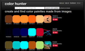
Color Hunter renders a color palette that can be of your chosen image.

In the beginning, the tool would not be work apparently quite effective. However, it is helpful in finding out a particular color if you cannot find one. What you can do is to enter that you like into Color Hunter, and then you can use this tool to create a color palette from the image that you have picked up.

Isn’t it an amazing tool to create one’s own custom theme.

All in all!

Be it an automatic design tool or your choice you need to make sure that you create the best possible impact on users. To master the art of persuasion as a developer you need to make sure to cast a good impression on your users. To attract the users, you can make use of color as bait.

This Case Study is a guest post written by a Senior Web developer. In this hyper-interactive, IT space you need to only look for comprehensive custom web Development not just of high aesthetic value, but one that renders incredible functionality.