Top quality free jquery plugins for web designers

December 1, 2017 John Wells 0

Jquery is becoming one of the most sought-after skill-set for any web designer, it is such a powerful tool these days for front end development. It can provide more interactive user experience with very limited effort. Jquery plugins are becoming more and more popular among the web design community mainly because of its simplicity and effectiveness. Anybody with very basic programming knowledge can easily customize and install a jquery plugin in his web design project. There is a huge repository of free jquery plugins online, new plugins are being added constantly each day.

Finding quality fresh jquery plugins from the huge repository can often be a tough task for a common man. Here we are doing the research part for you and here is a showcase of more than 15 high quality fresh free jquery plugins for web designers and developers. All these plugins are linked to its original source.

Arctext.js – Curving Text with CSS3 and jQuery

While CSS3 allows us to rotate letters, it is quite complicated to arrange each letter along a curved path. Arctext.js is a jQuery plugin that let’s you do exactly that. Based on Lettering.js, it calculates the right rotation of each letter and distributes the letters equally across the imaginary arc of the given radius.

Responsive Img – a jquery plugin

Using a PHP file, Responsive Img creates new images on the fly the first time they’re needed and puts them on your server.
Therefore, you can add Responsive Img to any site, without creating new images.
Responsive Img takes pixel ratio into account and uses larger images for Retina display and displays with other pixel ratios.

typeahead.js – a fast and fully-featured autocomplete library

Twitter has open sourced a very nice project named Typeahead.js for building smart auto-complete form fields.
It comes as a jQuery plugin shows suggestion as-users-type and can feature top suggestions with the help of styling.

Jquery Joyride

Joyride is extremely flexible and lets you take control of how people interact with your tour. We programmed it to be cross-browser compatible with modern browsers and even used some fancy CSS to avoid images. Now let’s see just how easy it is to take your first ride without getting the fuzz involved.

FitText – Jquery Plugin

FitText makes font-sizes flexible. Use this plugin on your fluid or responsive layout to achieve scalable headlines that fill the width of a parent element.

Reveal: jQuery Modals Made Easy

Reveal Jquery Modal Window Plugin – Reveal is awesome because it’s easy to implement, is cross-browser compatible with modern browsers (with some graceful degradation of course) and lightweight coming in at only 1.75KB. What that means for you is that it’s fast, sexy and just works. Now let’s see how easy is can be to get Reveal working!

Orbit: A Slick jQuery Image Slider Plugin

Orbit: A Slick jQuery Image Slider Plugin
Sick of confusing and bloated image sliders that never work?
Rock ZURB’s Orbit for a mere 4KB
Note: Works best in Chrome, Safari, FF3.5+ ( but is tested for IE7+, FF3.5+, Chrome, and Safari )

Tablecloth.js – Making HTML tables suck less

We’ve all been there. Either you’re redesigning a large site or working on a completely new one… styling tables is typically tedious and time-consuming. If you’d rather spend your valuable time making the other elements of your site pretty, use a tablecloth to do the heavy lifting.

Picker

A jQuery plugin for replacing default checkboxes and radios. Replace those boring default checkboxes and radio inputs with a custom picker.

ResponsiveSlides – Responsive slider plugin

ResponsiveSlides.js is a tiny jQuery plugin that creates a responsive slider using elements inside a container. It has been used on sites like Microsoft’s Build 2012 and Gridset App. ResponsiveSLides.js works with a wide range of browsers including all IE versions from IE6 and up. It also adds CSS max-width support for IE6 and other browsers that don’t natively support it. The only dependency is jQuery (1.6 and up supported) and that all the images are the same size.

Custom scrollbar plugin that’s fully customizable with CSS. Features vertical/horizontal scrolling, mouse-wheel support (via jQuery mousewheel plugin), scrolling buttons, scroll inertia with easing, auto-adjustable scrollbar length, nested scrollbars, scroll-to functionality, user-defined callbacks and much more.

Flipping Circle Slideshow

A simple circular slideshow where we flip the image in order to navigate.
It’s an experimental concept and the idea is to flip a circle in a specific angle depending on which spot of the circle we click. There are three different possibilities for each side: top, middle, and bottom. For example, when clicking on the top right part of the image, the circle will flip in the associated angle, making it look as if we press down that part and reveal the next image that is on the back face of the circle.

stickyMojo – contained sticky sidebar jQuery plugin

stickyMojo is a contained sticky sidebar jQuery plugin brought to you by MojoTech. It is lightweight, fast, flexible and compatible with Firefox, Chrome, Safari, and IE8+. It will degrade gracefully in older versions of IE.

PageSlide

Clicking on a button or link slides the page over to reveal a hidden pane,
one that usually contains secondary navigation, a form, or additional information.

Sidr – jQuery plugin for creating responsive side menus

Sidr – The best jQuery plugin for creating side menus and the easiest way for doing your menu responsive.

Spectrum – The No Hassle jQuery Colorpicker
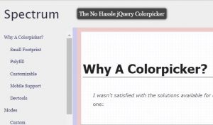
The No Hassle jQuery Colorpicker which is lightweight and easily customizable.

Super Scroll Orama

Superscrollorama is powered by TweenMax and the Greensock Tweening Engine. Go to greensock.com for documentation on how to use it. Why Greensock/TweenMax? Great performance, ease-of-use, expandability and basically because it is awesome.


7 Uniquely beautiful online shopping interfaces

July 23, 2017 John Wells 0

Online shopping has become more and more popular day after day and new shopping websites are being introduced almost every day with unique and innovative features. Nowadays with the change in the lifestyles, there is a vast and drastic change in people’s shopping habits. People hate shopping in crowds and they are searching for unique and quality products for less in the convenience of their home. Since online shopping eliminates the middlemen, consumers can purchase things directly from the buyer in real time. This is the main reason why online shopping sites are able to give frequent discounts and offer to its customers.

The heart of any online shopping application is the user interface or website design. The design itself has the power to make or break the business. In conventional offline shopping, the sellers keep their shop attractive, clean and organized. They arrange their products in such a way that it looks impressive to the customers so that they will go for it. Similarly, look and feel plays a very important role in the case of an online shopping system as well. Since the product is not directly accessible to the customer in online shopping to touch or feel, people won’t buy them if it is not very well presented. The presentation part, therefore, is critical and needs very good attention and research. Webeden (a free website builder for small shops) is an easy and reliable way to make a shop interface that will help you sell products, so do check it out if you’re looking to create your own website.

Here in this post, we are presenting you with some cool looking e-commerce websites which are selected randomly from the online shopping world.  

Stylemint

Stylemint an innovative and unique online shopping experience which comes from Mary-Kate Olsen and Ashley Olsen also known as the Olsen Twins collectively are American actresses and fashion designers. The website layout provides a super cool feeling with a clean minimalistic layout in simple lighter shades. Unlike other popular online shopping sites, Stylemint will not let you explore the product section right away. You have to be a registered user to see the product selections. You can use your email id facebook account to register. Once you are registered and logged in, they will ask you some questions and based on your answer they will generate a list of products best suited for you and presented to you in a personalized and attractive way. This intelligent mechanism is the unique feature which gives a personal touch to the entire Stylemint shopping experience. The shopping workflow and layout is all the way unique and fresh. The products are arranged elegantly and systematically.

Gilt

Gilt is another ‘member only shopping’ website, where you need to become a member to explore the product range. The best part about gilt is the entire sales take place online and you will not get their collections from anywhere else. It gets you something unique and new every day which is available on first come – first serve basis. If you want to get the most unique piece which has the fresh looks, keep an eye on their updates. Another cool feature to note is their advance preview service. They give you a preview of their upcoming items well in advance. The website layout looks really professional and attractive. They have used a product-centered design method which is the best approach for an ecom website UI. The products are presented in a way that it gets the maximum attention. They have a done a really good job in the product preview part, the product can be previewed as if you are looking at it in real. The entire website is on a grey theme which gives the product more attention and the products are looking more attractive to buy.

Myntra

The unique quality of Myntra is the wide range of products. They have the largest collection of lifestyle products which comes around 30,000 plus styles ranging from more than 500 top brands. This is such a huge product range for an online web store. Arranging and managing such a wide range of products is not at all easy and it is the most challenging part in the entire shopping website design, and they have done a brilliant job here. The product grouping, categorization, and presentation are simply awesome. The products are systematically grouped on the basis of category, brand, style, gender and what not. You could easily locate your favorite range of products simply with a click or two. The presentation part is very well done which provides a clear view of the product presented. The product can be previewed from many angles and even a video preview is available for many products.

Timefy

Timefy is a French shopping website exclusively for men’s designer watches. It has a huge collection of designer watches from across all top brands. The website design is simply beautiful, which uses lighter colors and shades of black and white primarily. The overall grey colored theme gives the website an elegant and professional look. The product presentation is amazing where the primary focus goes to the product image. It is designed in such a way that it doesn’t look cluttered when the number of products is too high. The best part about the design is, simplicity and minimalism. The shopping cart layout and design are highly user-friendly.

Firstcry

It is an exclusive online web store for Baby Care Products and kids accessories. It has an excellent collection of baby care products and accessories from all popular brands. The products are arranged systematically and in good order. The product presentation and preview is amazing. Though the website layout look bit crowded on first look, it is appealing and colorful. The entire theme is centered on kids, with cool bright colors and nice graphics. All little models who pose for dresses are looking cute and smart. Overall the website design and layout is perfect for a kids shopping website.

Solesociety

An exclusive online store for high quality shoes, handbags and other women’s accessories. The best part about the webstore UI is that, it is so simple and clean. They have done a wonderful job in making the web interface look simple and elegant. The colors used are primarily lighter shades, which gives it a complete professional look. The product photographs look terrific and high quality. You could preview the product from various angles and also can preview various color options of that product.

Zaino

Zaino sells exclusive bags and cases for kids. The website interface is too good as a kid’s store. It uses bright colors brilliantly in the base theme. Whitespaces are brilliantly used to prioritize content and to define the right flow. Product list and preview page layout makes this website more user-friendly. Even though the base theme color is pink, other colors such as blue-green and orange are blended along with it nicely to catch the attention of those little ones out there online. The slider on the homepage gives the website a lively effect and it catches the attention.


How to integrate Google Plus Commenting feature in WordPress blog

July 3, 2017 John Wells 0

Yes all of us are familiar with the development now that Google+ has added Google+ comments in the WordPress comments section now. Let’s accept it, we all love to see comments on our blogs as they signify recognition and to some extent, appreciation and WordPress being the best Content Management System attracts most of them. Now with Google+ too as a part of it, we have much more to look forward to in terms of getting comments on our posts and commenting on others to fuel interaction. However, lately people have been facing glitches in terms of adding the Google Plus comment system to their WordPress sites and there are more than one way to add this comment system to your site, be it through Code, Code for Thesis or through the ample number of plugins available.

Let us discuss in detail about Google+ comment system, the advantages and disadvantages it has and the process to add them to your WordPress website.

Google+ Comments: Pros and Cons

Though Facebook is still ahead, Google+ too has been able to gather a number of users with its sleek looking comment systems and the promise to increase their visibility which is why the whole Google+ comment system has come up. In terms of pros, we cannot deny the fact that it is Google at the end of the day, the king of SEO and it will definitely increase your followers and visibility. Another factor is that the Google+ comments will fuel your interaction with other bloggers which will ultimately be good for you. The other reasons would be the convenience of syncing with the Gmail account and the ability to just sign in with your Gmail account and get access to WordPress as well, and the other benefit or the SEO benefits which Google is known for. SEO or Search Engine Optimization is what makes or breaks your presence over the internet, which is why factors like page rankings and keywords hold so much importance. We also know Google is the most frequently used search engines ever and if you will use their own comment system, your posts are likely to score better when people enter the related keywords. This is a huge benefit of having the Google+ Comment System added to your WordPress site.

Enough of pros, now let’s get familiarized with a few cons as well. The disadvantages come in with things like unofficial plugins and nothing official from Google’s end till date, which means less convenience as the comments will have to be checked manually. This is because there is no notifications option present to track down the comments or replies you received on your blog. Also, a few might be worried about losing their comments as well, as though it seems next to impossible, some of us are paranoid enough to consider that Google will shut down one day and all our comments will be lost. Though far fetched, this uncertainty too can be counted as a con to Google+ comments.  This is all to it and now we jump to the tips to add Google+ comments to WordPress sites.

Adding Google+ Comments

This won’t be the toughest job you have done on your WordPress site and involves the download, installation, and activation of the Google+ Comments for WordPress Plugin. Once you have activated it, you will be able to gain control over it through Comments >> G+Comments. Not just Google+, you now will also be able to add other platforms like Facebook and other default WordPress comments and you can now choose the way the comments want to be placed. This can be done by going to Comments >> G+Comments, which will ultimately lead to its configuration.

Google+ is great also because it gives you the option of adding the tabbed commenting area which means that now you can also include other comments, as mentioned above. The other platforms include Facebook, Disqus and Default WordPress comments. The other features which this plugin provides you with include being able to arrange the order and the platforms which you would want to be displayed in the comments section and changing the label of each tab according to your own choice. Once you are done making all the needed changes, the next step is to click on the Save Changes button so that your changes aren’t lost. Once it is done it will be ready to be used.

Definitely, the pros outweigh the cons and it will not be a bad thing for you to use Google+ comments on your and other blog posts and WordPress websites. The whole process of adding Google+ comment system is also not a very tough task which makes it even easier for people to avail benefits of what Google has to offer us, in the best way possible.


10 easy and powerful online resources to create free websites

April 9, 2017 John Wells 0

A website is becoming an integral part of the success of any business establishment. The tendency of building a new website from its scratch has gone. People want to save time and it raises the need for ready-made website designing tools. We have so many such website builder tools available today for both free of cost and for some nominal charges. You just need to focus only on other important aspects of your website such as the content, branding, typography, etc. Your business whether it is online or offline certainly needs your web presence. Instead of doing it yourself or paying high fees to professionals, you can simply do it through these easy web designing tools.

You should have a clear idea about the layout, content, branding, etc. As long as you are ok with that, the web designing tools that we are going to discuss here will guide you in the web design process. Using these free website builder tools, you can simply and quickly create a quality website and make it up and running online.

Below are some of those highly powerful yet simple online tools/resources with the help of which you can create a quality website in minutes.

1. WIX

WIX is a free tool that lets you create and even host your website online. They have an easy to use simple interface. They have a huge repository of templates using the latest technologies such as HTML5 and CSS3. Most of these templates are responsive, therefore you can make sure that your website is accessible on all devices including a computer and other handheld devices. Here, the basic things are offered free, but if you wish to use some advanced features like removing ads from your website or linking some other websites to yours may cost some fees.

2. Getshopped

With Getshopped, you can set up your eCommerce website for free. It is also possible to create free webpages, websites, and blogs using Getshopped. It offers a facility to sell your products online. Getshopped has integration with major payment processors like PayPal, Google Checkout, etc. therefore, you can be assured of security in all your payments through Getshopped.

3. Jimdo

It is another free tool for creating your website online. Just sign up with them and follow the given link to create your webpage. Customize your webpage, as you want it to be. For the upgrades, you may be required to pay some dollars. The upgrades include some special features and custom newsletters that make the website more interactive.

4. Yola

Yola is another cool website building facility, it has a great collection of beautiful templates with a lot of customization options. Yola offers a variety of easy to use tools and services along. The highlight of Yola is the free web hosting services they offer.

5. Google sites

Google, a well-known brand offers the facility to create webpages easily. If you already own a Google account, then you can easily access Google sites and create your own website for free. You can even add some other contributors to your site through Google sites. You will get lots of customization options in the administration area, using which you can create a unique website.

6. Webnode

From scratch to end, you can create a perfect website using Webnode. The tool provides you all simple ways to create an excellent website. The major advantage with Webnode is they do not put any ads on your website. In addition to that, their interface is much easier than any other interface and perfect for the beginners in web designing.

7. IM Creator

Wanna make your own site for free? Do it easily with IM Creator. Even a beginner in web designing can come up with such a perfect and professional website with the help of IM Creator. It offers all simple ways to create a website.

 

8. Edicy

If you are in a need to create a website urgently and most importantly to make it alive on the internet in a matter of minutes, then the best choice is to go with Edicy. No extra software needed and therefore, no extra time for your works. Just choose any of the readymade template designs and get your website done in minutes.

9. 350 pages

350 pages let you create your website in a simple way, but the special part is you can edit your webpages from anywhere at any time. No download or installation is necessary as everything is loaded on a stable secure server.


10. doTemplate

It is a specially designed free website template creator. You have the option to download all the available templates. However, you can also make many customizations online before downloading. It’s really an awesome tool for beginners.


How to make your app site look irresistible and awesome

April 2, 2017 John Wells 0

Since you are reading this article on a computer or mobile devices, I hope that it is safe to assume that you have at a certain point of your life have actually used mobile applications. In fact, unless you are not using those bulky and UN-smartphones that are on the verge of oblivion, you are mostly like to use some apps on a regular basis.

In fact, there are no such things as too many apps. We simply cannot get enough of them because apps are seriously making our lives simpler and bearable. Ok, it seems that you are not willing to agree. Well, in that case, I would request you to turn off all the apps that are currently running on your Smartphone and tablet computer and try to spend a week without them.

Don’t even think about it because if you dare to do such an insane thing, it will make your life really miserable. Apps help us manage things when they become unmanageable and simplify the way we try to live our complex lives and of course not to forget the fact that apps make our lives more bearable.

Now, there are hundreds and thousands of apps are out there but only a few of them make it to the top. So, as you can understand, in this cut-throat competition, the only way to survive and gain popularity is by doing something different from the other.

Of course, you have to follow the basic tenets of social media marketing; I mean the app needs to have a website where people can gather information from. A typical website meant for marketing app usually tells us what the app is all about and why the visitors should get this app installed on their devices. But these are those basic things that everyone around is doing and that means, if you wish to make a cut here, you have to go beyond this:

Try the boring Idea of A Landing Page

Of course, your website is meant for making people aware of the fact that your app exists, but the website has a larger and bigger role to play. The purpose of your website is to get people to use your app. You can educate them and can make them believe that your App is going to revolutionize the way they live, but unless you push and convince them, they are not really gonna use your app.

So, here comes the importance of incorporating some of the most common ingredients of a landing page into your website so that the readers take action and you will see visible change. These changes will have a positive impact on the user experience front.

The good thing is, you would not have to make any drastic change for making people take desired actions. Just put the focus on Call to Action Button. Make people aware of what is going to happen when they click on the ‘Call to Action’ button and also make sure that you have described in proper English what your app is going to do in the Above the Fold section of your website.

However, if I am not asking much, you need to use your graphic design skills to create some nice images of the app in action and bulleted points in the page to make your proposition more strong and robust.

Try to Narrate A Nice Story

Well, check any other App based websites and you will see the front page is stuffed with technicalities or in other words technical specifications about the app. From the perspective of a website owner, it might appear that the website is doing a great job but in reality, you are devastating all your chances.

When you are presenting specifications about your app directly to your visitors, there are good chances that they will be comparing and contrasting them with other apps. Well, I hope that this is not what you actually intended. In that case, it would be better if you can tell a story instead.

By telling a story, you will make it easier for people to relate to the app. And of course, the app needs to be believable. Please do not come up with another boring story describing how your app has solved the problems of a writer struggling with keeping distractions at a bay [if your app happens to be something to do with managing distractions]. That would not be enough to make a cut

Rather, you should try this. Narrate how a writer was facing trouble, lost his girlfriend and all that sort of stuff as he failed to concentrate on his writing and how your nice and shiny app solved all problems and helped him reunited with his girlfriend. How does that sound? I hope your targeted audience is going to appreciate this.

Do Not Focus on Screenshot of the App heavily

It is quite expected that you are going to put the focus on the screenshots of the app so that the visitors can understand how it is going to solve their problem. There is a better way to do this. Rather than following this often trodden path, why not feature a man or woman telling how the app has solved their problems.

A video would be great, however, if you cannot manage that, it is okay still. You can feature images of an average Emily or Joe holding a phone with your app in action. It will be a powerful impact on the audience and they will get to see that people are actually using your app and they are getting benefited from it.

Try To Match Your App With Your Design

Though this one is quite common, I think it would not hurt you if I reiterate the fact that your app and your website design should complement one another. What I mean to say is that if your app is simple and has a sober color combination, you should not make your website [where you will be promoting] complicated and it should also not have a riot of colors.

Top 5 Mobile App Design Tips That Help Your App to Succeed

March 24, 2017 John Wells 0

With the constant growth of mobile technology, mobile phones have become a necessity and this is the reason why every businessman should have a mobile app for his business. Mobile applications can help you to showcase your products, services, and represent your business among your customers.

In recent times, mobile app development has flourished in the market at a very fast rate. From health & fitness to news to online shopping for games, there is nothing in the mobile market that is left.

Often, marketers are finding it difficult to design an application for their business that produces effective results. However, the reality depends on your survey and research that in return help you select the best option for your target audience. It is highly important that you design and develop one such app that fulfills all the requirements of users.

But how will you keep your users engaged with your mobile application? The answer to this question is “attractive user-experience”. A bad and unattractive UI design can affect your application’s credibility. Therefore, it becomes important that you consider both UI and UX while the app designing as both can break or make your app.

Here are some of the important design tips for your mobile app design.

Selecting Right Colors & Make Sure to Exile Clutter

If you will opt for including a lot of features and functionalities in your application, it will make your app’s user interface cluttered and quite difficult to navigate. You should not do that at any cost.

Make sure that your application has a clear and one main purpose as it will help you in designing and optimizing the user experience in an amazing way. Significantly, you should create more relevant content for your app as it will go far in developing brand engagement and increase loyalty as well.

Through a written outline, you can get a complete idea about the total number of pages that you need for your application’s content. Along with it, colors are playing a very important role in making your application attractive among your users.

Through colors, you can define the emotional relationship that your customers have with your service/products. When you design an app, you should keep in mind that every culture links with different colors with different symbols.

Try to Make It As Simple As Possible

Talking about designing a mobile application, simplicity is the most important point that must be considered while designing. Always design your app thinking about the first-time users of your app as you don’t want to puzzle them.

To get his required information if a user needs to navigate through four levels of menus, there are high chances that your application will be instantly uninstalled by them. Usually, users don’t like apps that have complex navigation. So, try to embed simplicity in your app’s UI with the latest style, so users do not need any special instructions while using the app.

If you have an application that is easy-to-use and intuitive, it motivates users to download and visit often. You should ensure that you follow the agreements of back-button behavior and keep it, where it is supposed to be.

Define Your Targeted Audience

As we all know that in various cases, the audience is defining your mobile app design. So, the below-mentioned steps will help you to know your targeted audience:

  • You should think, who will be interested in using your application. However, these are the actual users, but their main models will enable you to forecast users’ decisions concerning your application.
  • You should try to predict the user’s’ behavior. After comprehending their behavior, it will be easy for you to design a UI, which meet users’ expectations.

Rule of Accessibility

Many times, we accidentally click on the wrong button on the application and reach to any random screen. As the human fingers are bigger than the mouse cursors; therefore, it is essential to keep in mind a finger-friendly design that can give a positive impact on your application.

You should provide sufficient space for users so that they can easily tap their fingers whether they want to minimize, search or click on any button. However, fingers are about 45-57 pixels wide that are much larger than most of the design guidelines.

You should also keep in mind that people usually hold their phones in different ways like one thumb, two hands or two thumbs. Thus, you can keep this thumb and finger rule in your mind while adding touch buttons in the app.

Go with Flat UI

Do you know that designs are mainly focused on trends? It is true that designs mainly focus on the latest trends. This information will help you to make sure that your application is beyond and matching with the top industry standards.

Currently, flat design is in fashion as users find it attractive. Along with it, you can improve the usability of your app by considering device-specific shades like posture, thumb placement, and orientation.

These are the top 5 mobile design tips that can help you to make your application successful by designing it in a way it should be. Consider these tips and make your app apart from other applications.