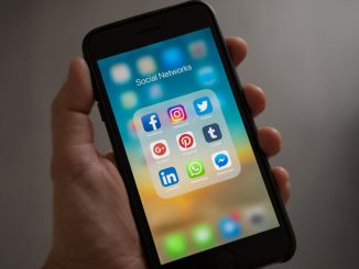
Social networking is the process of building social relations with people who share similar interests or people from similar backgrounds. The social networking practice is mostly carried out using a web-based online application or interface. These online applications are commonly referred to as social networking sites. There are a number of highly popular social networking websites such as Facebook, Twitter, Linkedin, Google Plus etc. Today almost all people who know how to access the internet will have an account with any of the above mentioned social networking websites.
A recent report published on TechCrunch states that more than 50% of Facebook’s active monthly users (AMUs) are mobile users. The number of users who access Facebook every day, on average, grew 8 percent to 665 million in March, from 618 million in December. The number of people who access social networking sites using smartphones or tablet computers has been growing so rapidly.
Even though there are many social media networks on the internet today, each has its own unique focus, user-base, and intended use. Facebook is a general purpose personal networking service, Twitter is also a general social networking service which is basically about sending short messages known as tweets, while LinkedIn is purely a professional networking platform. Similarly, each social networking platforms has its own intended use.
Here in this post, we are presenting some of those coolest social networking mobile apps, each of these apps are unique in its own way. All these applications are available both for Android and iPhone devices.
Tango Text, Voice, and Video
With Tango, you will be able to make the highest quality video & phone calls, texts, photo & video sharing, games and more for FREE! It’s an all-in-one social networking application that finally combines every way you want to interact with your dear ones. Join over 100 million people around the world using Tango today!
Snapchat
Snapchat is one of the fastest ways to share a moment with your friends. You have the full control on how long your friends can view your message – simply set the timer up to ten seconds and send the message.
Badoo – Meet New People
Badoo is another social network service using which you can meet new people. With over 180 million users, Badoo is really good for chatting, making friends, sharing interests, and even dating! Badoo is completely free and user-friendly. Try and find new people near you now!
WeChat – The new way to connect
WeChat is an emerging networking app which supports free texting, voice messages and video calls in your pocket. 300 million people love WeChat because it’s really fast, reliable, private and always on.
Skout for android
Skout is the global network application for meeting new people. Instantly meet people near you or around the world. Find new friends at a local bar or in Barcelona. Millions of people are connecting and meeting through Skout every day. Use skout’s exciting in-app features to increase your chances of meeting or chatting!
Bump
Bump is a groundbreaking innovative concept, use Bump™ to share contact info, photos, videos, and files simply by bumping two phones together. Just open Bump, hold your phones, and gently bump your hands together – Bump will magically do all the rest.
Text Plus
textPlus is a perfect option for free SMS texting and inexpensive local and international calls. It is damn easy if your friends and family have this app installed on their devices, it’s always free. textPlus works on all popular smartphones and tablets.
Seesmic
With Seesmic for Android, you will be able to view and update your Facebook and Twitter accounts all at the same time. Share photos, videos and take advantage of the Android shortcuts for direct access to your @ Replies from one of your Twitter accounts, or you can access your feeds from one of your Facebook pages and much more!
Tagged
Tagged – Meet, Date, Chat, Flirt, Free, Fun!
With over 300 million members make Tagged the largest and best FREE app to meet new people and make new buddies for flirting, dating, friendship and fun! Completely Free to download and – unlike other dating apps it’s free to connect with people too!
MeetMe
MeetMe shows you who’s sitting nearby and ready to chat, Kik, and meet — Completely FREE!
Whether you’re at the bar, on the beach, or hanging out at home, MeetMe is always the BEST app for meeting new people near you!
Android is a Linux-based operating system developed mainly for touchscreen mobile devices such as smartphones and tablet computers. Android is an open-source operating system owned by Google. What makes android special is the community support. Android has the support of a large developer community who writes applications. Android applications are used to extend the basic functionality. As of October 2012, there were approximately 700,000 android apps available in the app market, and the estimated number of applications downloaded from Google Play, Android’s primary app store, was more than 25 billion.
With these powerful apps, people can now perform almost all things on the go, which were previously possible only with computers. As far as web designers are concerned, they can now perform so many web design related things on the move using an Android powered device. That is the power of Android apps.
Here in this post, we have collected more than 5 best and useful android applications for web designers and developers. You can download the application from the play store,.
WM FTP Client
WM FTP Client is an FTP client developed with WinDev Mobile edited by PC SOFT.
This application will allow you to easily interact with an FTP server from your smartphone or your tablet.
You will be able to, among other things, rename, delete, download and send some files.
Adobe Photoshop Express
Edit and share photos virtually anywhere. Touch to crop, rotate, adjust color, and add artistic effects. Access all your photos and videos directly from your free Photoshop.com account. Quickly share with family and friends. Requires SD card. By downloading you agree to the Terms of Use at www.photoshop.com/misc/terms.html
DroidEdit (free code editor)
DroidEdit is a text and source code editor (similar to Notepad++ or gedit) for android tablets and phones with the following features:
– Syntax Highlighting for several languages (C, C++, C#, Java, HTML, CSS, Javascript, Python, Ruby, Lua, LaTeX, SQL, …)
Color Pal
Easily find color palettes and schemes for any design project. Whether you’re a web designer or just looking to paint your son’s room, you’ll find some of the best color palettes/schemes available.
Google Analytics
The Google Analytics app shows what is new and what is important on your Google Analytics profiles. See real-time statistics, customizable dashboards and intelligence events on your phone.
WebRank SEO
One of the Best SEO App in the Market.
Hurry! Ad-free version is available for a limited period only.
WebRank SEO gives you Website Ranks(Google Pagerank, Alexa Rank and Compete Rank), Sociometer(Facebook like tweets and google plus count), Pages Indexed and Backlinks in various search engines(Google, Bing, and Yahoo). A Search Engine Optimization(SEO) Tool for competitive website analysis.
With an amazing population leveraging mobile technology to the fullest, the need for delivering the finest mobile experiences has become vital. As an app developer, you can make sure that your mobile experience meets the end users’ expectations in the best possible manner. For this, a possible strategy is to identify the potential problems that can hamper the performance of your mobile application. With a detailed diagnosis of your app’s UX, you can even gather brilliant insights on redesigning the applications for enhanced functioning.
So, keep on reading this blog to get a clear idea about mobile UX scrutiny which will save you from receiving bad reviews for your application.
Why and when to perform an evaluation of Mobile UX?
It is vital for you to be familiar with the difference between app testing and mobile UX diagnosis.Unlike the case of app testing, performing a mobile UX diagnostic will unwind a number of issues related to the usability of the application.If you too are planning to conduct mobile UX diagnostic, then the best time to do it is during the app design and development phase. Here, you can ensure that your app is in compliance with the practices and guidelines that need to be followed for developing high-end mobile applications. Although UX Diagnosis can be done by a single annotator, the process can be handled best when undertaken by multiple annotators hailing from different backgrounds and possessing unique expertise.
Now, let me walk you through the 4 Steps that are involved in the evaluation of mobile UX
Step 1 – Identifying end users and specific scenarios
As a mobile UX evaluator, you need to be sure about the target audience for your app. Also, you should step into the end users’ shoes and check out all the possibilities available with the mobile application.You need to seek answers to questions including: Which devices are being used by the target users? Which operating system version is being used by the target users? What is the main competition for the mobile app?
Step 2 – Perform the app UX analysis
If you have appointed a team for conducting the mobile UX diagnosis, then ensure that each team member is being allotted an individual work on different aspects as explained below:
Adherence to 80/20 rule
As per the 80/20 rule, a whopping 80% of app users prefer using just 20% of its functionality. You need to check out whether the vital 20% functionality incorporated within the app is intuitive or not. The results attained thereafter would allow you to cut down unwanted features right away.
Rapid Competitive Benchmarking
Well, Rapid Competitive Benchmarking is basically a process where you can compare your mobile UX with multiple competitors that offer similar functionality. Here, you can make a note of all the areas where your competitors are offering a better user experience.
Reviewing the app’s overall UX feedback
The process of reviewing the overall UX feedback involves documenting the way users install your app, the cross-platform experience, the cross-device experience, reviews received by your app in multiple app stores and comments/feedback of users received via email.
Step 3 – Organize a Team Review session
Once your team is done with analyzing app UX, it is time for you to organize a team review session. This collaboration of all team members would enable you to compare and validate individual findings. You can ask one of the evaluators to facilitate the discussion, enabling others to verify whether they have come across similar issues or not. Finally, you should identify all possible solutions for the problems and jot down the same in the form of a consolidated list. If possible, you can even invite experienced app designers for reviewing your team discussion. Doing this would allow you to explore areas for further improvement.
Step 4 – Use a slide presentation for problems and feasible recommendations pertaining to app UX
Although a spreadsheet is a handy technique of reporting issues and solutions; choosing the visual way is perhaps a lot more impressive. Hence, you can indulge in creating powerpoint slides for summarizing your journey of diagnosing the mobile UX. Dedicating one slide to one problem will make it simpler for you to plan the re-design in a stress-free way. Plus, you can even incorporate the use of callouts and screen-shots for adding understandability to your app UX evaluation project. Grouping less severe problems together will allow you to address each one with an equal amount of attention.
Conclusion
Mobile user experience can make or break the reputation of your app. If you have just started with designing an app or already have one live, conducting a planned UX analysis will always work in your favor. I hope the overview presented above would have motivated you to gear up with Mobile UX analysis. By focusing on individual UX elements, you can effectively create a pleasing experience for the targeted app users.
Since you are reading this article on a computer or mobile devices, I hope that it is safe to assume that you have at a certain point of your life have actually used mobile applications. In fact, unless you are not using those bulky and UN-smartphones that are on the verge of oblivion, you are mostly like to use some apps on a regular basis.
In fact, there are no such things as too many apps. We simply cannot get enough of them because apps are seriously making our lives simpler and bearable. Ok, it seems that you are not willing to agree. Well, in that case, I would request you to turn off all the apps that are currently running on your Smartphone and tablet computer and try to spend a week without them.
Don’t even think about it because if you dare to do such an insane thing, it will make your life really miserable. Apps help us manage things when they become unmanageable and simplify the way we try to live our complex lives and of course not to forget the fact that apps make our lives more bearable.
Now, there are hundreds and thousands of apps are out there but only a few of them make it to the top. So, as you can understand, in this cut-throat competition, the only way to survive and gain popularity is by doing something different from the other.
Of course, you have to follow the basic tenets of social media marketing; I mean the app needs to have a website where people can gather information from. A typical website meant for marketing app usually tells us what the app is all about and why the visitors should get this app installed on their devices. But these are those basic things that everyone around is doing and that means, if you wish to make a cut here, you have to go beyond this:
Try the boring Idea of A Landing Page
Of course, your website is meant for making people aware of the fact that your app exists, but the website has a larger and bigger role to play. The purpose of your website is to get people to use your app. You can educate them and can make them believe that your App is going to revolutionize the way they live, but unless you push and convince them, they are not really gonna use your app.
So, here comes the importance of incorporating some of the most common ingredients of a landing page into your website so that the readers take action and you will see visible change. These changes will have a positive impact on the user experience front.
The good thing is, you would not have to make any drastic change for making people take desired actions. Just put the focus on Call to Action Button. Make people aware of what is going to happen when they click on the ‘Call to Action’ button and also make sure that you have described in proper English what your app is going to do in the Above the Fold section of your website.
However, if I am not asking much, you need to use your graphic design skills to create some nice images of the app in action and bulleted points in the page to make your proposition more strong and robust.
Try to Narrate A Nice Story
Well, check any other App based websites and you will see the front page is stuffed with technicalities or in other words technical specifications about the app. From the perspective of a website owner, it might appear that the website is doing a great job but in reality, you are devastating all your chances.
When you are presenting specifications about your app directly to your visitors, there are good chances that they will be comparing and contrasting them with other apps. Well, I hope that this is not what you actually intended. In that case, it would be better if you can tell a story instead.
By telling a story, you will make it easier for people to relate to the app. And of course, the app needs to be believable. Please do not come up with another boring story describing how your app has solved the problems of a writer struggling with keeping distractions at a bay [if your app happens to be something to do with managing distractions]. That would not be enough to make a cut
Rather, you should try this. Narrate how a writer was facing trouble, lost his girlfriend and all that sort of stuff as he failed to concentrate on his writing and how your nice and shiny app solved all problems and helped him reunited with his girlfriend. How does that sound? I hope your targeted audience is going to appreciate this.
Do Not Focus on Screenshot of the App heavily
It is quite expected that you are going to put the focus on the screenshots of the app so that the visitors can understand how it is going to solve their problem. There is a better way to do this. Rather than following this often trodden path, why not feature a man or woman telling how the app has solved their problems.
A video would be great, however, if you cannot manage that, it is okay still. You can feature images of an average Emily or Joe holding a phone with your app in action. It will be a powerful impact on the audience and they will get to see that people are actually using your app and they are getting benefited from it.
Try To Match Your App With Your Design
Though this one is quite common, I think it would not hurt you if I reiterate the fact that your app and your website design should complement one another. What I mean to say is that if your app is simple and has a sober color combination, you should not make your website [where you will be promoting] complicated and it should also not have a riot of colors.
With the constant growth of mobile technology, mobile phones have become a necessity and this is the reason why every businessman should have a mobile app for his business. Mobile applications can help you to showcase your products, services, and represent your business among your customers.
In recent times, mobile app development has flourished in the market at a very fast rate. From health & fitness to news to online shopping for games, there is nothing in the mobile market that is left.
Often, marketers are finding it difficult to design an application for their business that produces effective results. However, the reality depends on your survey and research that in return help you select the best option for your target audience. It is highly important that you design and develop one such app that fulfills all the requirements of users.
But how will you keep your users engaged with your mobile application? The answer to this question is “attractive user-experience”. A bad and unattractive UI design can affect your application’s credibility. Therefore, it becomes important that you consider both UI and UX while the app designing as both can break or make your app.
Here are some of the important design tips for your mobile app design.
Selecting Right Colors & Make Sure to Exile Clutter
If you will opt for including a lot of features and functionalities in your application, it will make your app’s user interface cluttered and quite difficult to navigate. You should not do that at any cost.
Make sure that your application has a clear and one main purpose as it will help you in designing and optimizing the user experience in an amazing way. Significantly, you should create more relevant content for your app as it will go far in developing brand engagement and increase loyalty as well.
Through a written outline, you can get a complete idea about the total number of pages that you need for your application’s content. Along with it, colors are playing a very important role in making your application attractive among your users.
Through colors, you can define the emotional relationship that your customers have with your service/products. When you design an app, you should keep in mind that every culture links with different colors with different symbols.
Try to Make It As Simple As Possible
Talking about designing a mobile application, simplicity is the most important point that must be considered while designing. Always design your app thinking about the first-time users of your app as you don’t want to puzzle them.
To get his required information if a user needs to navigate through four levels of menus, there are high chances that your application will be instantly uninstalled by them. Usually, users don’t like apps that have complex navigation. So, try to embed simplicity in your app’s UI with the latest style, so users do not need any special instructions while using the app.
If you have an application that is easy-to-use and intuitive, it motivates users to download and visit often. You should ensure that you follow the agreements of back-button behavior and keep it, where it is supposed to be.
Define Your Targeted Audience
As we all know that in various cases, the audience is defining your mobile app design. So, the below-mentioned steps will help you to know your targeted audience:
You should think, who will be interested in using your application. However, these are the actual users, but their main models will enable you to forecast users’ decisions concerning your application.
You should try to predict the user’s’ behavior. After comprehending their behavior, it will be easy for you to design a UI, which meet users’ expectations.
Rule of Accessibility
Many times, we accidentally click on the wrong button on the application and reach to any random screen. As the human fingers are bigger than the mouse cursors; therefore, it is essential to keep in mind a finger-friendly design that can give a positive impact on your application.
You should provide sufficient space for users so that they can easily tap their fingers whether they want to minimize, search or click on any button. However, fingers are about 45-57 pixels wide that are much larger than most of the design guidelines.
You should also keep in mind that people usually hold their phones in different ways like one thumb, two hands or two thumbs. Thus, you can keep this thumb and finger rule in your mind while adding touch buttons in the app.
Go with Flat UI
Do you know that designs are mainly focused on trends? It is true that designs mainly focus on the latest trends. This information will help you to make sure that your application is beyond and matching with the top industry standards.
Currently, flat design is in fashion as users find it attractive. Along with it, you can improve the usability of your app by considering device-specific shades like posture, thumb placement, and orientation.
These are the top 5 mobile design tips that can help you to make your application successful by designing it in a way it should be. Consider these tips and make your app apart from other applications.