Secondary Lighting – Give Depth To Your Digital Artworks
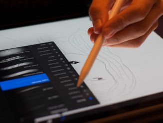
This short write up would be about some interesting technique I stumbled across gradually, about make digital artworks more interesting and less flat. You can apply this to almost all forms of digital artwork (digital painting or digital illustration), where you create the sense of depth and give volume to your subject by putting different shades of same color/hue. It can be applied where you are varying the value and hue too, once you get the underlying principle. To learn more checkout out our Online Digital Painting Course over at LawsOfColor.com on digital drawing and digital painting courses.
Let us take as simple example.
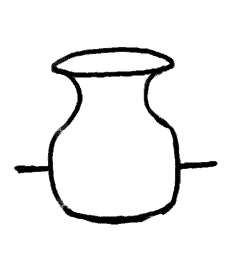
Line Art of a Vase
This is a simple line art of a vase or pot like object. Once you get the shape right, depending on the style or medium, you would start rendering its volume. First a light source is assumed, and color (or gray) is applied with varying value (intensity/shade). In this example let us assume the light source is on the left-top and behind the viewer.
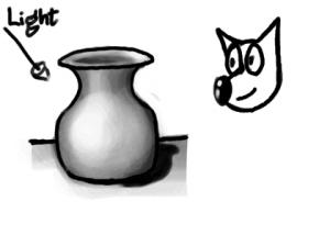
Vase shaded for simple light setup
It is pretty decent depiction of the shape of the vase, due to the varying intensity of light falling on different parts and surfaces. But it still seems to not have that character, and even with proper shading, looks a bit with out depth. The reason for this is, the above shading is not proper. It would have been proper if the vase was floating in empty space with the light source where we have assumed. Even with the shadow draw, it may not look convincing enough as we see in real life. So what are we missing?
The missing render is of, what may be called secondary light. It is the ambient light of the room, or some of the reflected light from the surface the vase is kept on. The moment you depict this secondary light, the artwork gains more character.
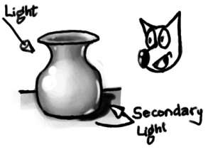
Vase shaded for light setup with secondary light
Here, I did exaggerate the light from the secondary source a bit more than I usually would so that it become clear. Observe the rim of reflected light drawn on the right hand surfaces of the vase, which are facing the ground/table.
When doing actual artwork, render the reflected light much lighter than the primary light source. Some times, the scene may have an actual secondary light source. The secondary light source may be almost as intense as the primary, but to get a dramatic artwork, always try to compose a scene having one strong primary light source.
In this example, to make it simple, I showed it in gray scale image. But when color/hue comes into play, the technique becomes even more interesting. Studying other established artists’ works, you can notice that most of them have a secondary light source color to be complementary of the primary light source. This, I think, is done to make an interesting composition by having color contrast in the artwork.
 Number 3: Use the right hues of color.
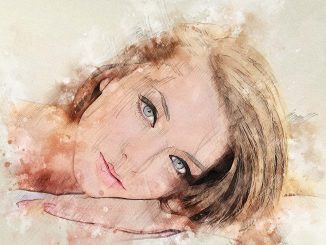
 My final tip is to draw over your reference photos. This is a way to study construction by drawing over a photo and thinking about the basic shapes of the face. There are different ways to use this technique. You can make a rough lay over on your reference photo and copy these lines. You can then use this ‘line art’ to build up your painting, giving yourself a head start. You could also make an even more abstract layover of your reference, using mostly angular shapes. This makes the shapes very simple and easy to duplicate. This time, don’t just copy the line art, but draw it yourself. It is a wonderful exercise to improve your hand eye coordination. Next, you can use this abstract line work to build up your portrait painting. But perhaps you are not too confident about your drawing skills yet. What you can do is make a more detailed line drawing on top of your reference. People might say this is cheating, but I think it’s still a great practice since it will help you understand the structure of the face.