Must have free android apps for web designers and developers

January 31, 2018 John Wells 0

Android is a Linux-based operating system developed mainly for touchscreen mobile devices such as smartphones and tablet computers. Android is an open-source operating system owned by Google. What makes android special is the community support. Android has the support of a large developer community who writes applications. Android applications are used to extend the basic functionality. As of October 2012, there were approximately 700,000 android apps available in the app market, and the estimated number of applications downloaded from Google Play, Android’s primary app store, was more than 25 billion.

With these powerful apps, people can now perform almost all things on the go, which were previously possible only with computers. As far as web designers are concerned, they can now perform so many web design related things on the move using an Android powered device. That is the power of Android apps.

Here in this post, we have collected more than 5 best and useful android applications for web designers and developers. You can download the application from the play store,.

WM FTP Client

WM FTP Client is an FTP client developed with WinDev Mobile edited by PC SOFT.
This application will allow you to easily interact with an FTP server from your smartphone or your tablet.
You will be able to, among other things, rename, delete, download and send some files.

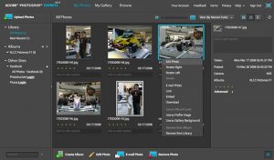
Adobe Photoshop Express

Edit and share photos virtually anywhere. Touch to crop, rotate, adjust color, and add artistic effects. Access all your photos and videos directly from your free Photoshop.com account. Quickly share with family and friends. Requires SD card. By downloading you agree to the Terms of Use at www.photoshop.com/misc/terms.html

DroidEdit (free code editor)

DroidEdit is a text and source code editor (similar to Notepad++ or gedit) for android tablets and phones with the following features:

– Syntax Highlighting for several languages (C, C++, C#, Java, HTML, CSS, Javascript, Python, Ruby, Lua, LaTeX, SQL, …)

Color Pal

Easily find color palettes and schemes for any design project. Whether you’re a web designer or just looking to paint your son’s room, you’ll find some of the best color palettes/schemes available.

Google Analytics

The Google Analytics app shows what is new and what is important on your Google Analytics profiles. See real-time statistics, customizable dashboards and intelligence events on your phone.


WebRank SEO

One of the Best SEO App in the Market.

Hurry! Ad-free version is available for a limited period only.

WebRank SEO gives you Website Ranks(Google Pagerank, Alexa Rank and Compete Rank), Sociometer(Facebook like tweets and google plus count), Pages Indexed and Backlinks in various search engines(Google, Bing, and Yahoo). A Search Engine Optimization(SEO) Tool for competitive website analysis.

 

Cool looking Google Plus business pages of top brands

January 30, 2018 John Wells 0

Google has recently launched Google Plus business pages which will enable businesses or brands to connect with fans in a manner similar to Facebook Pages. With the help of Google+ business pages, the company can start sharing information about their product or services and invite others to join in on the conversation. Even though Facebook pages are still more popular among business giants, google plus is increasingly gaining trust and popularity among the business community.

Here is a showcase of more than 20 Google Plus business pages of top brands worldwide. All the images are linked to their official Google Plus brand page.

Adobe

Adobe Google Plus business page

Amazon.com

Amazon.com official Google Plus business page

BMW

BMW Google Plus business page

Disney Store

Disney Store Official Google Plus business page

Volvo Cars

Volvo Cars Google Plus business page

Samsung Mobile

Samsung Mobile Google Plus business page

The Home Depot

The Home Depot Google Plus business page

eBay

Ebay Google Plus business page

Emirates

Emirates official Google Plus business page

UEFA Champions League

UEFA Champions League Google Plus business page

KFC – Kentucky Fried Chicken

KFC – Kentucky Fried Chicken Google Plus business page

Dell

Dell Google Plus business page

Cadbury

Cadbury Google Plus business page

The Coca-Cola Company

The Coca-Cola Company Google Plus business page

Angry Birds

Angry Birds Google Plus business page

HootSuite

Hootsuite Google Plus business page

Mashable

Mashable Google Plus business page

HUGO BOSS

HUGO BOSS Google Plus business page

The Wall Street Journal

The Wall Street Journal Google Plus business page

Audi

Audi Google Plus business page

Smashing Magazine

Smashing Magazine Google Plus business page


Mobile UX dissection – The right approach to deliver remarkable user experiences

January 7, 2018 John Wells 0

With an amazing population leveraging mobile technology to the fullest, the need for delivering the finest mobile experiences has become vital. As an app developer, you can make sure that your mobile experience meets the end users’ expectations in the best possible manner. For this, a possible strategy is to identify the potential problems that can hamper the performance of your mobile application. With a detailed diagnosis of your app’s UX, you can even gather brilliant insights on redesigning the applications for enhanced functioning.

So, keep on reading this blog to get a clear idea about mobile UX scrutiny which will save you from receiving bad reviews for your application.

Why and when to perform an evaluation of Mobile UX?

It is vital for you to be familiar with the difference between app testing and mobile UX diagnosis. Unlike the case of app testing, performing a mobile UX diagnostic will unwind a number of issues related to the usability of the application. If you too are planning to conduct mobile UX diagnostic, then the best time to do it is during the app design and development phase. Here, you can ensure that your app is in compliance with the practices and guidelines that need to be followed for developing high-end mobile applications. Although UX Diagnosis can be done by a single annotator, the process can be handled best when undertaken by multiple annotators hailing from different backgrounds and possessing unique expertise.

Now, let me walk you through the 4 Steps that are involved in the evaluation of mobile UX

Step 1 – Identifying end users and specific scenarios

As a mobile UX evaluator, you need to be sure about the target audience for your app. Also, you should step into the end users’ shoes and check out all the possibilities available with the mobile application. You need to seek answers to questions including: Which devices are being used by the target users? Which operating system version is being used by the target users? What is the main competition for the mobile app?

Step 2 – Perform the app UX analysis

If you have appointed a team for conducting the mobile UX diagnosis, then ensure that each team member is being allotted an individual work on different aspects as explained below:

Adherence to 80/20 rule

As per the 80/20 rule, a whopping 80% of app users prefer using just 20% of its functionality. You need to check out whether the vital 20% functionality incorporated within the app is intuitive or not. The results attained thereafter would allow you to cut down unwanted features right away.

Rapid Competitive Benchmarking

Well, Rapid Competitive Benchmarking is basically a process where you can compare your mobile UX with multiple competitors that offer similar functionality. Here, you can make a note of all the areas where your competitors are offering a better user experience. 

Reviewing the app’s overall UX feedback

The process of reviewing the overall UX feedback involves documenting the way users install your app, the cross-platform experience, the cross-device experience, reviews received by your app in multiple app stores and comments/feedback of users received via email.

Step 3 – Organize a Team Review session

Once your team is done with analyzing app UX, it is time for you to organize a team review session. This collaboration of all team members would enable you to compare and validate individual findings. You can ask one of the evaluators to facilitate the discussion, enabling others to verify whether they have come across similar issues or not. Finally, you should identify all possible solutions for the problems and jot down the same in the form of a consolidated list. If possible, you can even invite experienced app designers for reviewing your team discussion. Doing this would allow you to explore areas for further improvement.

Step 4 – Use a slide presentation for problems and feasible recommendations pertaining to app UX

Although a spreadsheet is a handy technique of reporting issues and solutions; choosing the visual way is perhaps a lot more impressive. Hence, you can indulge in creating powerpoint slides for summarizing your journey of diagnosing the mobile UX. Dedicating one slide to one problem will make it simpler for you to plan the re-design in a stress-free way. Plus, you can even incorporate the use of callouts and screen-shots for adding understandability to your app UX evaluation project. Grouping less severe problems together will allow you to address each one with an equal amount of attention.

Conclusion

Mobile user experience can make or break the reputation of your app. If you have just started with designing an app or already have one live, conducting a planned UX analysis will always work in your favor. I hope the overview presented above would have motivated you to gear up with Mobile UX analysis. By focusing on individual UX elements, you can effectively create a pleasing experience for the targeted app users.